Help us build this. Leave comments, suggest improvements, and help create better design documentation for agents.
Adidas
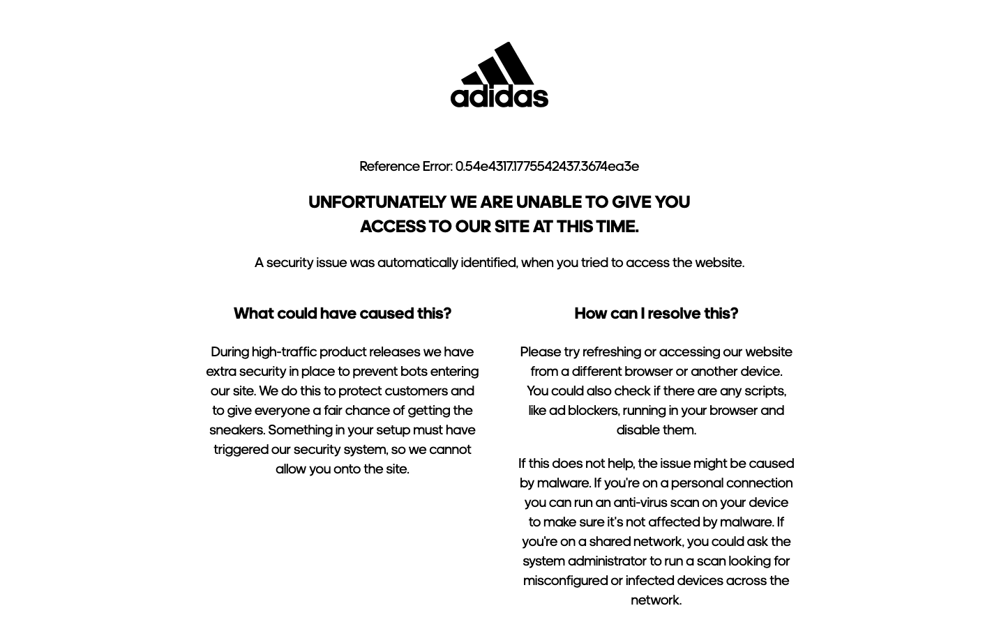
FashionAdidas employs a stark, utilitarian error page aesthetic that strips away all brand warmth in favor of clinical functionality. The monochromatic palette creates an almost medical atmosphere, while the custom 'adineue' typeface maintains brand consistency even in failure states, suggesting a brand confident enough to be austere when necessary.
Design Identity
Signature Color
Adidas Black
#000000
Athletic authority and uncompromising performance standards
Visual Identity
Extreme minimalism with surgical precision in typography hierarchy, using only black text on white backgrounds with the iconic three-stripe logo as the sole visual anchor.
Component Style
Invisible components - no visible buttons, borders, or interactive elements. Everything relies on pure typography and negative space, creating an almost print-like digital experience.
Spacing Philosophy
Cathedral-like spacing with massive whitespace zones that dwarf the content, creating a sense of isolation and focus. Text blocks are centered and given breathing room that feels almost reverent.
Design Principles
- Typography does all the heavy lifting - no decorative elements
- Center-aligned content with symmetrical margins
- Single column layout never exceeds 60% viewport width
- Line height maintains 1.4 ratio for optimal readability
- Black text on white background - no color variations
Target Audience
Performance-focused athletes and sneaker enthusiasts who expect direct, no-nonsense communication even during technical difficulties
Mood
Design descriptions are AI-generated based on visual analysis and may not fully reflect the brand's official design guidelines.
Design System
Typography Scale
| Element | Font | Size | Weight | Line Height |
|---|---|---|---|---|
| body | 20px | 400 | 28px | |
| h1 | 25px | 700 | 35px | |
| h3 | 23.4px | 700 | 32.76px | |
| p | 20px | 400 | 28px | |
| button | 16px | 500 | normal | |
| input | 13.3333px | 400 | normal | |
| header | 20px | 400 | 28px | |
| main | 20px | 400 | 28px |
Color Palette
No colors extracted