Help us build this. Leave comments, suggest improvements, and help create better design documentation for agents.
Afterpay
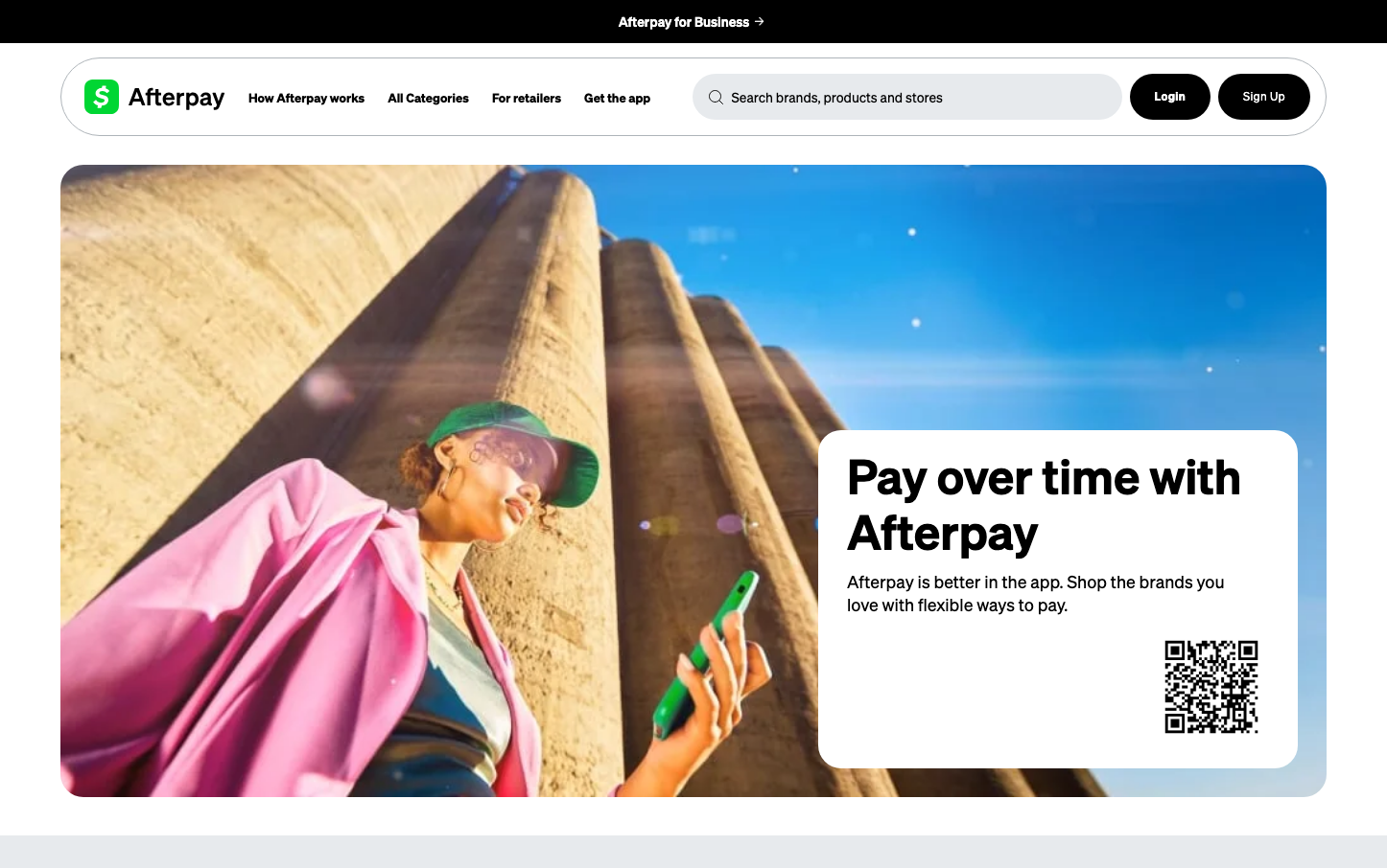
FintechAfterpay's brand radiates financial optimism through its signature mint green and lifestyle-first imagery, positioning payment flexibility as a pathway to personal freedom. The 'Cash Sans' typography reinforces financial credibility while maintaining approachability, creating trust in the fintech space.
Design Identity
Signature Color
Afterpay Mint
#00d64f
financial growth and accessible prosperity - suggesting money that grows and opportunities that flourish
Visual Identity
The distinctive mint green accent color combined with aspirational lifestyle photography and minimal shadow usage creates an instantly recognizable 'optimistic fintech' aesthetic that feels more like a lifestyle brand than traditional banking.
Component Style
Clean, shadow-free components with subtle green accent borders on interaction states. Elements feel flat and approachable rather than elevated, with focus on color changes rather than dimensional effects for feedback.
Spacing Philosophy
Generous whitespace creates breathing room that suggests financial freedom, with the hero section using asymmetrical layout to balance lifestyle imagery against clean typography blocks.
Design Principles
- Shadows are avoided entirely - components rely on color and border changes for interaction feedback
- Green accent colors (#00a93e hover, #00d64f focus) provide the primary interactive language
- Cash Sans typography reinforces financial trust while maintaining friendly accessibility
- Lifestyle photography dominates over product shots to emphasize life outcomes over features
- Clean borders and flat design philosophy keeps focus on content over decoration
Target Audience
Millennials and Gen-Z consumers who view financial services as lifestyle enablers rather than necessary evils - people who want to buy now but pay responsibly.
Mood
Design descriptions are AI-generated based on visual analysis and may not fully reflect the brand's official design guidelines.
Design System
Typography Scale
| Element | Font | Size | Weight | Line Height |
|---|---|---|---|---|
| body | 16px | 400 | 24px | |
| p | 14px | 600 | 21px | |
| a | 16px | 400 | 24px | |
| input | 14px | 400 | 48px | |
| main | 16px | 400 | 24px |
Color Palette
#00a93e#00d64f#000000#cccccc#3b82f6#ffffff


