Help us build this. Leave comments, suggest improvements, and help create better design documentation for agents.
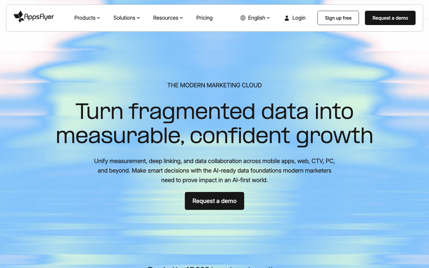
AppsFlyer
AnalyticsAppsFlyer's brand identity centers on ethereal data visualization through dreamy, cloud-like gradients that transform technical complexity into accessible beauty. The flowing blue-to-green aurora backdrop contrasts with sharp, geometric typography, creating a sophisticated balance between organic data flows and precise measurement tools.
Design Identity
Signature Color
Data Stream Blue
#3884f2
trustworthy analytics precision with approachable accessibility
Visual Identity
Distinctive aurora-like gradient backgrounds that visualize data as flowing, organic clouds while maintaining sharp typographic hierarchy - making complex analytics feel both beautiful and trustworthy
Component Style
Sharp-cornered components with 3px border radius maximum, dark backgrounds (#292b2e to #000000) for primary actions, clean sans-serif typography, and floating soft shadows that lift elements subtly above the gradient canvas
Spacing Philosophy
Generous breathing room around hero content with the gradient background acting as negative space, creating focus on central messaging while the aurora extends to screen edges for immersive data visualization metaphor
Design Principles
- Border radius never exceeds 3px for component consistency
- Typography uses PPFormula for headlines, Inter for UI - creating clear hierarchy
- Gradients flow horizontally across full viewport width
- Dark UI components float above light gradient backgrounds
- Button text uses 16px Inter at 400 weight for accessibility
Target Audience
Growth marketers and mobile app developers who need to translate complex attribution data into actionable insights for executive stakeholders
Mood
Design descriptions are AI-generated based on visual analysis and may not fully reflect the brand's official design guidelines.
Design System
Typography Scale
| Element | Font | Size | Weight | Line Height |
|---|---|---|---|---|
| body | 20px | 400 | 32px | |
| h1 | 62px | 400 | 80.6px | |
| h2 | 48px | 400 | 62.4px | |
| h3 | 20px | 400 | 34px | |
| h4 | 16px | 400 | 25.6px | |
| p | 20px | 400 | 32px | |
| a | 16px | 400 | 32px | |
| button | 16px | 400 | 16px | |
| nav | 20px | 400 | 32px | |
| footer | 20px | 400 | 32px |
Color Palette
#ffffff#f8f8f8#e4e5e7#d2d4d7#b8b8b8#94989f#71767d#585c63#46494f#292b2e#171717#000000