Help us build this. Leave comments, suggest improvements, and help create better design documentation for agents.
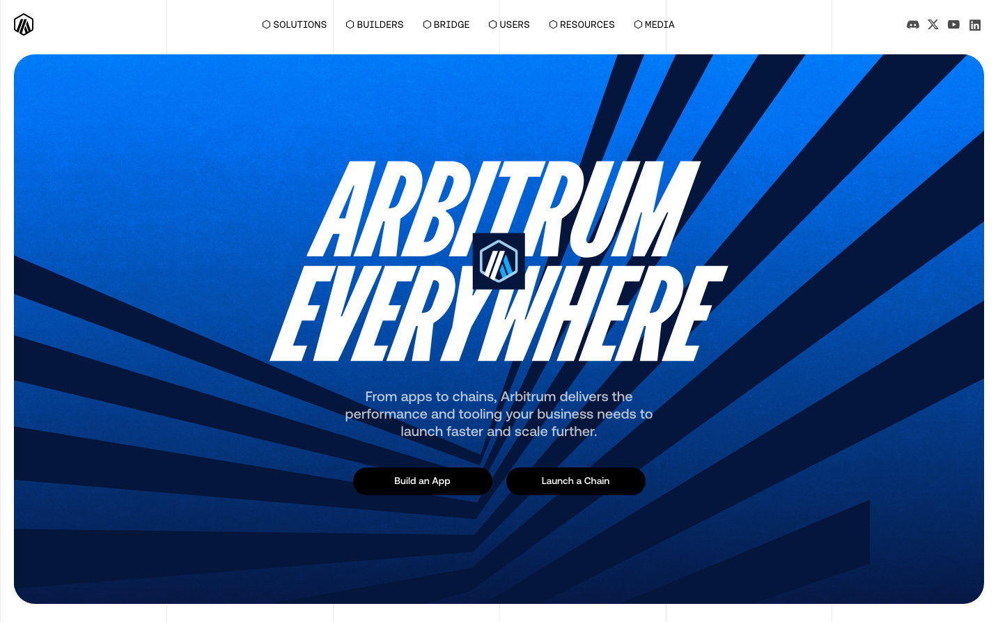
Arbitrum
Web3Arbitrum's visual identity centers around explosive energy and unstoppable momentum, using a dynamic sunburst pattern on intense blue gradients that radiates from behind bold, compressed typography. The design evokes the feeling of breaking through limitations with technological force, positioning blockchain infrastructure as a catalyst for explosive growth.
Design Identity
Signature Color
Arbitrum Electric Blue
#1E5AFF
High-voltage innovation and unstoppable blockchain momentum
Visual Identity
The signature sunburst/explosion pattern radiating from the center with compressed, impact-style typography creates an unmistakable sense of breakthrough energy and technological disruption.
Component Style
Buttons feature rounded corners (approximately 32px border-radius for pill-shaped CTAs) with solid fills and no shadows, maintaining a clean, approachable feel that contrasts with the explosive hero graphics. Everything feels substantial but not heavy, with medium font weights throughout.
Spacing Philosophy
Generous breathing room around the central hero message with tight letter-spacing on the compressed headline typography creates dramatic contrast between explosive energy and controlled precision.
Design Principles
- All typography uses Aeonik font family with 500 weight consistently
- Hero headlines use extreme compression and tight tracking
- Primary buttons maintain 32px+ border-radius for pill shapes
- Blue gradients always flow from electric blue to deeper navy
- Geometric sunburst patterns radiate from central focal points
Target Audience
Blockchain developers and Web3 entrepreneurs who need enterprise-grade infrastructure but want to move fast and break through technical barriers
Mood
Design descriptions are AI-generated based on visual analysis and may not fully reflect the brand's official design guidelines.
Design System
Typography Scale
| Element | Font | Size | Weight | Line Height |
|---|---|---|---|---|
| body | 16px | 500 | 24px | |
| p | 20px | 500 | 25px | |
| a | 14px | 500 | 21px | |
| button | 14px | 500 | 21px | |
| nav | 14px | 500 | 21px | |
| header | 14px | 500 | 21px | |
| main | 16px | 500 | 24px |
Color Palette
#ffffff#3b82f6