Help us build this. Leave comments, suggest improvements, and help create better design documentation for agents.
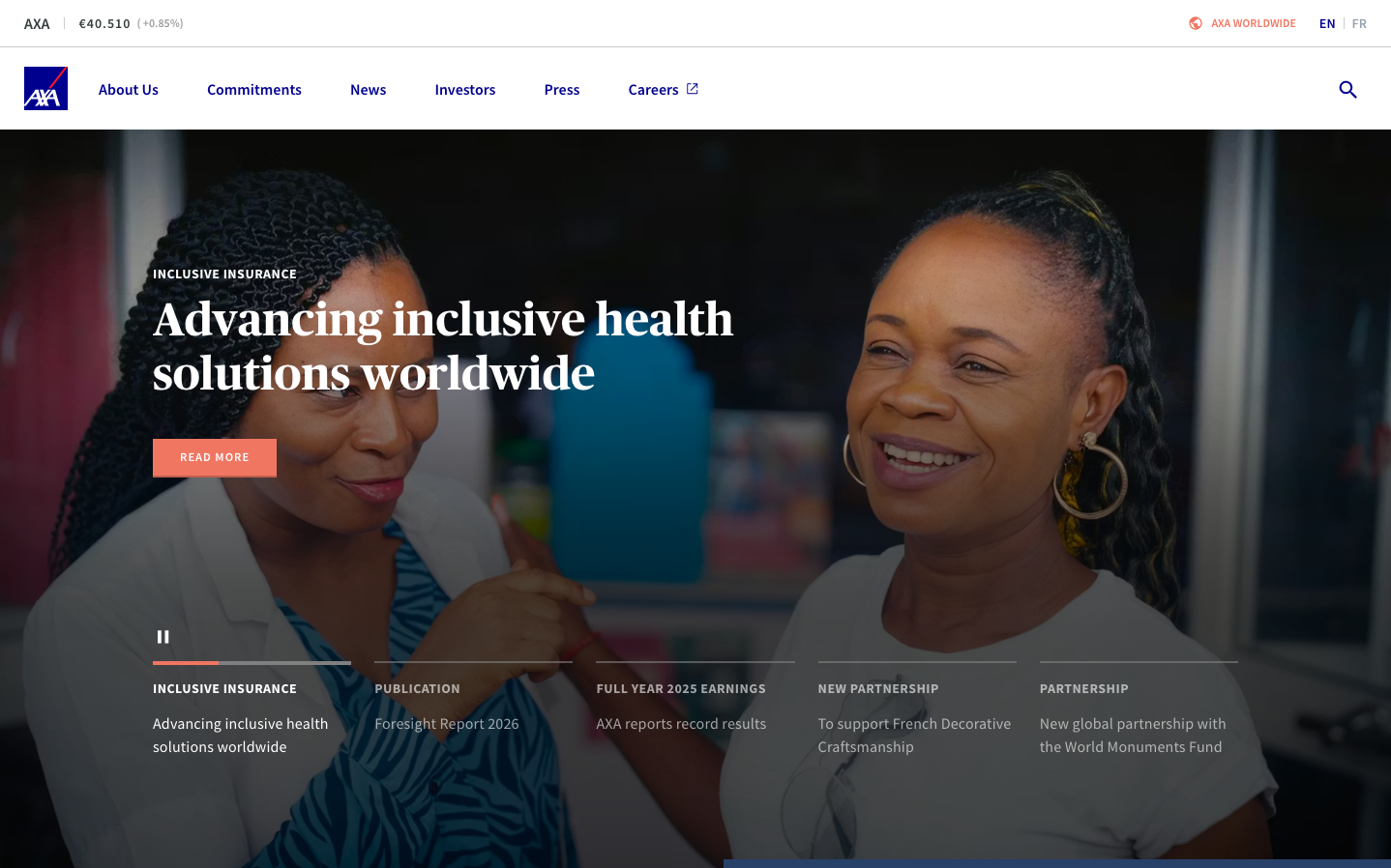
AXA
InsurtechAXA presents a sophisticated insurance brand that balances corporate authority with human warmth through deep navy blues and coral accents. The typography mix of serif headlines (Publico-Headline) with sans-serif body text (Source Sans Pro) creates editorial gravitas while maintaining accessibility, positioning AXA as a trustworthy yet approachable global insurer.
Design Identity
Signature Color
AXA Royal Blue
#00008f
institutional insurance authority with European heritage
Visual Identity
The dramatic combination of large serif headlines over photographic backgrounds with coral accent elements creates an editorial magazine aesthetic that's distinctly more sophisticated than typical insurance industry websites.
Component Style
Clean rectangular buttons with coral backgrounds and no visible shadows or borders, creating flat but confident interactive elements. The coral 'READ MORE' button stands out boldly against the dark photography backdrop with sharp corners and substantial padding.
Spacing Philosophy
Generous whitespace in navigation with comfortable breathing room between menu items, while content sections use dramatic full-width photography with overlaid text creating intimate, magazine-style layouts.
Design Principles
- Headlines use Publico-Headline serif at 24px for editorial authority
- Body text maintains 16px Source Sans Pro for readability
- Coral accent color (#d24723) reserved for primary actions only
- Photography dominates above-fold with text overlay approach
- Navigation stays minimal with clean sans-serif styling
Target Audience
International business leaders and affluent individuals seeking premium insurance solutions with European sophistication
Mood
Design descriptions are AI-generated based on visual analysis and may not fully reflect the brand's official design guidelines.
Design System
Typography Scale
| Element | Font | Size | Weight | Line Height |
|---|---|---|---|---|
| body | 16px | 400 | 16px | |
| h2 | 24px | 700 | 32px | |
| h3 | 14px | 700 | 18px | |
| h4 | 16px | 400 | 24px | |
| p | 16px | 600 | 24px | |
| a | 16px | 400 | 16px | |
| button | 16px | 400 | 16px | |
| nav | 16px | 400 | 16px | |
| header | 16px | 400 | 16px | |
| footer | 16px | 400 | 16px |
Color Palette
#fafafa#757575#343c3d#ffffff#cccccc#000000#d24723#00008f#111b1d#e5e5e5#f0f0f0