Help us build this. Leave comments, suggest improvements, and help create better design documentation for agents.
Benevity
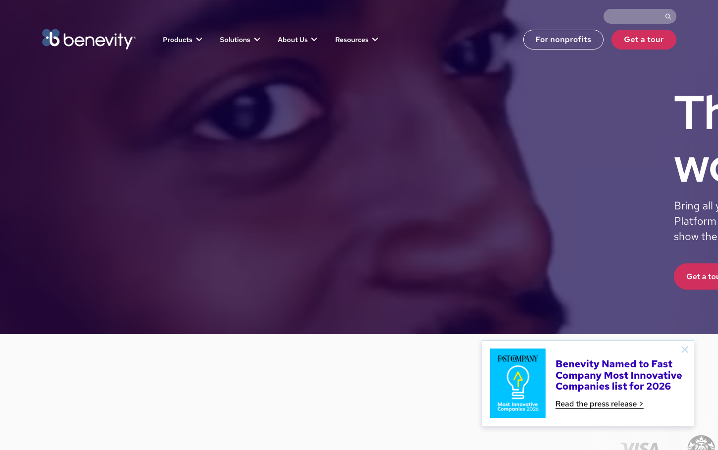
CSRBenevity employs a cosmic, purpose-driven aesthetic with deep violet-to-blue gradients that evoke trust and transformation. The Red Hat typography family creates approachable professionalism, while the dramatic purple overlay suggests social impact happening at scale.
Design Identity
Signature Color
Moonshot Blue
#160e4c
Ambitious social impact and transformative purpose - the deep space where corporate responsibility meets meaningful change
Visual Identity
Dramatic purple-to-blue gradient overlays on human imagery, creating an ethereal, purpose-driven atmosphere that makes social impact feel both personal and cosmic in scale.
Component Style
Rounded, approachable buttons with substantial padding that feel human-centered. The coral 'Get a tour' button provides warm contrast against the cool cosmic backdrop, while the secondary button uses subtle transparency to maintain hierarchy without competing.
Spacing Philosophy
Generous breathing room around key CTAs and navigation elements, with the hero section using dramatic full-screen real estate to create emotional impact before revealing content below.
Design Principles
- Typography scales dramatically from 96px headlines to 22px body text for clear hierarchy
- Red Hat font family throughout for consistent, approachable personality
- Deep purple overlays at 60-70% opacity over human photography
- Coral accent color reserved exclusively for primary CTAs
- Line-height maintains 1.4x ratio for optimal readability
Target Audience
Corporate CSR leaders and HR professionals who want to make employee giving programs feel meaningful rather than administrative.
Mood
Design descriptions are AI-generated based on visual analysis and may not fully reflect the brand's official design guidelines.
Design System
Typography Scale
| Element | Font | Size | Weight | Line Height |
|---|---|---|---|---|
| body | 22px | 400 | 30.8px | |
| h1 | 96px | 700 | 105.6px | |
| h2 | 51px | 700 | 56.1px | |
| h3 | 30px | 700 | 36px | |
| p | 20px | 700 | 22.4px | |
| a | 22px | 400 | 30.8px | |
| input | 11.04px | 400 | 11.04px | |
| nav | 22px | 400 | 30.8px | |
| footer | 22px | 400 | 30.8px | |
| main | 22px | 400 | 30.8px |
Color Palette
#160e4c#ffffff#111111#222222#cef5ca#114e0b#080331#fafafa#0036ff#170e4f#1a1a1a#3100b7

