Help us build this. Leave comments, suggest improvements, and help create better design documentation for agents.
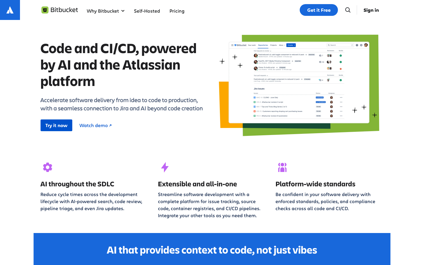
Bitbucket
Dev ToolsBitbucket's identity balances enterprise credibility with developer accessibility through vibrant geometric layouts and confident typography. The brand uses bold color blocking and asymmetric shapes to create visual energy while maintaining professional polish, suggesting both innovation and reliability.
Design Identity
Signature Color
Bitbucket Blue
#4285F4
Developer trust and enterprise reliability - the confident blue of code collaboration
Visual Identity
Distinctive geometric color blocks in green, orange, and blue that create asymmetric compositions with angular shapes and strategic negative space - immediately recognizable even without the logo.
Component Style
Medium rounded corners (6-8px) with subtle shadows and clean borders. Buttons feel substantial with generous padding, while interface elements maintain crisp definition without being harsh. Components have a tactile, clickable quality.
Spacing Philosophy
Generous whitespace creates breathing room between major sections, while compact internal spacing keeps related elements cohesive. Asymmetric layouts break traditional grid constraints for visual interest.
Design Principles
- Typography uses Charlie Display/Text family exclusively for brand consistency
- Color blocks use pure saturated colors without gradients
- Interface screenshots maintain authentic proportions and detail
- Geometric shapes are always angular, never organic curves
- Headings use 700 weight for maximum impact and hierarchy
Target Audience
Development teams and DevOps engineers who need enterprise-grade tools but value intuitive design and seamless workflow integration
Mood
Design descriptions are AI-generated based on visual analysis and may not fully reflect the brand's official design guidelines.
Design System
Typography Scale
| Element | Font | Size | Weight | Line Height |
|---|---|---|---|---|
| body | 16px | 400 | 16px | |
| h1 | 48px | 700 | 56px | |
| h2 | 36px | 700 | 48px | |
| h3 | 24px | 600 | 32px | |
| h4 | 20px | 600 | 24px | |
| h5 | 14px | 700 | 17.5px | |
| h6 | 12px | 400 | 24px | |
| p | 12px | 600 | 18px | |
| a | 16px | 400 | 16px | |
| button | 16px | 400 | 16px |
Color Palette
#1e1f21