Help us build this. Leave comments, suggest improvements, and help create better design documentation for agents.
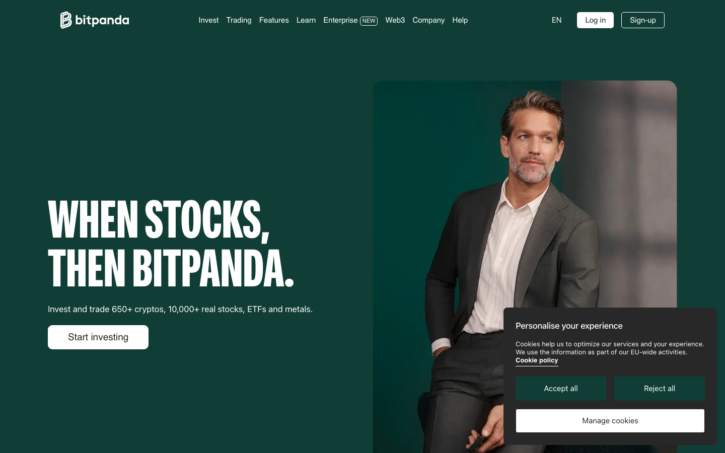
Bitpanda
CryptoBitpanda creates a bold, ambitious fintech identity through explosive typography contrasts—pairing ultra-condensed display headlines with clean Inter body text. The deep emerald background evokes wealth and sophistication, while the stark white typography creates dramatic impact that feels both luxurious and approachable.
Design Identity
Signature Color
Bitpanda Forest Green
#1e3930
financial growth and premium investment sophistication
Visual Identity
The explosive typography contrast between ultra-condensed display headlines and refined body text, combined with the sophisticated emerald-to-dark gradient background that creates depth and premium positioning.
Component Style
Clean, minimalist buttons with generous rounded corners (approximately 8px) and ample padding. No shadows or heavy borders—everything relies on solid fills and clear typography hierarchy. Components feel substantial but not heavy, with confident spacing.
Spacing Philosophy
Generous whitespace with dramatic asymmetrical layouts. Large 80px+ margins create breathing room around hero content, while internal component padding is substantial (16-24px) to maintain touch-friendly interactions and premium feel.
Design Principles
- Display typography uses Bitpanda Compressed at massive scales (96px+) for maximum impact
- Body text exclusively uses Inter for readability and modern feel
- Border radius consistently around 8px for approachable but professional touch
- White text on dark backgrounds for dramatic contrast and premium positioning
- Spacing follows 20px base unit with generous 60-80px section margins
Target Audience
Ambitious retail investors and crypto enthusiasts who want sophisticated tools but approachable experiences—people transitioning from basic trading apps to more professional platforms.
Mood
Design descriptions are AI-generated based on visual analysis and may not fully reflect the brand's official design guidelines.
Design System
Typography Scale
| Element | Font | Size | Weight | Line Height |
|---|---|---|---|---|
| body | 16px | 400 | 24px | |
| h1 | 108px | 700 | 97.2px | |
| h2 | 96px | 700 | 86.4px | |
| h3 | 17px | 500 | 29px | |
| p | 15px | 400 | 19.9995px | |
| a | 16px | 400 | 24px | |
| button | 16px | 400 | 24px | |
| header | 16px | 400 | 24px | |
| footer | 16px | 400 | 24px | |
| main | 16px | 400 | 24px |
Color Palette
#ffffff#f3f3f2#f5f5f5#000000#27d17f#e62e54#e1e3e6#f8f8f8#8b8b8b#191919#6765e4#db5325