Help us build this. Leave comments, suggest improvements, and help create better design documentation for agents.
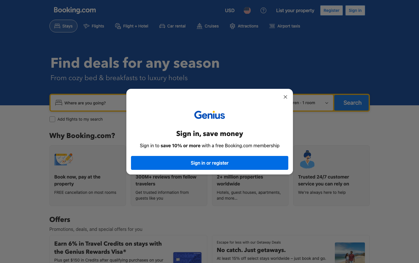
Booking.com
TravelBooking.com employs a sophisticated dual-tone aesthetic that balances trustworthy deep navy backgrounds with crisp white content areas, creating a sense of premium reliability. The typography hierarchy mixing Avenir Next for headlines with system fonts for body text communicates both approachability and professional competence in the travel space.
Design Identity
Signature Color
Booking Navy
#003580
Travel industry authority and trustworthy booking confidence
Visual Identity
The distinctive deep navy hero sections with generous whitespace and the characteristic rounded search bar with warm yellow/orange accent borders create an instantly recognizable booking interface pattern.
Component Style
Buttons use moderate 6-8px border radius with solid fills, while the main search container features prominent rounded corners (30px padding) and warm accent borders. Components feel substantial but approachable - neither sharp corporate nor overly soft consumer.
Spacing Philosophy
Generous 30px searchBox padding creates breathing room around key conversion elements, while the hero section uses expansive vertical space to establish hierarchy. Content sections use comfortable spacing that prioritizes readability over density.
Design Principles
- Border radius uses either subtle curves (6-8px) or extreme rounding (9999px for pills)
- Typography hierarchy: 24px bold Avenir Next for headers, 14-16px system fonts for body
- Navy backgrounds paired with white content cards create depth
- Warm accent colors (yellow/orange) only on primary conversion elements
- 30px minimum padding on critical interaction zones
Target Audience
Mainstream travelers aged 25-55 who value reliability and comprehensive options over cutting-edge design, including both leisure and business bookers who need confident decision-making tools
Mood
Design descriptions are AI-generated based on visual analysis and may not fully reflect the brand's official design guidelines.
Design System
Typography Scale
| Element | Font | Size | Weight | Line Height |
|---|---|---|---|---|
| body | 14px | 400 | 20px | |
| h1 | 24px | 700 | 32px | |
| h2 | 24px | 700 | 32px | |
| h3 | 16px | 700 | 24px | |
| p | 24px | 400 | 32px | |
| a | 14px | 400 | 20px | |
| button | 16px | 500 | 24px | |
| input | 14px | 500 | 20px | |
| nav | 14px | 400 | 20px | |
| header | 14px | 400 | 20px |
Color Palette
No colors extracted