Help us build this. Leave comments, suggest improvements, and help create better design documentation for agents.
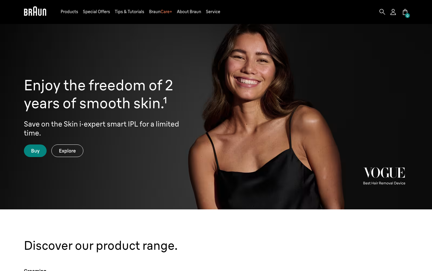
Braun
Consumer ElectronicsBraun embodies German industrial design philosophy with stark minimalism and purposeful typography. The design balances clinical precision with warm human connection, using subtle teal accents against predominantly monochromatic foundations to create an atmosphere of sophisticated restraint.
Design Identity
Signature Color
Braun Teal
#04857f
precision engineering meets human wellness - the intersection of technical excellence and personal care
Visual Identity
Extreme typographic hierarchy with massive 48px+ headlines contrasted against stark white space and minimal color usage - the text itself becomes the primary visual element rather than graphics or imagery.
Component Style
Soft rounded corners (approximately 24px) with solid fills and no visible borders or shadows. Buttons feel substantial but approachable, emphasizing touch-friendly interaction over sharp precision.
Spacing Philosophy
Generous asymmetrical spacing that creates dramatic focal points. Large blocks of negative space (80px+ gaps) isolate key messages, while tight 20px internal spacing maintains component cohesion.
Design Principles
- Typography scales dramatically - headlines at 48px, body at 16px, creating 3:1 ratio hierarchy
- Border radius consistently around 24px for all interactive elements
- Color palette restricted to black, white, teal, with occasional warm accent (#ffd635)
- Braun Linear custom typeface used exclusively at 400 weight for body, 500 for buttons
- Vertical rhythm based on 20px baseline grid
Target Audience
Design-conscious consumers aged 25-45 who value German engineering heritage and seek premium personal care devices that blend seamlessly into modern minimalist lifestyles.
Mood
Design descriptions are AI-generated based on visual analysis and may not fully reflect the brand's official design guidelines.
Design System
Typography Scale
| Element | Font | Size | Weight | Line Height |
|---|---|---|---|---|
| body | 16px | 400 | 24px | |
| h1 | 48px | 400 | 60px | |
| h2 | 40px | 400 | 50px | |
| h3 | 40px | 400 | 50px | |
| p | 48px | 400 | 60px | |
| a | 16px | 400 | 24px | |
| button | 16px | 500 | 24px | |
| nav | 16px | 400 | 24px | |
| header | 16px | 400 | 24px | |
| footer | 16px | 400 | 24px |
Color Palette
#000000#ea9e1c#979797#ffffff#f5f5f5#e6e6e6#9b9b9b#ffd635#a19486#d9d9d9#707070#3960fd