Help us build this. Leave comments, suggest improvements, and help create better design documentation for agents.
BuildKite
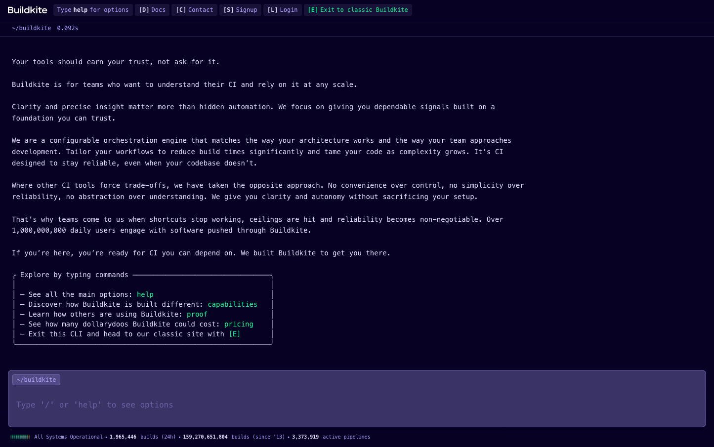
DevOpsBuildkite channels deep nocturnal energy with an ultra-dark terminal aesthetic that feels like stepping into a midnight command center. The monospace typography creates surgical precision while electric accent colors punctuate the darkness like status indicators on sophisticated developer infrastructure.
Design Identity
Signature Color
Deep Space Terminal
#070224
nocturnal developer focus and uncompromising technical depth
Visual Identity
The terminal-inspired interface with ultra-dark backgrounds and monospace typography creates an unmistakable command-line aesthetic that feels like a native developer tool rather than a web application.
Component Style
Clean monospace buttons with subtle borders and no shadows - everything feels like terminal output with precise spacing and developer-focused functionality over visual flourishes.
Spacing Philosophy
Dense information layout with tight line spacing that maximizes content visibility while maintaining readability - optimized for scanning large amounts of technical data quickly.
Design Principles
- Monospace typography for all interactive elements using Input Mono
- Dark terminal background (#070224) dominates all interface areas
- Electric accent colors (green #00e285, purple #7f3ffc) only for status indicators
- No shadows or gradients - flat technical aesthetic
- 16px base font size with 24px line height for optimal code readability
Target Audience
Senior DevOps engineers and platform teams who live in terminals and value technical authenticity over marketing polish.
Mood
Design descriptions are AI-generated based on visual analysis and may not fully reflect the brand's official design guidelines.
Design System
Typography Scale
| Element | Font | Size | Weight | Line Height |
|---|---|---|---|---|
| body | 16px | 400 | 24px | |
| p | 16px | 400 | 24px | |
| button | 12px | 400 | 12px | |
| input | 16px | 400 | 24px | |
| header | 16px | 400 | 24px | |
| footer | 16px | 400 | 24px | |
| main | 16px | 400 | 24px |
Color Palette
#070224#e5e1ff#cd3131#e6a704#00e285#fdfdff#00b368#ffffff#87171f#7f3ffc#000000#706b8e