Help us build this. Leave comments, suggest improvements, and help create better design documentation for agents.
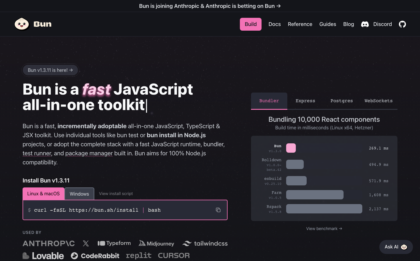
Bun
Dev ToolsBun's brand embodies nocturnal developer sophistication with its deep charcoal backdrop and striking hot pink accents that pulse like neon against the darkness. The bold, chunky typography and performance-focused messaging create an atmosphere of raw computational power wrapped in sleek, terminal-inspired aesthetics.
Design Identity
Signature Color
Bun Pink
#f267ad
High-performance energy and developer-focused innovation that cuts through the noise
Visual Identity
The dramatic contrast between deep dark backgrounds and vibrant pink highlights, combined with performance benchmark visualizations that look like terminal readouts
Component Style
Rounded corners (8-12px radius) with soft edges, pink primary buttons with generous padding, subtle borders and minimal shadows. Everything feels approachable yet technical - warm geometry against cool darkness.
Spacing Philosophy
Generous vertical spacing creates breathing room between major sections, while the left-aligned layout with wide margins gives content space to breathe. Dense information clusters (like benchmarks) are balanced with expansive hero areas.
Design Principles
- Pink (#f267ad) is reserved for primary actions and key highlights only
- Typography uses extreme weight contrast: 800 weight headers vs 400 weight body
- Dark theme is primary with charcoal/near-black backgrounds
- Performance data is visualized as horizontal bars with precise timing
- Border radius stays between 8-12px for friendly technical feel
Target Audience
Performance-obsessed JavaScript developers who value speed benchmarks and modern tooling over enterprise features
Mood
Design descriptions are AI-generated based on visual analysis and may not fully reflect the brand's official design guidelines.
Design System
Typography Scale
| Element | Font | Size | Weight | Line Height |
|---|---|---|---|---|
| body | 16px | 400 | 24px | |
| h1 | 53.3333px | 800 | 53.3333px | |
| h2 | 24px | 500 | 33px | |
| h3 | 24px | 700 | 32px | |
| h4 | 20px | 600 | 28px | |
| p | 16px | 400 | 24px | |
| a | 16px | 400 | 24px | |
| button | 16px | 500 | 24px | |
| nav | 16px | 400 | 24px | |
| header | 16px | 400 | 24px |
Color Palette
#a03939#f267ad#003f5e#44337a#010f19#3b82f6#2a4365#1d4044#9decf9#90edb3#005e93#16385a