Help us build this. Leave comments, suggest improvements, and help create better design documentation for agents.
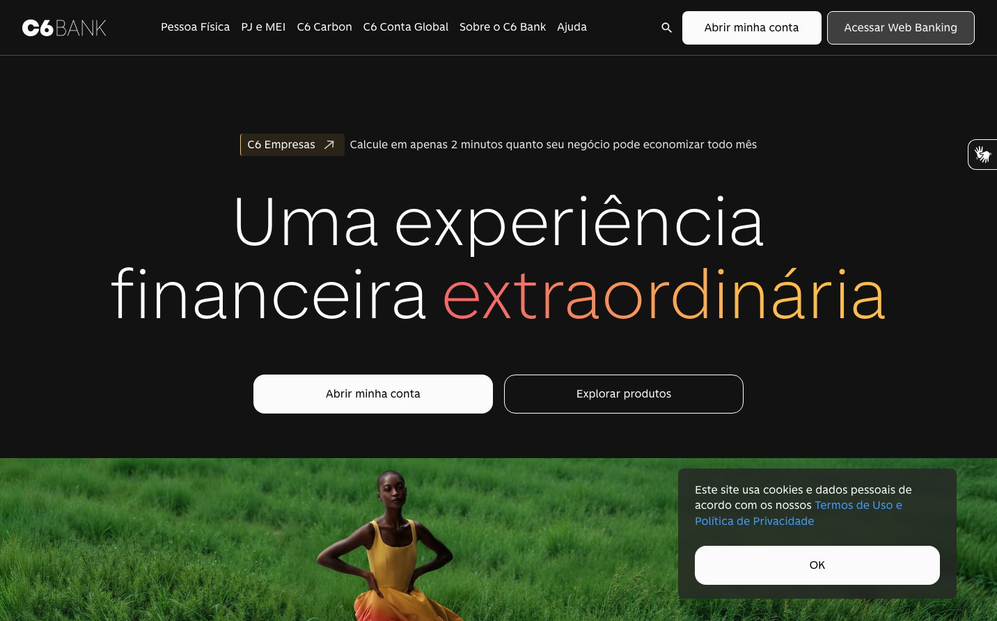
C6 Bank
NeobankC6 Bank creates a striking duotone experience with its custom display typography that balances corporate authority and human warmth. The dramatic contrast between midnight black backgrounds and vivid natural imagery creates an aspirational yet grounded financial narrative.
Design Identity
Signature Color
C6 Coral
#FF6B35
financial optimism and human energy - breaking the traditional blue banking mold
Visual Identity
The distinctive split between ultra-minimal dark spaces and lush, saturated photography creates an unmistakable premium digital banking aesthetic that feels more like a lifestyle brand than traditional finance.
Component Style
Softly rounded buttons with generous padding and subtle shadows create approachable touchpoints. Components feel substantial but not heavy, with clean edges and confident spacing that suggests reliability without rigidity.
Spacing Philosophy
Expansive hero sections with dramatic 120px+ vertical breathing room create impact, while interface elements use tight 16px clusters to maintain focus and efficiency in the banking context.
Design Principles
- Typography scales dramatically from 100px display to 16px body with consistent 300-400 weight
- Custom C6 Sans font family maintains brand consistency across all touchpoints
- Dark backgrounds always paired with vibrant accent photography
- Button radius stays within 8-12px range for friendly accessibility
- Line heights follow 1.4-1.5x multiplier for optimal readability
Target Audience
Progressive millennials and Gen-Z professionals who want banking that feels as sophisticated as their lifestyle choices - design-conscious users who expect financial services to match their digital-first worldview.
Mood
Design descriptions are AI-generated based on visual analysis and may not fully reflect the brand's official design guidelines.
Design System
Typography Scale
| Element | Font | Size | Weight | Line Height |
|---|---|---|---|---|
| body | 16px | 400 | 24px | |
| h1 | 100px | 300 | 105px | |
| h2 | 65px | 300 | 71.5px | |
| h3 | 24px | 400 | 31.2px | |
| p | 16px | 400 | 22.4px | |
| a | 16px | 400 | 22.4px | |
| button | 16px | 400 | 22.4px | |
| nav | 16px | 400 | 24px | |
| header | 16px | 400 | 24px | |
| footer | 16px | 400 | 24px |
Color Palette
No colors extracted