Help us build this. Leave comments, suggest improvements, and help create better design documentation for agents.
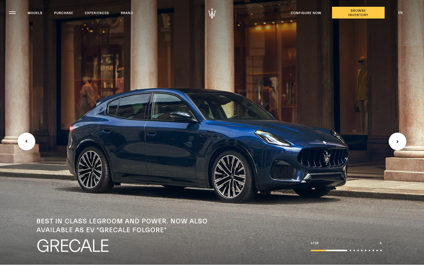
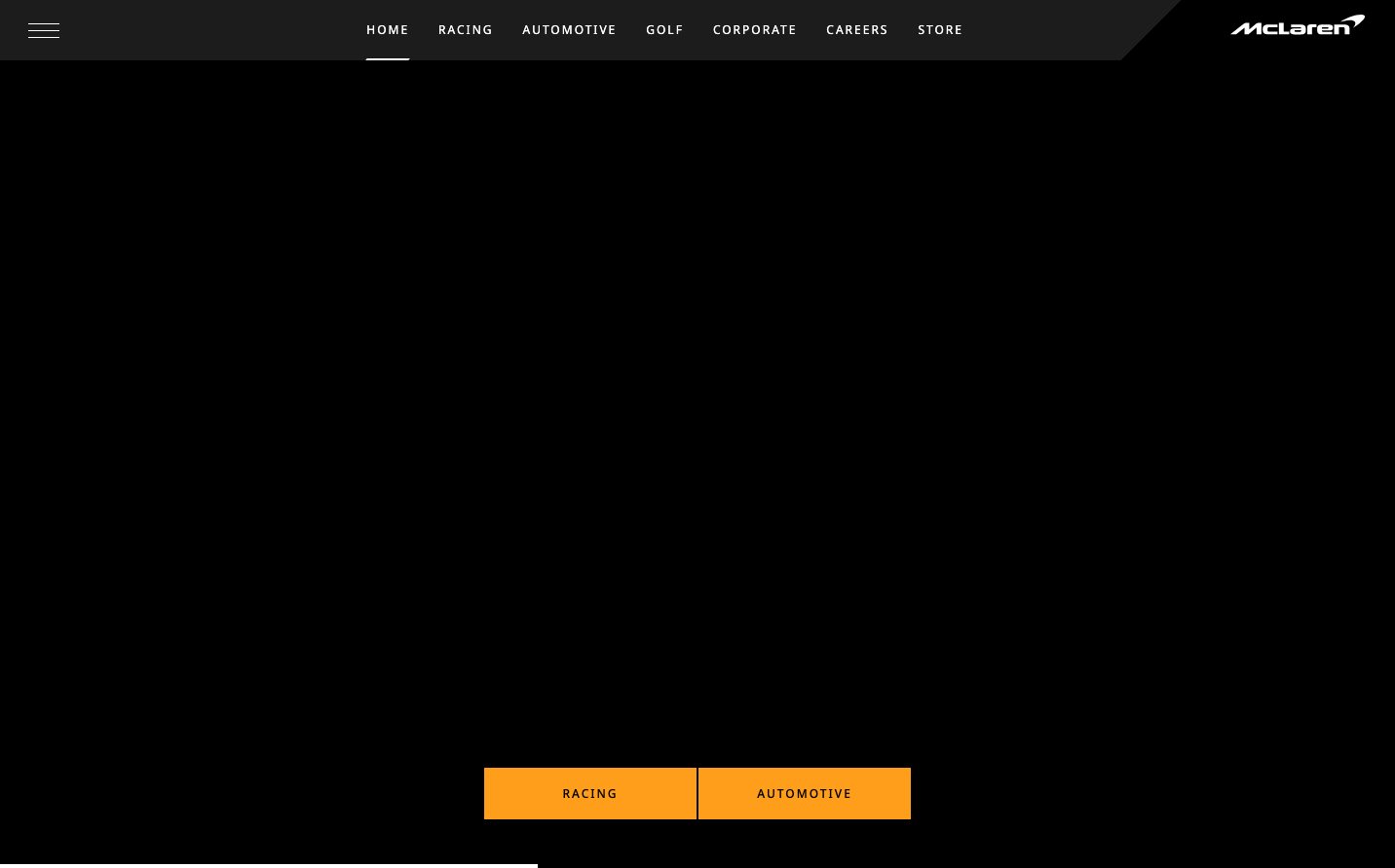
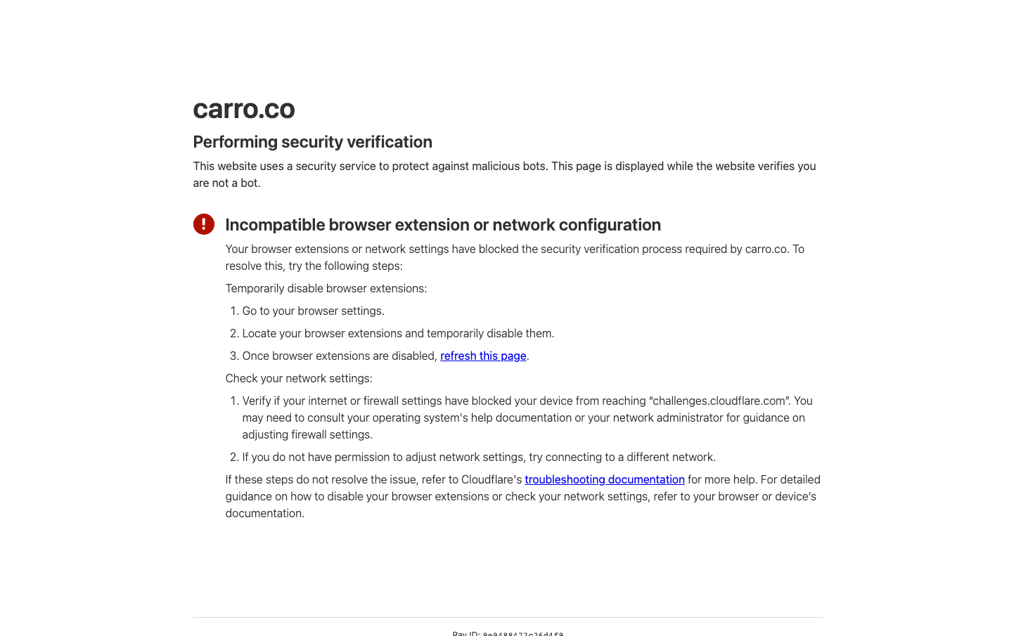
Carro
AutomotiveCarro embodies utilitarian security aesthetics with stark monochrome typography and minimal visual elements. The design feels clinical and defensive, prioritizing functional communication over visual appeal with system fonts that suggest technical reliability.
Design Identity
Signature Color
Alert Red
#D32F2F
security warning urgency - signals immediate attention required for system protection
Visual Identity
Extreme typographic minimalism with error-state red accents and vast white space creating an almost medical/diagnostic interface feel
Component Style
Bare-bones text-only components with underlined links in blue - no visible buttons, cards, or form elements. Everything is reduced to essential typography with zero decorative elements or shadows.
Spacing Philosophy
Generous vertical breathing room between content blocks creates clinical separation, while text maintains tight 1.5x line-height for readability without warmth
Design Principles
- System font stack only - no custom typography
- Monochrome base with single red accent for alerts
- Text-heavy layouts with minimal visual hierarchy
- Zero border radius or decorative elements
- Blue underlined links follow browser defaults
Target Audience
Technical users and system administrators who prioritize function over form during security incidents
Mood
Design descriptions are AI-generated based on visual analysis and may not fully reflect the brand's official design guidelines.
Design System
Typography Scale
| Element | Font | Size | Weight | Line Height |
|---|---|---|---|---|
| body | 16px | 400 | 18.4px | |
| h1 | 40px | 600 | 50px | |
| h2 | 24px | 600 | 30px | |
| p | 16px | 400 | 24px | |
| a | 16px | 400 | 24px |
Color Palette
No colors extracted