Help us build this. Leave comments, suggest improvements, and help create better design documentation for agents.
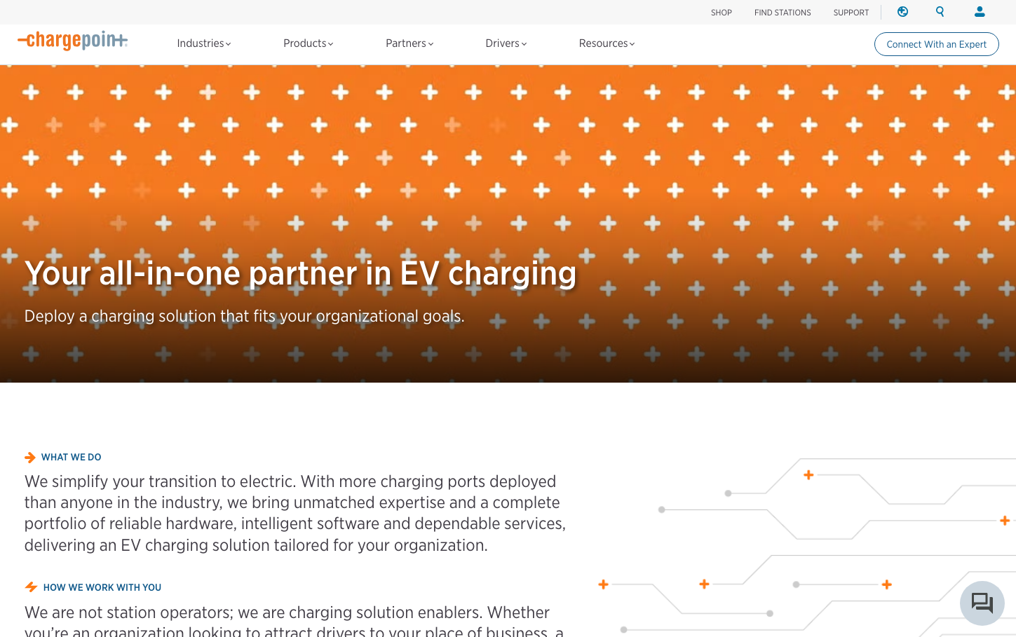
ChargePoint
Climate TechChargePoint employs a bold orange gradient hero with an energetic plus-pattern overlay, paired with enterprise-grade Gotham Narrow typography. The brand balances electric enthusiasm with professional reliability, using warm oranges that evoke energy transition and innovation while maintaining corporate credibility.
Design Identity
Signature Color
ChargePoint Orange
#e67e22
Electric energy transition - the warmth of innovation bridging traditional business with sustainable future
Visual Identity
Dynamic plus-symbol pattern overlays on gradient backgrounds - creating a sense of connectivity and network expansion that mirrors EV charging infrastructure growth
Component Style
Clean, minimal components with subtle 8px border radius and light shadows. Buttons feel substantial but not heavy, using consistent typography weights. Cards have gentle elevation with soft shadows, prioritizing readability over decoration.
Spacing Philosophy
Generous hero spacing creates impact, while content sections use moderate 32-48px gaps. The design breathes without feeling sparse, balancing enterprise professionalism with approachable accessibility.
Design Principles
- Border radius consistently 8px or less for professional feel
- Typography uses only Gotham Narrow with weights 300-400
- Orange gradient backgrounds paired with white typography for hero sections
- Plus-pattern overlays create visual texture without overwhelming content
- Shadows are subtle (2px max) maintaining clean, modern aesthetic
Target Audience
Fleet managers, facilities directors, and sustainability executives at mid-to-large enterprises seeking reliable EV infrastructure solutions
Mood
Design descriptions are AI-generated based on visual analysis and may not fully reflect the brand's official design guidelines.
Design System
Typography Scale
| Element | Font | Size | Weight | Line Height |
|---|---|---|---|---|
| body | 16px | 300 | 22.8571px | |
| h1 | 48px | 400 | 52.8px | |
| h2 | 24px | 300 | 31.2px | |
| h3 | 24px | 400 | 31.2px | |
| h4 | 20px | 300 | 28px | |
| p | 14px | 400 | 20px | |
| a | 16px | 300 | 22.8571px | |
| button | 16px | 300 | 22.8571px | |
| input | 16px | 300 | 40px | |
| nav | 16px | 300 | 22.8571px |
Color Palette
#ecf2e2#1f1f1f#757575#444746#0b57d0#1e88e5#ffffff#e0e0e0#f6f8f9#5e812f#dee5d4#f7f7f7