Help us build this. Leave comments, suggest improvements, and help create better design documentation for agents.
Chime
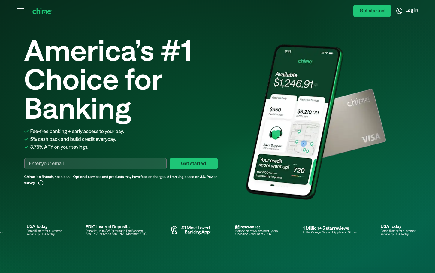
NeobankChime's brand radiates approachable financial confidence through a harmonious deep forest green that feels both trustworthy and refreshing. The custom 'Chime Saans' typography strikes a perfect balance between friendly accessibility and professional authority, while the mobile-first composition emphasizes real-world utility over flashy aesthetics.
Design Identity
Signature Color
Chime Forest Green
#15744a
Progressive financial growth and trustworthy prosperity - not sterile bank blue, but living, growing wealth
Visual Identity
The distinctive deep green gradient background paired with a prominent mobile phone mockup showing actual banking interface - immediately recognizable as a mobile-first fintech that prioritizes real functionality over abstract concepts.
Component Style
Softly rounded corners with moderate 8-12px radius, clean fills without heavy shadows. Buttons feel substantial with generous padding, while the input field has a subtle border treatment. Everything feels touchable and mobile-optimized rather than desktop-precise.
Spacing Philosophy
Generous vertical breathing room with the hero content occupying roughly 60% of the viewport width, while the mobile mockup claims the right third. Internal component spacing is tight and efficient, reflecting mobile-first priorities where screen real estate matters.
Design Principles
- Typography never exceeds 96px for headlines, maintaining mobile readability
- Border radius consistently stays around 8-12px for friendly approachability
- Green dominates 80% of the color story with strategic white contrast
- Mobile mockup always shows real interface, never abstract graphics
- Underlined links maintain classic web accessibility patterns
Target Audience
Younger adults (25-35) who are smartphone-native, frustrated with traditional banking fees, and prioritize transparency and simplicity over complex financial products.
Mood
Design descriptions are AI-generated based on visual analysis and may not fully reflect the brand's official design guidelines.
Design System
Typography Scale
| Element | Font | Size | Weight | Line Height |
|---|---|---|---|---|
| body | 16px | 400 | 24px | |
| h1 | 96px | 600 | 96px | |
| h2 | 48px | 600 | 48px | |
| h3 | 24px | 500 | 28.8px | |
| p | 16px | 500 | 22.4px | |
| a | 16px | 400 | 22px | |
| button | 16px | 600 | 22px | |
| input | 16px | 500 | 20px | |
| nav | 16px | 400 | 24px | |
| header | 16px | 400 | 24px |
Color Palette
#ffffff#15744a