Help us build this. Leave comments, suggest improvements, and help create better design documentation for agents.
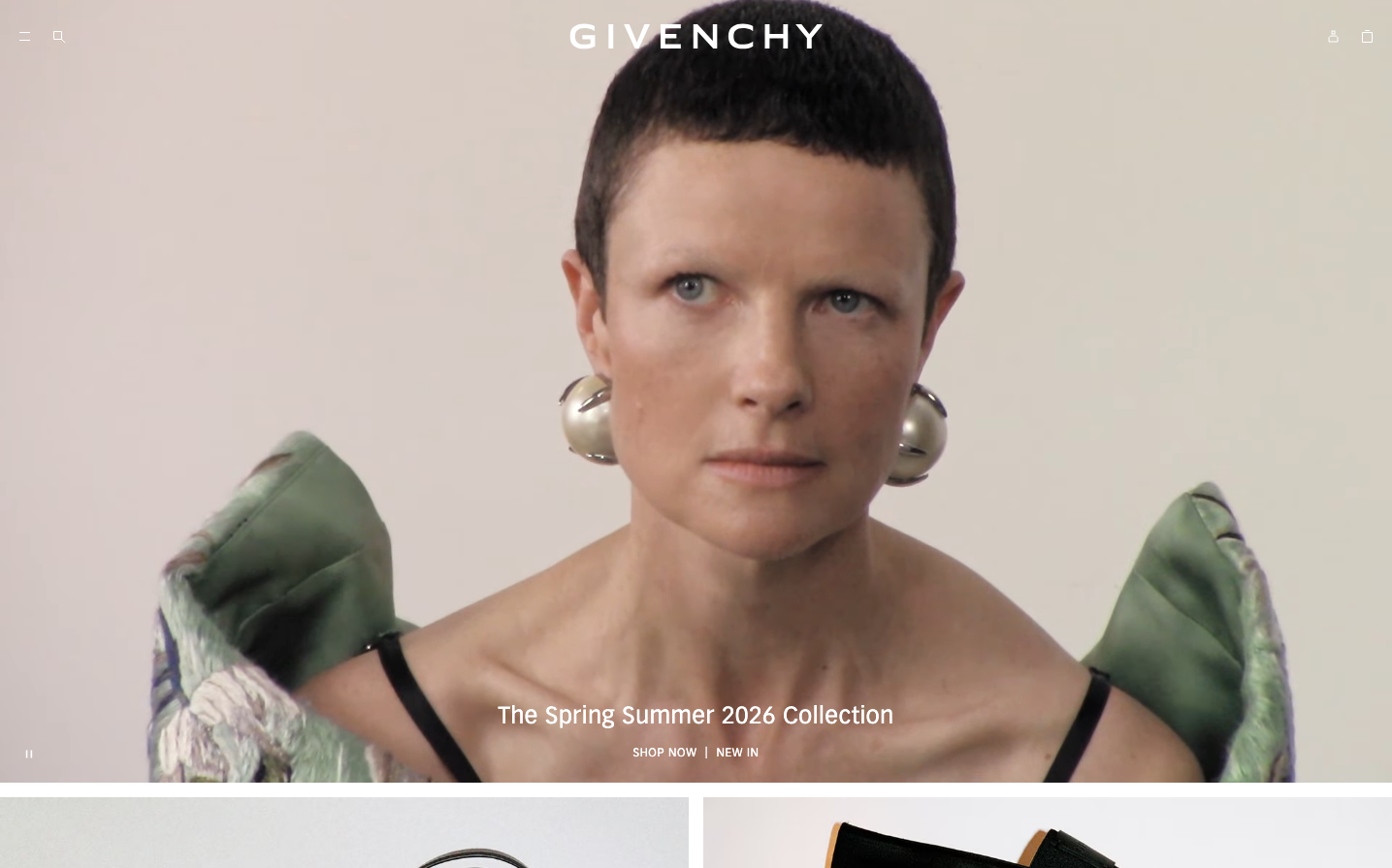
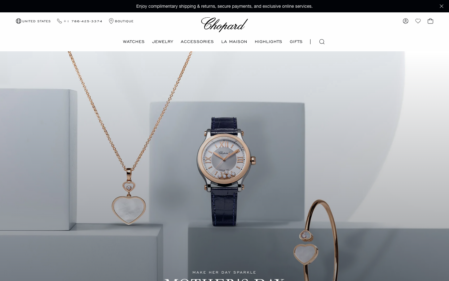
Chopard
LuxuryChopard embodies Swiss luxury jewelry craftsmanship through dramatic theatrical lighting and pristine white gallery spaces that showcase their precious pieces like museum artifacts. The brand balances classical elegance with contemporary minimalism, using neutral tones and generous whitespace to let the jewelry's inherent beauty command attention.
Design Identity
Signature Color
Gallery White
#fefefe
Pure luxury canvas that elevates precious objects to art status
Visual Identity
Dramatic product staging with gallery-quality lighting on pure white geometric platforms - creates an atmosphere of a high-end jewelry exhibition where each piece is presented as a precious artifact
Component Style
Invisible UI with transparent overlays and minimal navigation - buttons and interactive elements deliberately fade into the background to never compete with the jewelry showcase
Spacing Philosophy
Museum-grade breathing room with expansive negative space surrounding each product - creates intimate viewing moments while maintaining the grandeur of a luxury gallery experience
Design Principles
- Product photography uses dramatic directional lighting to create depth and shadow play
- Typography hierarchy mixes classical serif (Walbaum) with modern sans-serif (Dosis) for timeless sophistication
- Navigation remains minimal and translucent to preserve focus on jewelry pieces
- Color palette restricted to neutral grays and whites with rose gold accents from products
- Geometric display platforms create clean staging for jewelry photography
Target Audience
Ultra-high-net-worth collectors and connoisseurs who view luxury jewelry as both personal adornment and investment-grade art pieces
Mood
Design descriptions are AI-generated based on visual analysis and may not fully reflect the brand's official design guidelines.
Design System
Typography Scale
| Element | Font | Size | Weight | Line Height |
|---|---|---|---|---|
| body | 16px | 400 | 24px | |
| h1 | 32px | 700 | 48px | |
| h2 | 48px | 400 | 57.6px | |
| h3 | 18.72px | 700 | 28.08px | |
| h6 | 24px | 400 | 31.2px | |
| p | 14px | 400 | 21px | |
| a | 16px | 400 | 17.6px | |
| button | 16px | 400 | 17.6px | |
| input | 16px | 400 | 24px | |
| nav | 16px | 400 | 24px |
Color Palette
#fefefe#010307#0070d2#008827#00a1e0#cc0000#7ed0ee#f9f9f9#eeeeee#cccccc#999999#666666