Help us build this. Leave comments, suggest improvements, and help create better design documentation for agents.
Coca-Cola
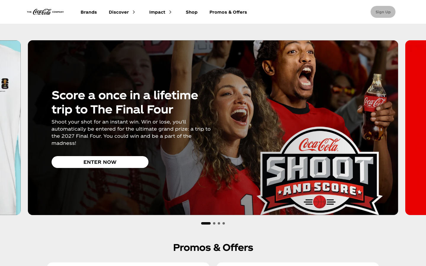
BeveragesCoca-Cola's design embodies energetic celebration through bold typography and immersive storytelling. The signature red creates an atmosphere of excitement and shared joy, while the generous use of white space allows promotional content to feel cinematic rather than cramped. The overall aesthetic prioritizes emotional connection over minimalism.
Design Identity
Signature Color
Coca-Cola Red
#ea0000
Energy, excitement, and shared celebration - the color of moments that matter
Visual Identity
Hero-driven layouts with cinematic promotional imagery that fills the viewport, paired with bold white typography overlays and pill-shaped call-to-action buttons that feel approachable yet urgent.
Component Style
Pill-shaped buttons with extreme border radius (8000px) create friendly, approachable interactions. Cards use generous 64px padding on desktop with subtle 16px radius corners. Everything feels warm and inviting rather than sharp or clinical.
Spacing Philosophy
Generous breathing room with 64px card padding and 160px layout margins on desktop creates a premium, uncluttered experience. The brand prioritizes impact over density, letting hero content dominate the viewport.
Design Principles
- Buttons always use pill shape with 8000px border radius for maximum friendliness
- Typography hierarchy jumps dramatically: 38px headlines, 24px subheads, 16px body
- Desktop margins never less than 160px to maintain premium spacing
- Hero sections dominate viewport with full-width imagery
- All interactive elements use 700 font weight for clear action hierarchy
Target Audience
Sports fans and celebration seekers aged 18-34 who value shared experiences and moments of joy over individual achievement
Mood
Design descriptions are AI-generated based on visual analysis and may not fully reflect the brand's official design guidelines.
Design System
Typography Scale
| Element | Font | Size | Weight | Line Height |
|---|---|---|---|---|
| body | 16px | 400 | 24px | |
| h1 | 38px | 700 | 48px | |
| h2 | 32px | 700 | 40px | |
| h3 | 24px | 700 | 32px | |
| h4 | 10px | 700 | 18px | |
| p | 16px | 400 | 24px | |
| a | 16px | 700 | 24px | |
| button | 16px | 700 | 24px | |
| header | 16px | 400 | 24px | |
| footer | 16px | 400 | 24px |
Color Palette
#ffffff#bdbdbd#000000#8b8b8b#eeeeee#353535#6c6c6c#95cb87#d5d5d5#a5a5a5#ea0000#4f4f4f