Help us build this. Leave comments, suggest improvements, and help create better design documentation for agents.
Cohere
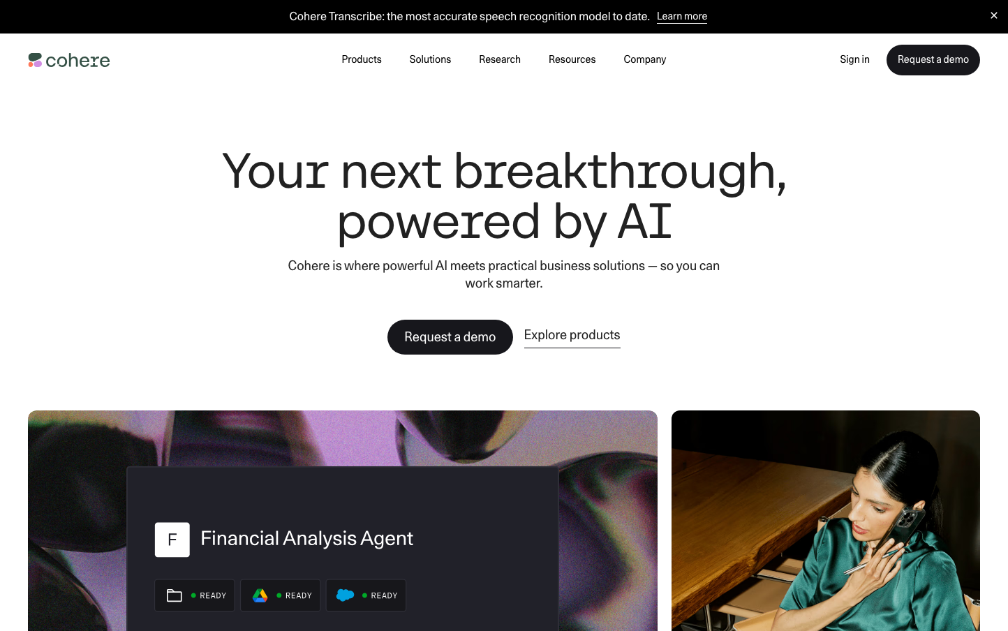
AICohere's brand aesthetic merges scientific precision with humanistic warmth through its custom Unica77 typeface that feels both technical and approachable. The predominantly monochromatic palette with strategic coral accents creates a sophisticated AI-first identity that emphasizes substance over flashiness.
Design Identity
Signature Color
Cohere Blue
#4c6ee6
trustworthy AI intelligence with enterprise credibility
Visual Identity
Expansive white space paired with oversized typography creates a sense of intellectual breathing room, while the dual-typeface system (CohereText for headlines, Unica77 for body) establishes a distinctive typographic hierarchy that feels both academic and accessible.
Component Style
Softly rounded corners with minimal shadows create approachable yet professional components. Buttons have subtle 8px border radius with clean fills, avoiding harsh edges while maintaining enterprise credibility. Cards and containers use gentle elevation rather than stark borders.
Spacing Philosophy
Generous vertical rhythm with large section gaps (80px+) creates a sense of thoughtful pacing, while tighter internal component spacing maintains readability. The layout breathes like scientific documentation - unhurried and confident.
Design Principles
- Headlines use CohereText at 72px with 400 weight for maximum impact
- Body text never exceeds 16px to maintain readability across interfaces
- Border radius consistently stays at 8px or less for subtle softness
- Color palette remains minimal with strategic accent usage
- Whitespace ratios follow 1:3 hierarchy between sections
Target Audience
Technical decision-makers and AI researchers who value substance over style - CTOs, data scientists, and enterprise developers who need powerful AI tools without the marketing fluff.
Mood
Design descriptions are AI-generated based on visual analysis and may not fully reflect the brand's official design guidelines.
Design System
Typography Scale
| Element | Font | Size | Weight | Line Height |
|---|---|---|---|---|
| body | 16px | 400 | 24px | |
| h1 | 72px | 400 | 72px | |
| h2 | 32px | 400 | 38.4px | |
| h3 | 48px | 400 | 57.6px | |
| h4 | 32px | 400 | 38.4px | |
| h5 | 24px | 400 | 31.2px | |
| p | 16px | 400 | 22.4px | |
| a | 14px | 400 | 19.6px | |
| button | 16px | 400 | 24px | |
| input | 14px | 400 | 21px |
Color Palette
#4c6ee6#ffffff