Help us build this. Leave comments, suggest improvements, and help create better design documentation for agents.
Coupang
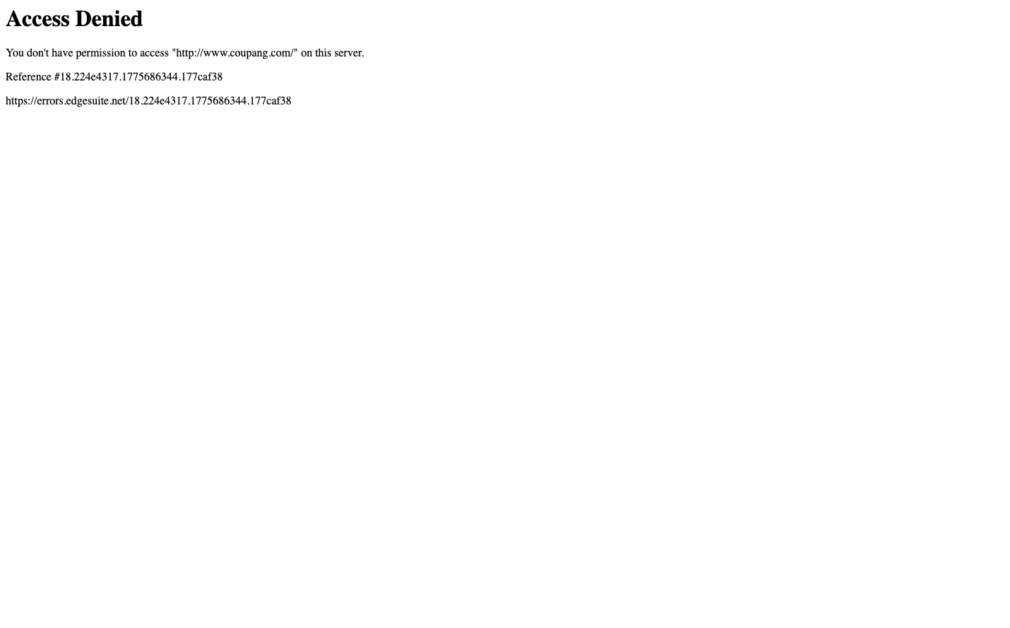
E-commerceCoupang presents a stark, institutional aesthetic that prioritizes functionality over finesse. The Times New Roman typography creates an unexpectedly academic, almost governmental feel for an e-commerce platform, while the minimal black-on-white error page suggests a brand focused on technical precision rather than emotional engagement.
Design Identity
Signature Color
Technical Black
#000000
uncompromising utility and system-level authority
Visual Identity
The distinctive use of Times New Roman typography in a digital commerce context - this serif choice immediately sets Coupang apart from the sans-serif dominance of other e-commerce platforms.
Component Style
Brutally minimal with zero visual flourish - plain text on white backgrounds with standard browser styling, no custom buttons, borders, or interactive elements visible. Everything defers to browser defaults.
Spacing Philosophy
Extremely tight, newspaper-like density with minimal line spacing and compact text blocks. No generous whitespace or breathing room - information is packed efficiently.
Design Principles
- Typography uses only Times family across all elements
- Font sizes limited to 16px body and 32px headings
- Font weights stick to 400 regular and 700 bold only
- Zero custom styling beyond basic typography
- Black text on white background exclusively
Target Audience
Pragmatic online shoppers who prioritize speed and efficiency over design aesthetics, particularly in Asian markets where functional density is valued
Mood
Design descriptions are AI-generated based on visual analysis and may not fully reflect the brand's official design guidelines.
Design System
Typography Scale
| Element | Font | Size | Weight | Line Height |
|---|---|---|---|---|
| body | 16px | 400 | normal | |
| h1 | 32px | 700 | normal | |
| p | 16px | 400 | normal |
Color Palette
No colors extracted
UI Elements
No components detected