Help us build this. Leave comments, suggest improvements, and help create better design documentation for agents.
Culture Amp
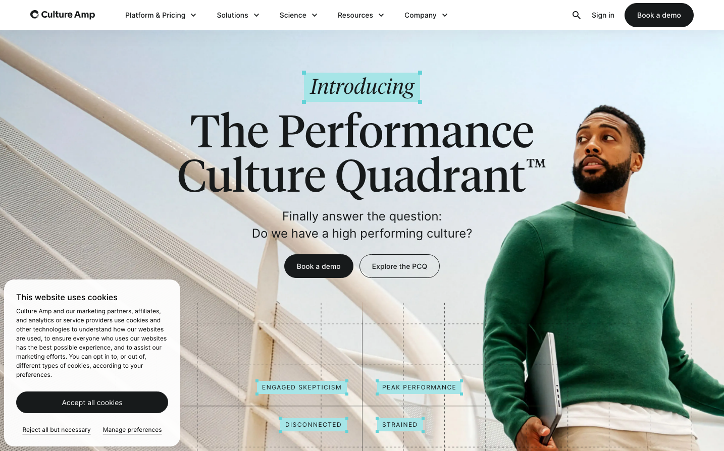
HR TechCulture Amp presents a sophisticated academic-meets-corporate identity that balances scholarly authority with progressive tech sensibilities. The Tiempos serif headlines create intellectual gravitas while Inter sans-serif body text maintains approachability, suggesting expertise that's accessible rather than intimidating.
Design Identity
Signature Color
Culture Amp Teal
#5DDED7
progressive HR transformation - combining the trust of corporate blue with the optimism of growth green
Visual Identity
Asymmetric hero layouts with large serif headlines positioned off-center, complemented by bright teal accent blocks that create dynamic visual anchors against muted photography
Component Style
Clean, minimal buttons with generous rounded corners (approximately 24px radius) and no visible borders or shadows. The design favors solid fills over outlines, creating confident, approachable touchpoints that feel substantial but not heavy.
Spacing Philosophy
Generous breathing room with large section gaps that create a premium, uncluttered feel. The layout uses asymmetric spacing to create visual interest while maintaining plenty of whitespace around key elements like the headline and CTA buttons.
Design Principles
- Headlines always use Tiempos serif at large sizes (90px+) for authority
- Body text exclusively uses Inter for clarity and accessibility
- Teal accent color used sparingly as visual punctuation, never overwhelming
- Buttons use pill-shaped radius (24px+) for friendly approachability
- Photography uses muted, professional tones to let typography dominate
Target Audience
HR leaders and people operations professionals who value data-driven insights but need solutions that feel human-centered rather than purely technical
Mood
Design descriptions are AI-generated based on visual analysis and may not fully reflect the brand's official design guidelines.
Design System
Typography Scale
| Element | Font | Size | Weight | Line Height |
|---|---|---|---|---|
| body | 16px | 400 | 22px | |
| h1 | 90px | 400 | 88px | |
| h2 | 40px | 500 | 48px | |
| h3 | 16px | 600 | 24px | |
| p | 16px | 400 | 24px | |
| a | 16px | 400 | 22px | |
| button | 16px | 400 | 22px | |
| input | 16px | 400 | 24px | |
| nav | 16px | 400 | 22px | |
| footer | 16px | 400 | 22px |
Color Palette
#007aff#3b82f6#ffffff