Help us build this. Leave comments, suggest improvements, and help create better design documentation for agents.
Cursor
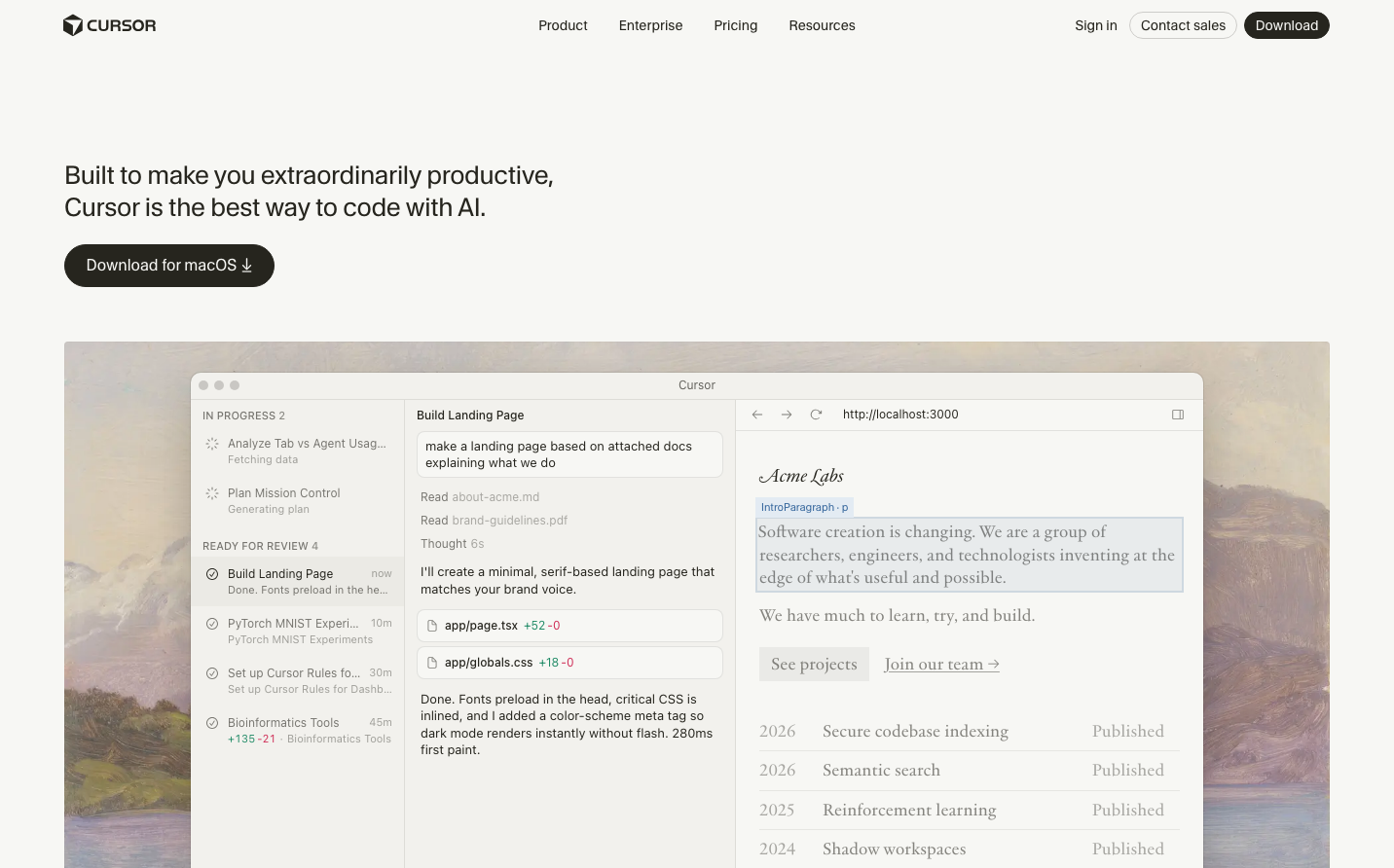
AICursor embodies sophisticated AI-assisted coding through a refined editorial aesthetic. The warm cream (#f7f7f4) background creates an inviting workspace, while the striking orange accent (#f54e00) signals AI intelligence and energy. Typography pairs gothic sans-serif for interface precision with serif for readable content, creating a scholarly yet modern coding environment.
Design Identity
Signature Color
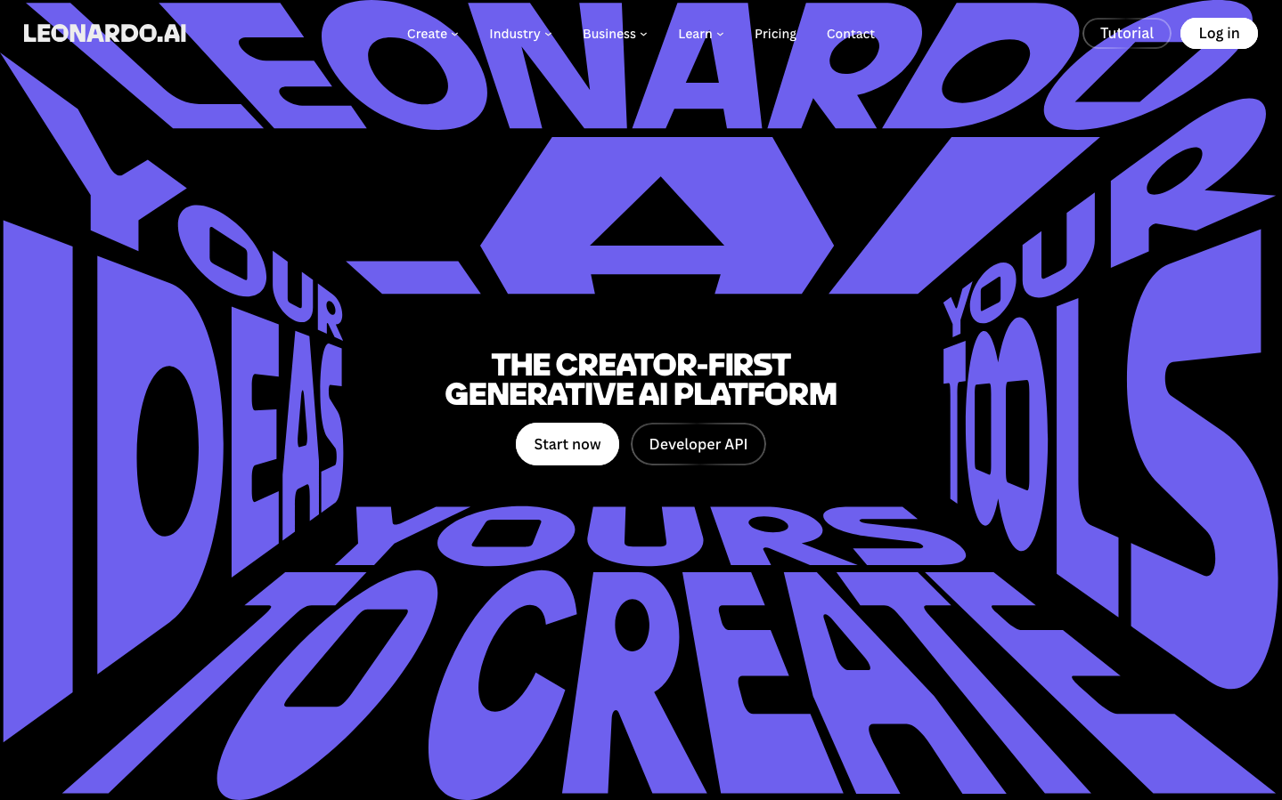
Cursor Orange
#f54e00
AI-powered innovation and creative energy in developer tools
Visual Identity
The distinctive dual-typography system - CursorGothic for UI elements combined with jjannon serif for content - creates an editorial coding environment that feels more like a refined publication than typical developer tools.
Component Style
Minimal rounded corners (2-8px), no visible shadows or heavy borders. Components feel lightweight and editorial with subtle hover states using cream tones (#f0efeb, #ebeae5). The dark button (#3b3a33) provides confident contrast against the warm background.
Spacing Philosophy
Generous breathing room emphasizes content hierarchy. The warm cream background creates natural separation between sections without harsh dividers, while the code interface maintains comfortable density for productivity.
Design Principles
- Border radius stays minimal: 2px, 4px, 8px maximum
- Typography uses only two families: CursorGothic for UI, jjannon serif for content
- Color palette restricted to warm neutrals with single orange accent
- Transitions are quick and subtle: 0.14-0.15s duration
- No drop shadows or heavy borders - relies on background color shifts
Target Audience
Senior developers and technical writers who value craft, readability, and sophisticated tooling over flashy interfaces
Mood
Design descriptions are AI-generated based on visual analysis and may not fully reflect the brand's official design guidelines.
Design System
Typography Scale
| Element | Font | Size | Weight | Line Height |
|---|---|---|---|---|
| body | 16px | 400 | 24px | |
| h1 | 26px | 400 | 32.5px | |
| h2 | 14px | 400 | 21px | |
| h3 | 22px | 400 | 28.6px | |
| p | 17.28px | 400 | 23.328px | |
| a | 14px | 400 | 14px | |
| button | 14px | 400 | 21px | |
| nav | 16px | 400 | 24px | |
| header | 16px | 400 | 24px | |
| footer | 16px | 400 | 24px |
Color Palette
#f7f7f4#26251e#f54e00#f2f1ed#ebeae5#1f8a65#cf2d56#dfa88f#9fc9a2#9fbbe0#c0a8dd#ffffff