Help us build this. Leave comments, suggest improvements, and help create better design documentation for agents.
Dashlane
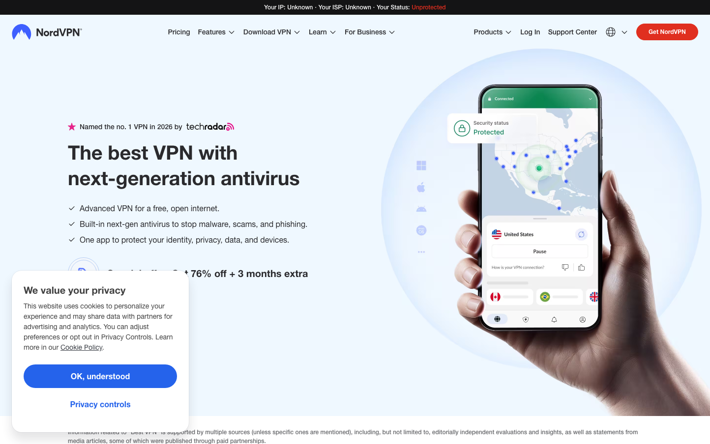
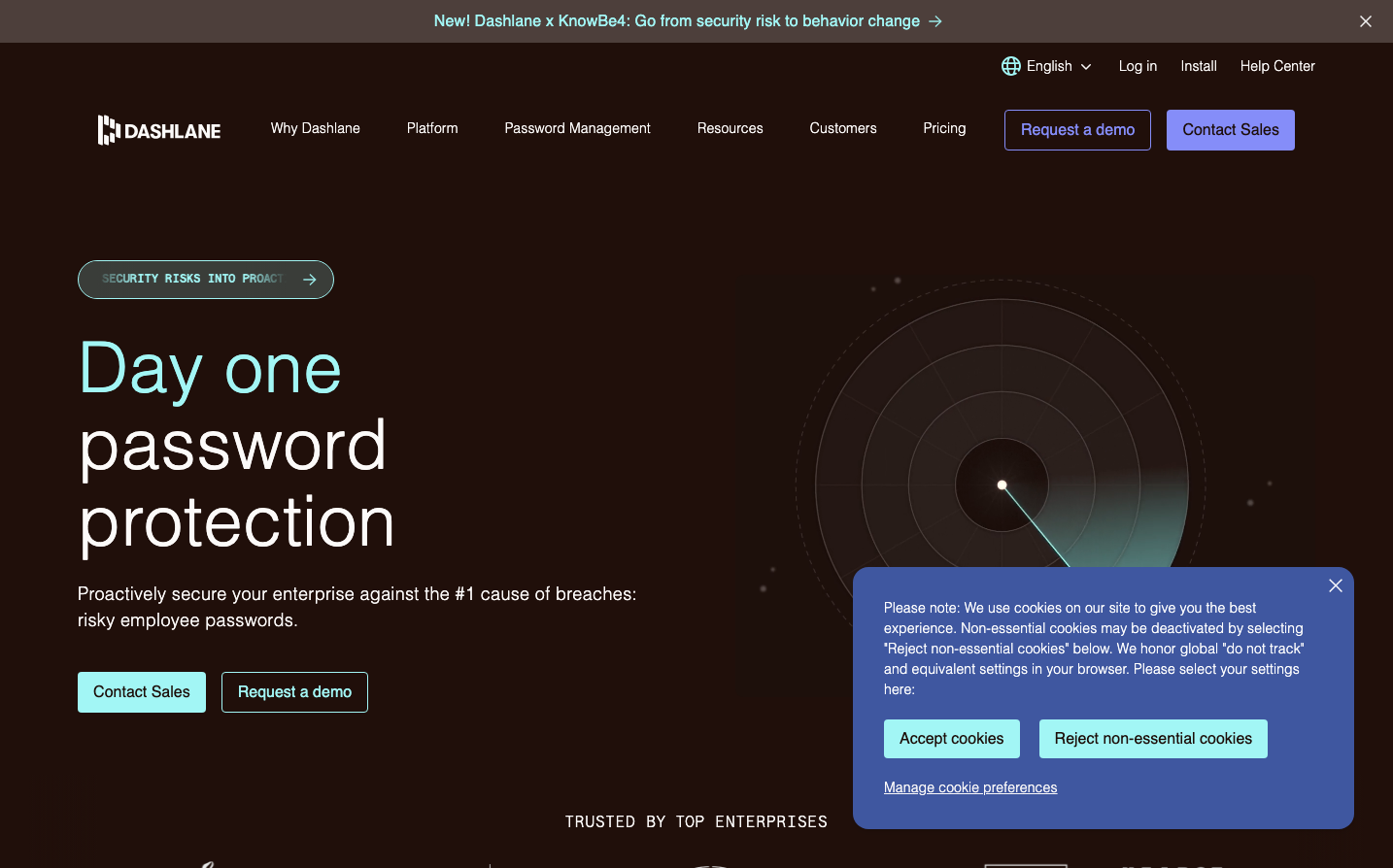
CybersecurityDashlane's signature aesthetic combines nocturnal sophistication with aqua-tech precision, featuring ethereal aquamarine accents against deep espresso backgrounds. The ultra-light Saans typography creates an almost weightless, premium feel that whispers security rather than shouting it.
Design Identity
Signature Color
Dashlane Aquamarine
#c7fbf9
digital trust and cybersecurity elegance - a sophisticated take on tech safety
Visual Identity
The distinctive combination of whisper-thin typography at 300 weight with ethereal aquamarine glows against dark backgrounds creates an unmistakable 'digital vault' aesthetic that feels both secure and weightless.
Component Style
Buttons feature soft rounded corners with subtle aquamarine backgrounds and ultra-light 300 weight typography. Everything feels ethereal and precise - no heavy shadows or sharp edges, just gentle glows and refined transparency effects.
Spacing Philosophy
Generous breathing room with dramatic negative space creates a sense of premium security. The layout prioritizes impact through scale and space rather than density, with the radar visualization given enormous real estate to dominate the right side.
Design Principles
- Typography weight never exceeds 500 - even links stay refined
- Aquamarine tints from 60-80 range provide all accent colors
- Dark espresso backgrounds (80-100 range) create security mood
- Button corners use subtle radius, never sharp or overly rounded
- Scale hierarchy relies on dramatic size jumps (18px to 72px)
Target Audience
Enterprise security decision-makers and privacy-conscious professionals who value sophisticated, understated security solutions over flashy cybersecurity marketing
Mood
Design descriptions are AI-generated based on visual analysis and may not fully reflect the brand's official design guidelines.
Design System
Typography Scale
| Element | Font | Size | Weight | Line Height |
|---|---|---|---|---|
| body | 16px | 300 | 24px | |
| h1 | 72px | 300 | 79.2px | |
| h2 | 36px | 300 | 39.6px | |
| h3 | 48px | 300 | 52.8px | |
| h4 | 36px | 300 | 39.6px | |
| p | 18px | 300 | 27px | |
| a | 16px | 500 | 24px | |
| button | 16px | 300 | 24px | |
| nav | 16px | 300 | 24px | |
| header | 16px | 300 | 24px |
Color Palette
#fdfdfd#1d0e09#e9e7e6#d3cfce#bcb7b5#a69f9d#908784#796f6c#635753#4d3f3b#251007#200f0a