Help us build this. Leave comments, suggest improvements, and help create better design documentation for agents.
Deliveroo
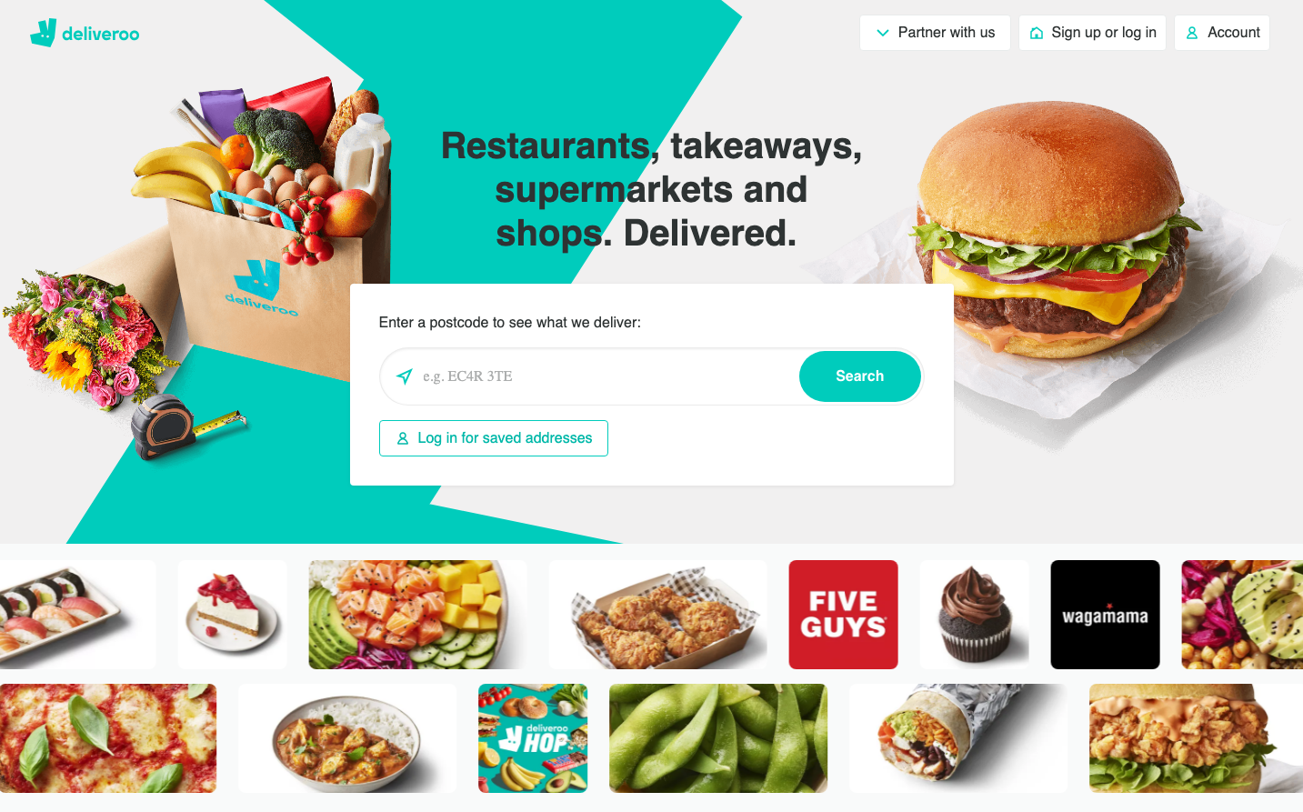
FoodDeliveroo's brand radiates vibrant energy through its signature turquoise-teal that feels fresh and appetite-stimulating, perfectly balanced against warm food photography. The Stratos typography creates bold, confident headlines that feel approachable yet substantial, while the overall composition maintains an energetic, food-forward personality that makes delivery feel exciting rather than utilitarian.
Design Identity
Signature Color
Deliveroo Teal
#00CCBC
Fresh appetite stimulation and reliable delivery speed - a color that bridges digital efficiency with food excitement
Visual Identity
The distinctive angular teal geometric shapes that create dynamic diagonal compositions, always paired with high-quality food photography and that specific warm-meets-cool color temperature balance.
Component Style
Soft, approachable rounded corners with substantial padding that feels generous and food-friendly. Buttons have pill-like shapes (high border radius) with solid fills, no harsh shadows - everything feels tactile and appetizing rather than clinical.
Spacing Philosophy
Generous whitespace around hero elements creates breathing room for food photography, while the geometric teal shapes provide visual tension. Components have comfortable padding that suggests abundance rather than efficiency.
Design Principles
- Teal geometric shapes always create diagonal movement across layouts
- Food photography gets maximum visual priority with ample whitespace
- Border radius on interactive elements is consistently pill-shaped (24px+)
- Typography hierarchy uses Stratos bold (600 weight) for all major headings
- Color palette strictly limited to teal, warm food tones, and clean whites
Target Audience
Urban food enthusiasts aged 25-40 who view food delivery as a lifestyle choice rather than convenience, prioritizing quality and variety over pure speed
Mood
Design descriptions are AI-generated based on visual analysis and may not fully reflect the brand's official design guidelines.
Design System
Typography Scale
| Element | Font | Size | Weight | Line Height |
|---|---|---|---|---|
| body | 16px | 400 | 16px | |
| h1 | 40px | 600 | 48px | |
| h2 | 40px | 600 | 48px | |
| h3 | 18px | 700 | 24px | |
| p | 16px | 400 | 22px | |
| a | 16px | 400 | 48px | |
| button | 13.3333px | 400 | 24px | |
| input | 16px | 400 | 24px | |
| nav | 16px | 400 | 16px | |
| footer | 16px | 400 | 16px |
Color Palette
No colors extracted


