Help us build this. Leave comments, suggest improvements, and help create better design documentation for agents.
Deno
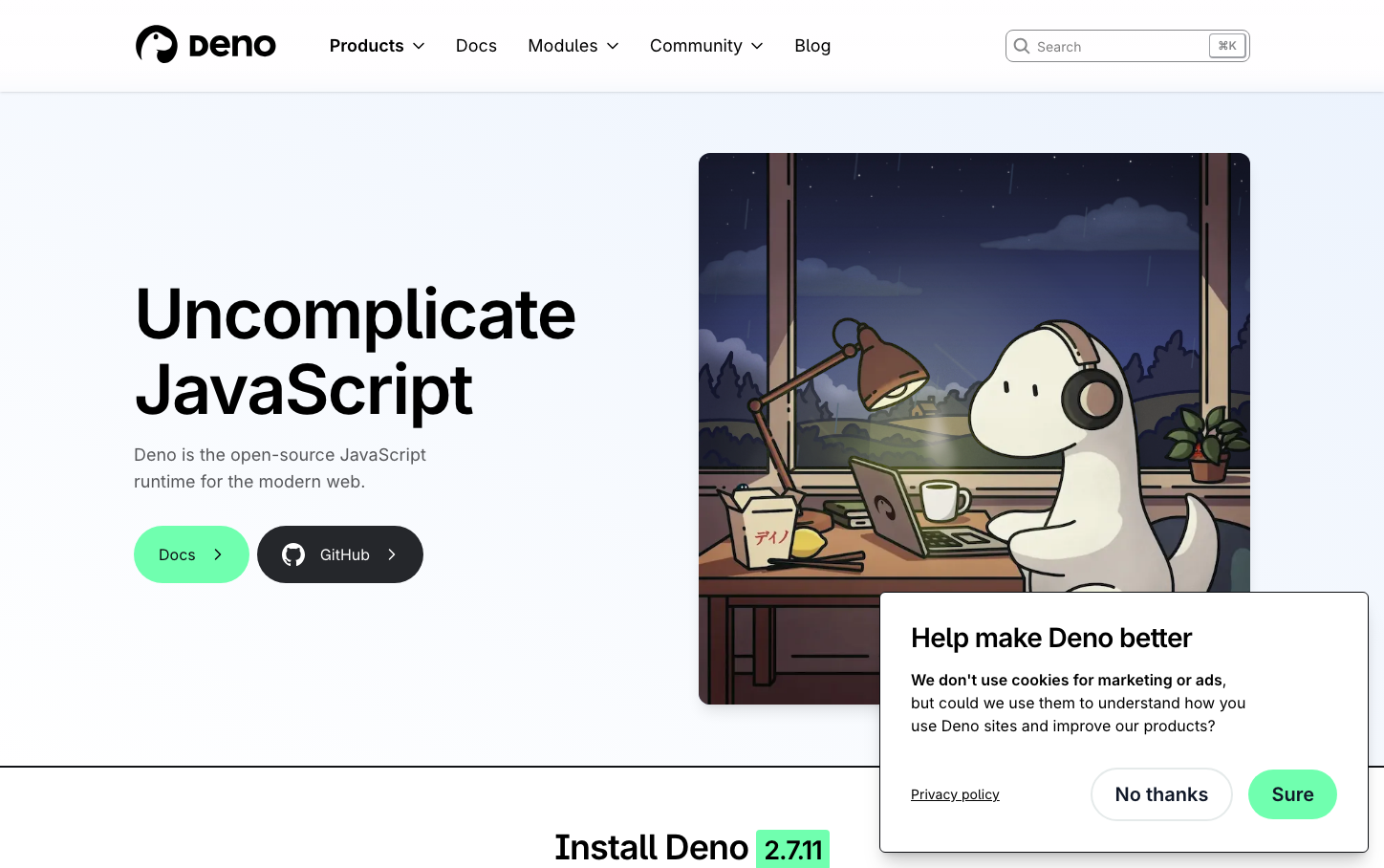
Developer ToolsDeno creates a nocturnal, studio-like atmosphere with its signature electric mint green (#70ffaf) paired with dramatic dark backgrounds and a charming dinosaur mascot. The design balances technical precision with warmth, using Inter typography and a cozy illustrated aesthetic that makes JavaScript development feel approachable yet sophisticated.
Design Identity
Signature Color
Deno Electric Mint
#70ffaf
vibrant JavaScript innovation that stands out from traditional blue developer tools
Visual Identity
The illustrated dinosaur mascot working at a desk with warm lighting creates an instantly recognizable 'coding companion' aesthetic that humanizes the technical JavaScript runtime space.
Component Style
Rounded corners with generous padding and solid fills - buttons feel substantial and friendly rather than sharp or minimal. The 'Docs' button shows bright mint green with rounded edges, while secondary buttons use dark backgrounds with white text.
Spacing Philosophy
Generous whitespace creates breathing room around the central hero content, with the illustration taking up nearly half the viewport to establish immediate brand recognition and warmth.
Design Principles
- Headlines use 72px Inter at 700 weight for maximum impact
- Electric mint green (#70ffaf) is reserved for primary actions and runtime branding
- Dark backgrounds (#25272b, #020617) create dramatic contrast
- Illustrations always include warm lighting and cozy environments
- Button text uses 18px Inter at 700 weight for clear hierarchy
Target Audience
JavaScript developers who want powerful tooling without corporate sterility - those who appreciate craft, simplicity, and a bit of personality in their development experience.
Mood
Design descriptions are AI-generated based on visual analysis and may not fully reflect the brand's official design guidelines.
Design System
Typography Scale
| Element | Font | Size | Weight | Line Height |
|---|---|---|---|---|
| body | 16px | 400 | 24px | |
| h1 | 72px | 700 | 79.2px | |
| h2 | 36px | 700 | 39.6px | |
| h3 | 36px | 700 | 39.6px | |
| h4 | 20px | 700 | 22px | |
| p | 12px | 400 | 16px | |
| a | 16px | 400 | 24px | |
| button | 18px | 700 | 36px | |
| input | 18px | 400 | 28px | |
| nav | 18px | 400 | 28px |
Color Palette
#70ffaf#ffebe9#dafbe1#f8f9fc#475269#66c2ff#57606a#401c00#0969da#656d76#e1ecf2#9ea0a5

