Help us build this. Leave comments, suggest improvements, and help create better design documentation for agents.
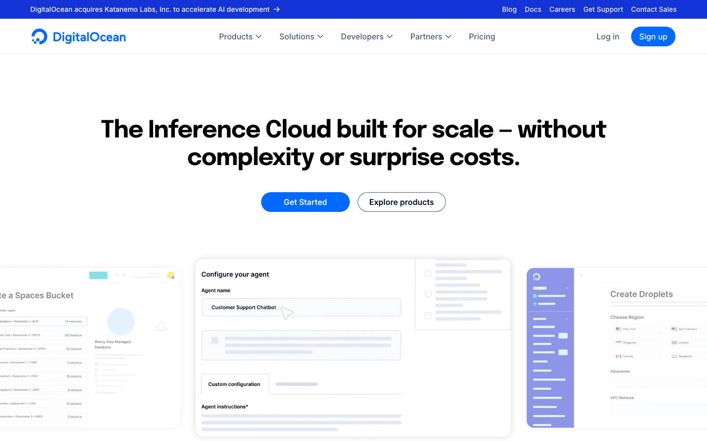
DigitalOcean
Dev ToolsDigitalOcean embodies pragmatic developer confidence with its distinctive bright blue signature color that radiates accessibility over intimidation. The Epilogue headline font creates a friendly-yet-serious tone that says 'enterprise-capable but startup-approachable', while the clean interface mockups showcase infrastructure complexity made beautifully simple.
Design Identity
Signature Color
DigitalOcean Blue
#0080FF
approachable cloud infrastructure - technical sophistication without enterprise intimidation
Visual Identity
The distinctive bright blue combined with clean interface mockups showing infrastructure dashboards and configuration screens - it has a uniquely 'developer-first cloud' aesthetic that balances technical depth with visual clarity.
Component Style
Rounded corners (approximately 8px radius) with solid fills and no shadows - buttons feel substantial but approachable. The blue primary buttons have generous padding and clean typography, while interface mockups show card-based layouts with subtle borders and organized data presentation.
Spacing Philosophy
Generous vertical spacing around the hero section creates breathing room, while the interface mockups demonstrate tight, organized layouts that maximize information density without feeling cramped.
Design Principles
- Headlines use Epilogue at 48px/700 weight for friendly authority
- Primary blue (#0080FF) dominates CTAs and key interface elements
- Border radius consistently around 8px for approachable softness
- Interface mockups always show real product functionality
- Clean card-based layouts for complex data presentation
Target Audience
Mid-level developers and engineering teams at growing companies who need enterprise-grade infrastructure without enterprise complexity or pricing
Mood
Design descriptions are AI-generated based on visual analysis and may not fully reflect the brand's official design guidelines.
Design System
Typography Scale
| Element | Font | Size | Weight | Line Height |
|---|---|---|---|---|
| body | 16px | 400 | 22.4px | |
| h1 | 48px | 700 | 56px | |
| h2 | 18px | 700 | 26px | |
| h3 | 18px | 700 | 26px | |
| p | 14px | 500 | 20px | |
| a | 14px | 500 | 21px | |
| button | 16px | 400 | 22.4px | |
| nav | 16px | 400 | 0px | |
| header | 16px | 400 | 22.4px | |
| footer | 16px | 400 | 22.4px |
Color Palette
No colors extracted