Help us build this. Leave comments, suggest improvements, and help create better design documentation for agents.
Disney
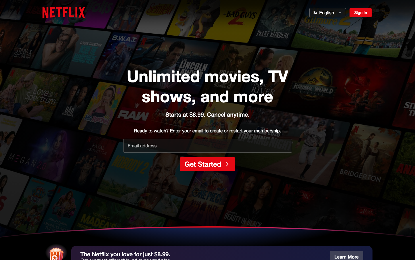
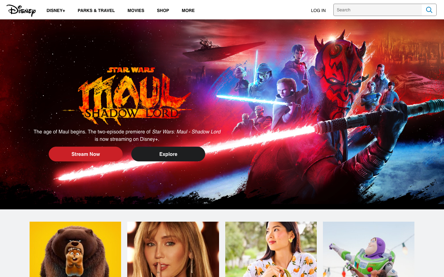
EntertainmentDisney's identity merges enchanting fantasy with cinematic grandeur through dramatic, immersive visuals that transport viewers into epic storytelling worlds. The design creates emotional connections through powerful imagery, bold typography treatments, and theatrical lighting that makes every piece of content feel like a movie poster.
Design Identity
Signature Color
Lightsaber Crimson
#FF0000
Epic drama and emotional intensity - the color of heroic conflict and passionate storytelling
Visual Identity
Cinematic full-bleed hero imagery with dramatic lighting effects and custom lettering treatments that feel like movie titles rather than web typography
Component Style
Buttons have generous rounded corners (approximately 24px) with bold, high-contrast fills. Red primary actions feel urgent and heroic, while dark secondary buttons blend into the dramatic backgrounds. No harsh borders - everything flows organically into the immersive experience.
Spacing Philosophy
Generous breathing room around key content blocks with tight, intimate spacing within character groupings. The layout prioritizes emotional impact over information density, using expansive hero sections to create cinematic presence.
Design Principles
- Hero sections always use full-viewport immersive imagery
- Typography scales dramatically from 16px body to 48px+ display sizes
- Color palette dominated by deep cinematic tones with strategic bright accents
- Button corner radius consistently around 24px for friendly approachability
- Custom typography treatments for major titles feel hand-crafted, not systematic
Target Audience
Families and entertainment enthusiasts who value emotional storytelling and premium content experiences over utilitarian functionality
Mood
Design descriptions are AI-generated based on visual analysis and may not fully reflect the brand's official design guidelines.
Design System
Typography Scale
| Element | Font | Size | Weight | Line Height |
|---|---|---|---|---|
| body | 16px | 400 | 19.2px | |
| h2 | 30px | 400 | 30px | |
| p | 48px | 400 | 52px | |
| a | 17.6px | 600 | 19.36px | |
| button | 16px | 400 | 17.6px | |
| input | 14px | 400 | 16.8px | |
| nav | 16px | 400 | 19.2px | |
| footer | 16px | 400 | 19.2px |
Color Palette
No colors extracted