Help us build this. Leave comments, suggest improvements, and help create better design documentation for agents.
Dunkin
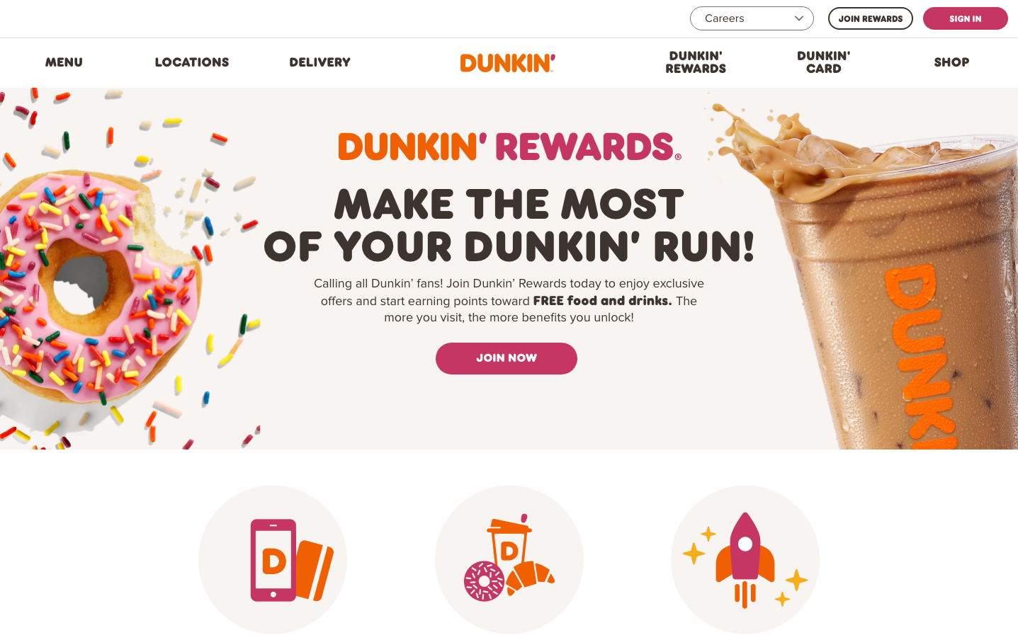
FoodDunkin's identity bursts with playful energy through explosive rainbow sprinkles and bold orange typography that screams accessibility and joy. The design balances chaotic fun (scattered colorful sprinkles) with structured reliability (clean navigation and organized content), creating a 'controlled celebration' aesthetic that makes coffee feel like a daily party.
Design Identity
Signature Color
Dunkin' Orange
#FF6600
energetic approachability and morning enthusiasm - not corporate, but trustworthy fun
Visual Identity
Sprinkles everywhere - literal rainbow confetti scattered across white backgrounds, combined with chunky sans-serif typography that feels like friendly shouting rather than corporate messaging.
Component Style
Rounded buttons with soft pill-like edges (roughly 24px radius) in vibrant colors, clean white cards with subtle shadows, and bold typography that prioritizes readability over elegance. Everything feels approachable and finger-friendly.
Spacing Philosophy
Generous breathing room around hero content with tight, efficient spacing in navigation - creates a 'festival poster' effect where the main message gets space to celebrate while practical elements stay compact and accessible.
Design Principles
- Orange dominates as primary brand color in logos and key CTAs
- Sprinkle graphics create movement and energy across white space
- Typography mixes custom DunkinSansExtraBold for impact with ProximaNova for readability
- Button corners are consistently rounded to 20-24px for friendly approachability
- Product photography uses warm lighting to enhance food appeal
Target Audience
Everyday coffee drinkers who want their daily routine to feel celebratory rather than mundane - people who choose fun and familiarity over artisanal complexity
Mood
Design descriptions are AI-generated based on visual analysis and may not fully reflect the brand's official design guidelines.
Design System
Typography Scale
| Element | Font | Size | Weight | Line Height |
|---|---|---|---|---|
| body | 14px | 400 | 14px | |
| h1 | 60px | 400 | 60px | |
| h2 | 48px | 900 | 48px | |
| h3 | 18px | 400 | 24px | |
| p | 17.92px | 800 | 17.92px | |
| a | 14px | 700 | 14px | |
| button | 0px | 400 | normal | |
| input | 16.1px | 400 | 16.1px | |
| nav | 14px | 400 | 14px | |
| footer | 14px | 400 | 14px |
Color Palette
No colors extracted


