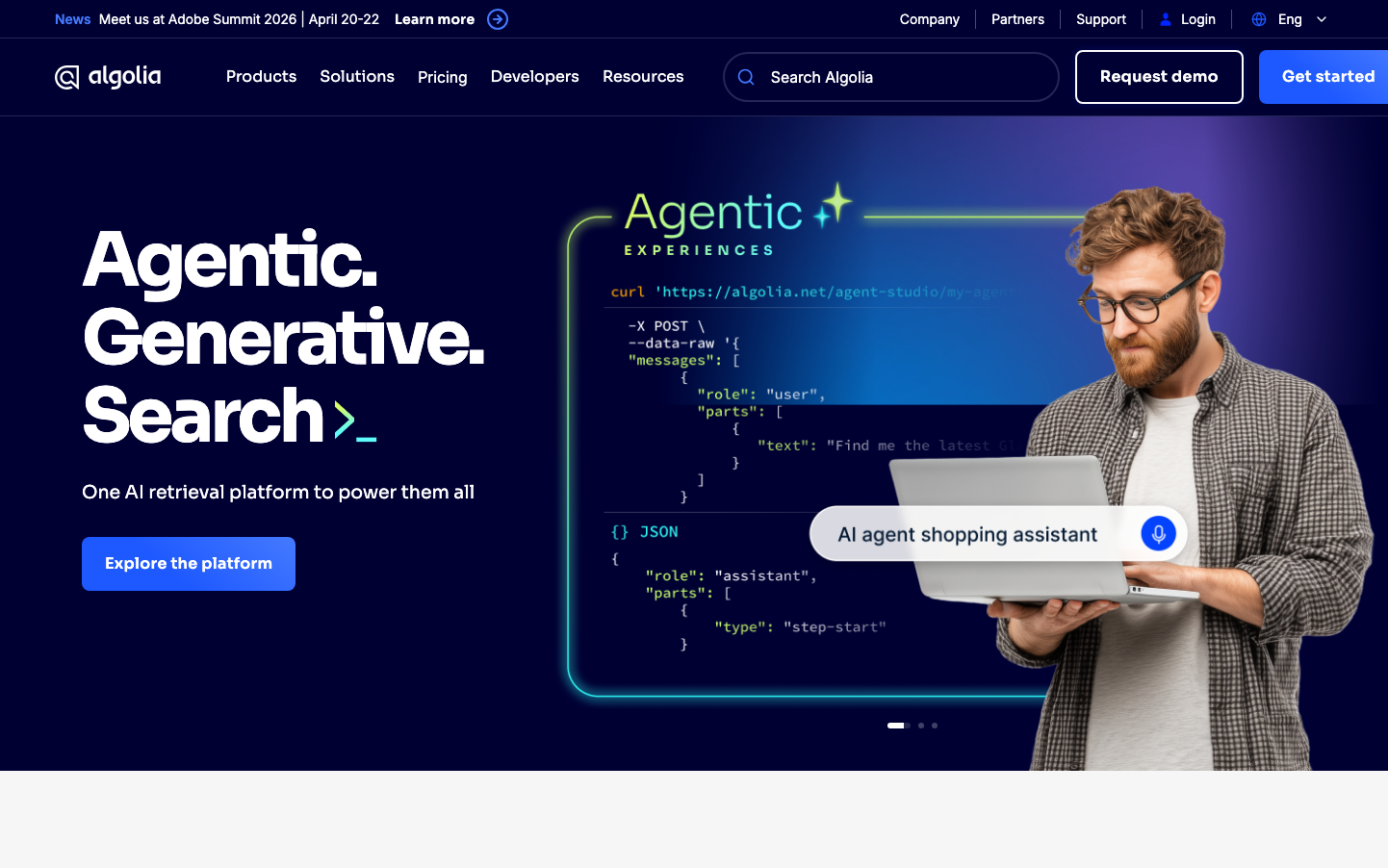
Help us build this. Leave comments, suggest improvements, and help create better design documentation for agents.
Elastic
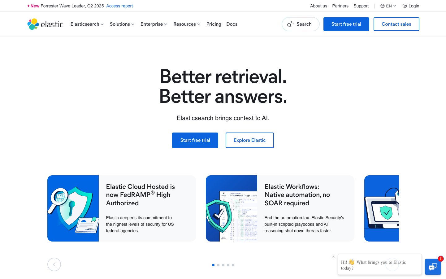
SearchElastic employs a bold, enterprise-grade aesthetic that balances technical authority with approachable clarity. The vivid blue palette projects confidence and innovation, while the generous whitespace and prominent illustration-based cards create an unexpectedly welcoming experience for a search technology platform.
Design Identity
Signature Color
Elastic Blue
#0b64dd
Data intelligence and enterprise reliability - a vibrant blue that signals innovation without sacrificing trustworthiness
Visual Identity
Large illustrated card components with protective shield and security imagery, combined with extreme whitespace and bold two-line headlines that create dramatic emphasis through line breaks.
Component Style
Rounded 8-16px corners with clean shadows, buttons have substantial padding and bold typography. Cards feature colorful illustrated backgrounds with blue gradients, creating a friendly yet professional feel. No harsh borders - everything flows with subtle elevation.
Spacing Philosophy
Dramatically generous vertical spacing creates breathing room between major sections, while card layouts use asymmetrical positioning. The hero area uses extreme whitespace to isolate the core message, creating enterprise gravitas.
Design Principles
- Headlines split across two lines for dramatic emphasis
- Border radius consistently 8px for buttons, 16px for cards
- Illustrations always include shield/security iconography
- Blue gradients span from midnight (#153385) to bright elastic blue (#0b64dd)
- Typography hierarchy uses MierB for all headings, Inter for body
Target Audience
Enterprise developers and technical leaders who need powerful search capabilities but value intuitive interfaces over complex feature displays
Mood
Design descriptions are AI-generated based on visual analysis and may not fully reflect the brand's official design guidelines.
Design System
Typography Scale
| Element | Font | Size | Weight | Line Height |
|---|---|---|---|---|
| body | 16px | 400 | 24px | |
| h1 | 64px | 600 | 64px | |
| h2 | 22px | 600 | 26.4px | |
| h3 | 16px | 600 | 19.2px | |
| h4 | 26px | 600 | 31.2px | |
| h5 | 14px | 700 | 16.8px | |
| h6 | 16px | 600 | 19.2px | |
| p | 14px | 700 | 14px | |
| a | 14px | 700 | 21px | |
| button | 13px | 400 | 13px |
Color Palette
#000000#222326#323439#4a4d55#8a919e#a2a9b4#b5bcc4#ccd2d7#d4dae5#eeeff1#f8f9fa#ffffff