Help us build this. Leave comments, suggest improvements, and help create better design documentation for agents.
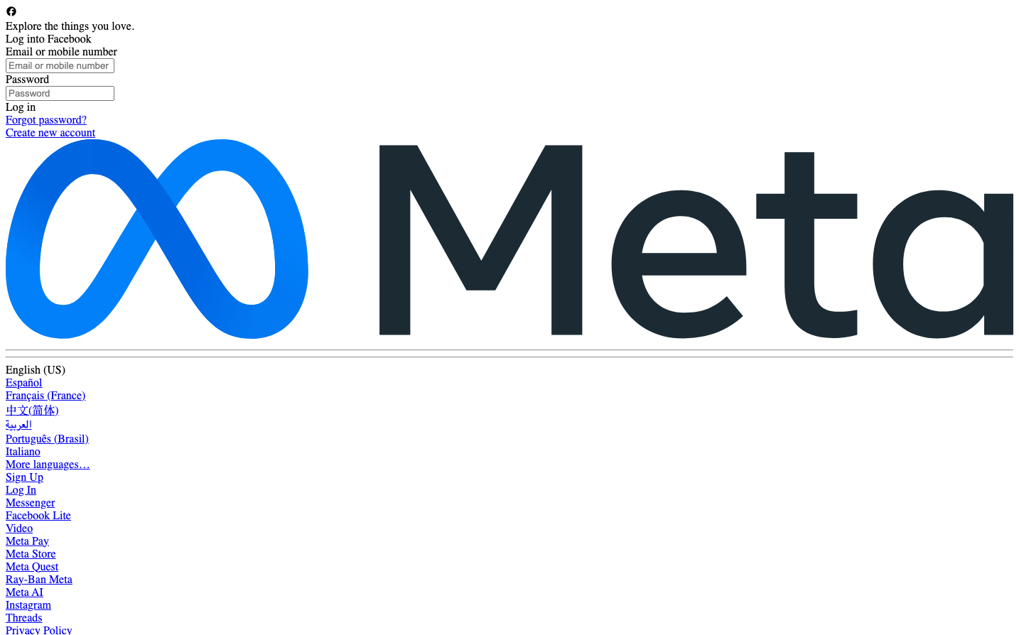
Meta's brand identity balances corporate trust with approachable humanity through its signature infinity-loop logo in electric blue paired with clean, utilitarian typography. The design philosophy emphasizes democratic accessibility - making advanced technology feel familiar and unthreatening through generous whitespace, soft rounded corners, and a deliberately understated aesthetic that prioritizes function over flash.
Design Identity
Signature Color
Meta Blue
#1877F2
Democratic connectivity and trustworthy innovation - the color of digital infrastructure that billions rely on daily
Visual Identity
The flowing infinity symbol in electric blue creates instant recognition - a mathematical concept made warm and organic, representing endless connection and possibility without the coldness typically associated with tech logos.
Component Style
Soft, welcoming components with generous 12-18px border radius on buttons and 16px on cards. No harsh shadows or sharp edges - everything feels touchable and human-scaled. Light gray borders (#ced0d4) and subtle backgrounds create definition without aggression.
Spacing Philosophy
Generous breathing room with substantial padding (10px+ on interactive elements) creates a sense of calm rather than urgency. The layout feels spacious but not wasteful - designed for billions of daily users who need clarity over visual drama.
Design Principles
- Border radius ranges from 12px (buttons) to 18px (medium elements) - never sharp
- Primary interactive elements use 10px+ vertical padding for touch-friendliness
- Color palette stays within neutral grays (#666a72 to #f0f0f0) except for the signature blue
- Typography mixes system fonts (Arial for inputs) with serif (Times) for approachable formality
- Animation durations are substantial (300ms to 2000ms) - nothing feels rushed
Target Audience
Global mainstream users across all demographics who need social technology to feel familiar, trustworthy, and accessible rather than cutting-edge or exclusive
Mood
Design descriptions are AI-generated based on visual analysis and may not fully reflect the brand's official design guidelines.
Design System
Typography Scale
| Element | Font | Size | Weight | Line Height |
|---|---|---|---|---|
| body | 16px | 400 | normal | |
| a | 16px | 400 | normal | |
| input | 13.3333px | 400 | normal |
Color Palette
#111112#e7eaed#666a72#b2b8be#ffffff#ced0d4#dbecff#9fa4ab#000000#e4e6eb#fee4e6#dfe2e5