Help us build this. Leave comments, suggest improvements, and help create better design documentation for agents.
Fintual
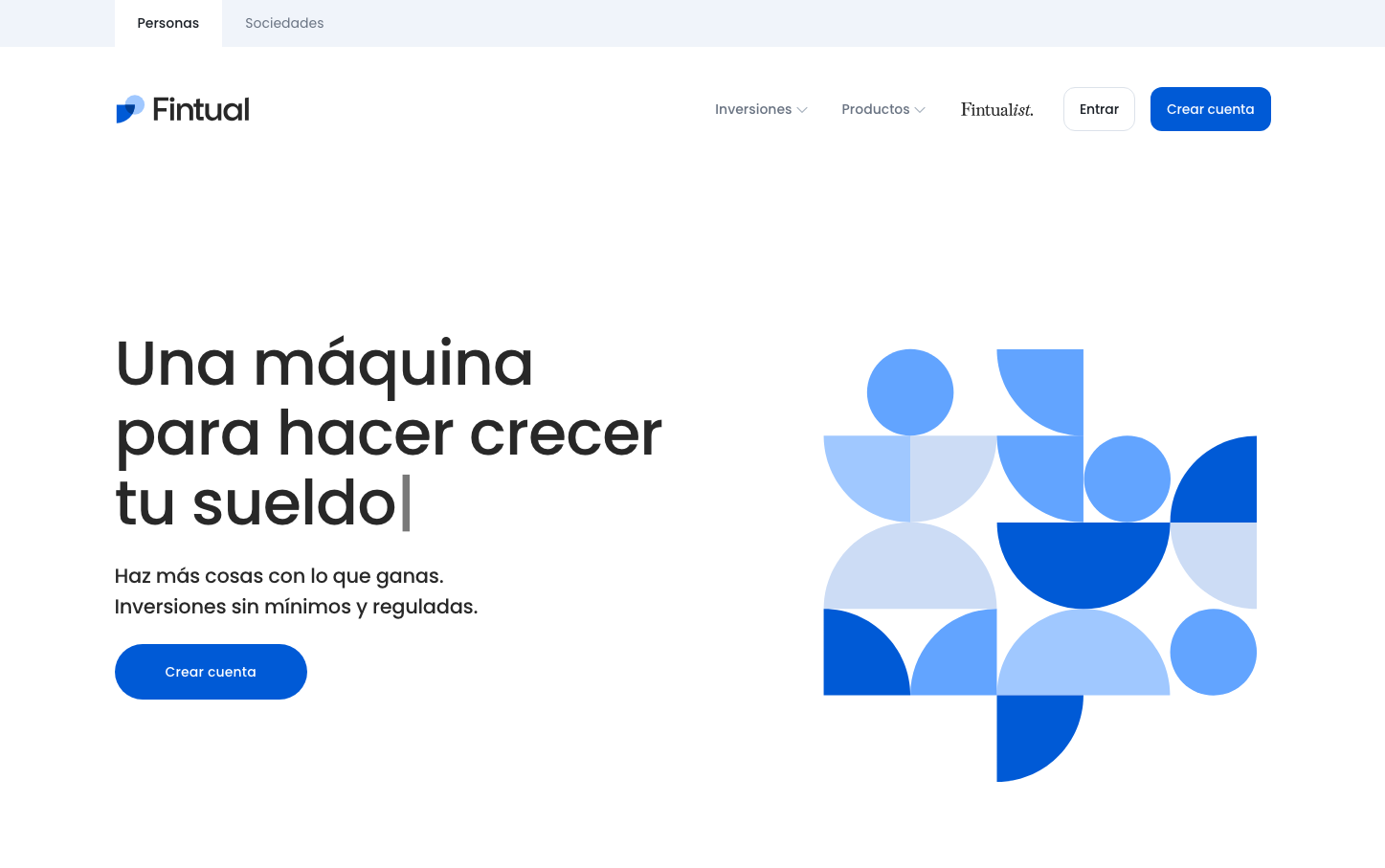
FintechFintual projects accessibility and trust through a systematic blue palette that transitions from deep navy (#005ad6) to playful sky tones, while Poppins typography creates approachable sophistication. The abstract geometric illustration uses overlapping circles and squares in blue gradients, making complex financial concepts feel intuitive and welcoming rather than intimidating.
Design Identity
Signature Color
Fintual Trust Blue
#005ad6
Reliable fintech expertise with approachable accessibility - serious enough for investments, friendly enough for everyday users
Visual Identity
Overlapping geometric shapes in gradient blues create a modular, building-block aesthetic that suggests financial growth and systematic investment strategies through visual metaphor.
Component Style
Rounded corners with 12-24px border radius create friendly touchpoints, while the primary button uses substantial padding and medium font weights. Components feel substantial but approachable, avoiding sharp edges or heavy shadows in favor of clean fills and gentle curves.
Spacing Philosophy
Generous left-aligned composition with the headline taking up roughly 40% of the viewport width, while the geometric illustration fills the remaining space. Large 48px+ gaps between sections create breathing room that suggests financial stability and unhurried decision-making.
Design Principles
- Border radius stays between 8-24px for friendly approachability
- Typography uses only Poppins at 500 weight for headings, 400 for body
- Blue color system spans from #005ad6 to #62a4ff with systematic hover states
- Geometric illustrations use overlapping circles and rounded rectangles exclusively
- Left-aligned layouts with 40/60 text-to-visual ratio
Target Audience
Chilean millennials and Gen-Z looking to start investing with minimal financial knowledge, who need sophisticated tools presented in an approachable, non-intimidating interface
Mood
Design descriptions are AI-generated based on visual analysis and may not fully reflect the brand's official design guidelines.
Design System
Typography Scale
| Element | Font | Size | Weight | Line Height |
|---|---|---|---|---|
| body | 16px | 400 | normal | |
| h1 | 21px | 500 | 31.5px | |
| h2 | 65px | 500 | 73.125px | |
| h3 | 24px | 500 | 36px | |
| h5 | 20px | 500 | 30px | |
| p | 14px | 500 | 22px | |
| a | 14px | 400 | normal | |
| button | 13.3333px | 400 | normal | |
| nav | 16px | 400 | normal | |
| header | 16px | 400 | normal |
Color Palette
#000000#005ad6#62a4ff#003f96#c4c4c4#4bc590#5dd6a1#079a68#d55e5e#d56d6d#b34144#282828