Help us build this. Leave comments, suggest improvements, and help create better design documentation for agents.
Freee
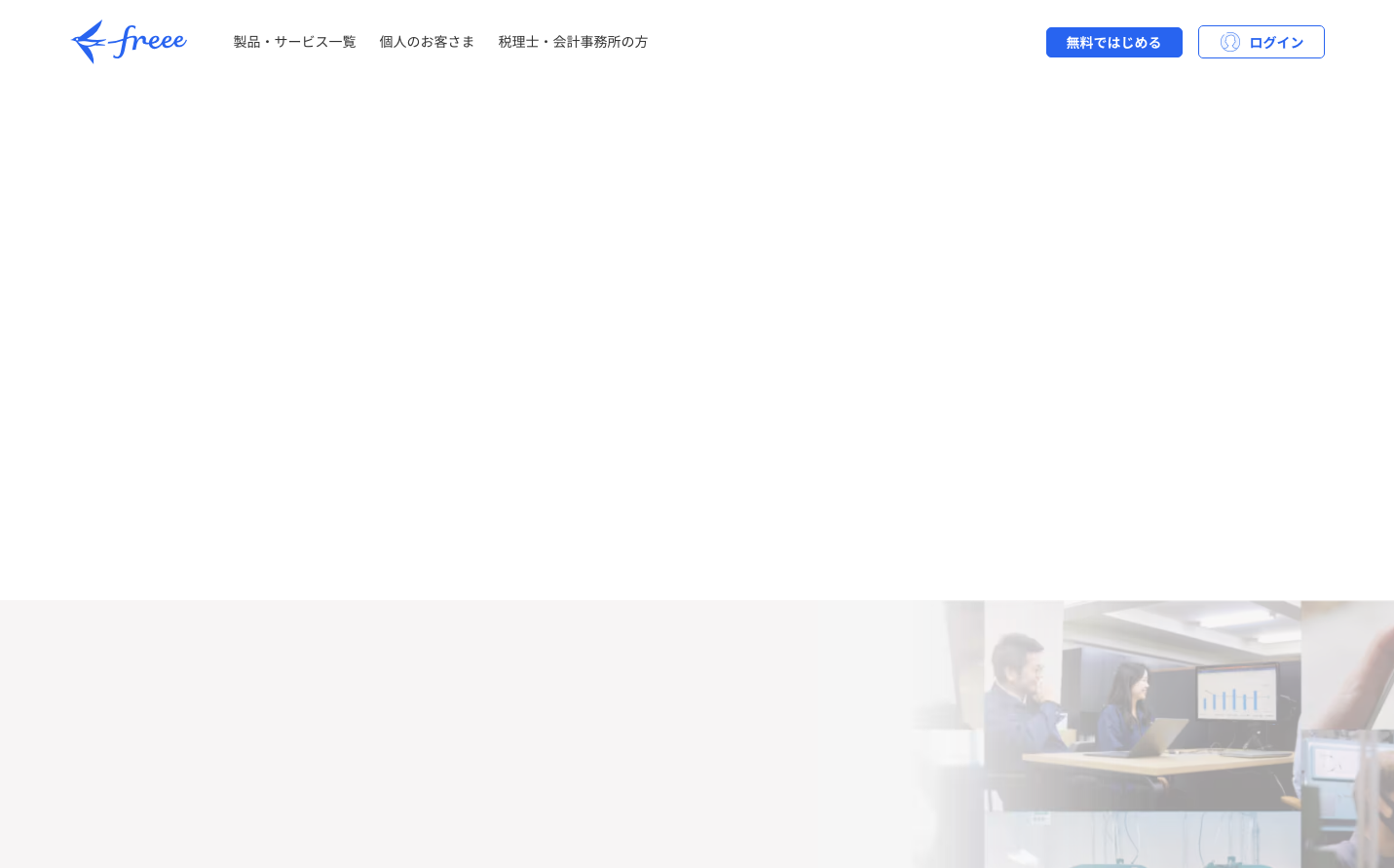
FintechFreee embodies Japanese digital minimalism with its extensive use of pristine whitespace and subtle blue accents. The Noto Sans JP typography creates a professional yet approachable atmosphere, while the vast empty canvas suggests infinite possibilities and uncluttered thinking.
Design Identity
Signature Color
iOS System Blue
#007aff
familiar digital trust and platform-native reliability
Visual Identity
Extreme whitespace dominance with floating navigation elements and minimal content density - creating a zen-like digital environment that feels more like a meditation space than a typical SaaS interface.
Component Style
Soft rounded buttons with generous padding and subtle shadows. Clean outlined forms with delicate borders. Everything feels touchable and friendly, borrowing heavily from mobile design language with medium corner radii around 6-8px.
Spacing Philosophy
Luxurious whitespace with massive 80px+ vertical gaps between sections. The interface breathes with generous padding that prioritizes clarity over information density, creating a premium sense of space.
Design Principles
- Typography uses exclusively Noto Sans JP across all elements
- Button font weight is consistently 700 for strong hierarchy
- Base font size is 16px with 24px line height for optimal readability
- Heading sizes jump dramatically: 24px for h3, 34px for h2
- Navigation and body text share identical 16px/400 weight styling
Target Audience
Japanese business professionals and accountants who value simplicity over feature complexity, preferring calm interfaces that reduce cognitive load during financial tasks
Mood
Design descriptions are AI-generated based on visual analysis and may not fully reflect the brand's official design guidelines.
Design System
Typography Scale
| Element | Font | Size | Weight | Line Height |
|---|---|---|---|---|
| body | 16px | 400 | 24px | |
| h2 | 34px | 500 | 51px | |
| h3 | 24px | 700 | 36px | |
| p | 16px | 400 | 24px | |
| a | 16px | 400 | 24px | |
| button | 14px | 700 | 21px | |
| input | 16px | 400 | normal | |
| nav | 16px | 400 | 24px | |
| header | 16px | 400 | 24px | |
| footer | 16px | 400 | 24px |
Color Palette
#007aff