Help us build this. Leave comments, suggest improvements, and help create better design documentation for agents.
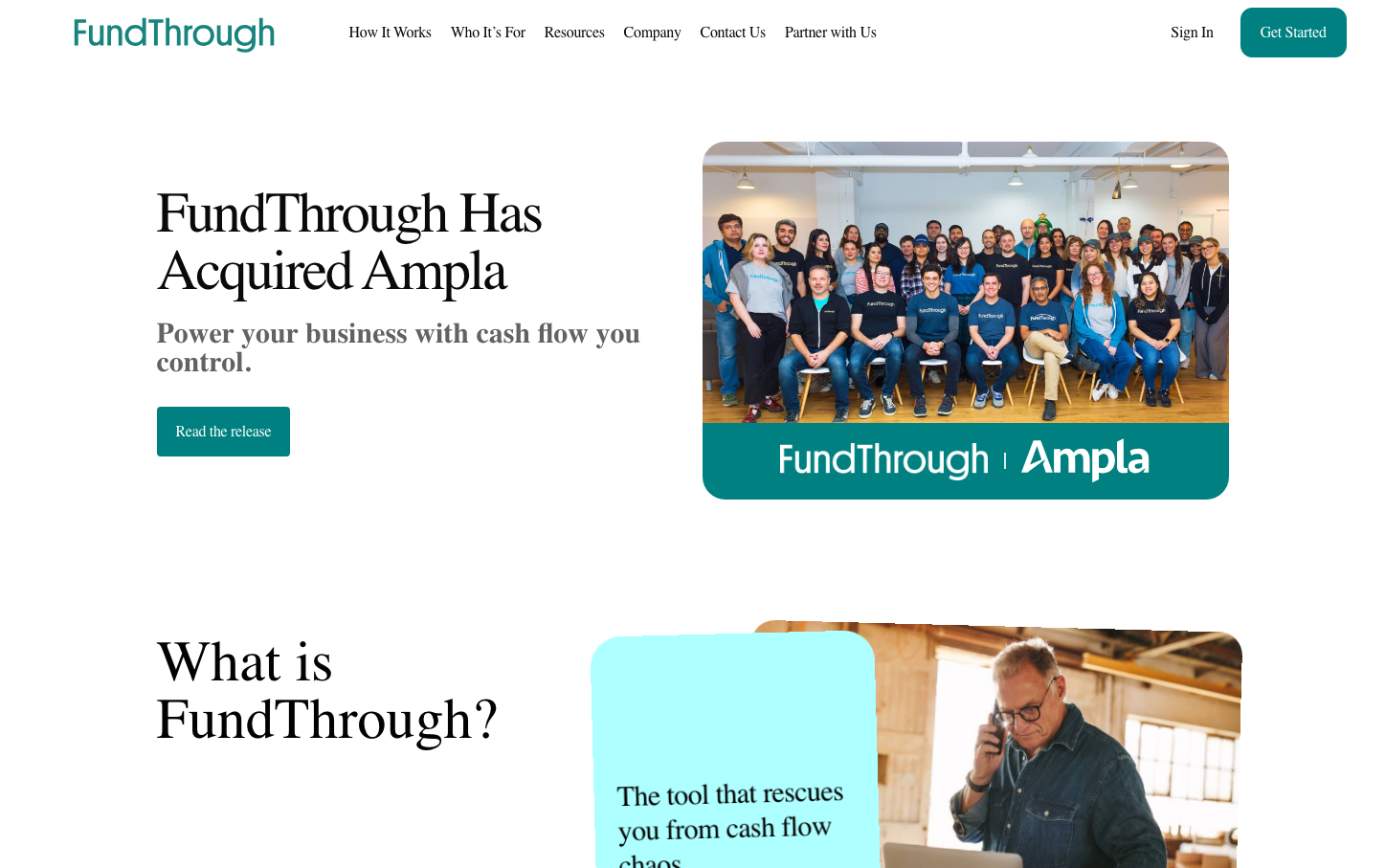
Ampla
FintechA fintech brand that balances approachability with authority through a distinctive teal-green signature color and mixed typography hierarchy. The design emphasizes human connection (team photography) while maintaining professional credibility through clean layouts and strategic use of whitespace.
Design Identity
Signature Color
FundThrough Teal
#00B5A5
Financial growth and trustworthy innovation - bridges the gap between traditional banking green and modern fintech blue
Visual Identity
Generous whitespace combined with human-centered photography and a distinctive teal accent color that appears consistently across CTAs and branding elements
Component Style
Rounded corner buttons (8px radius) with solid fills, no shadows or borders. Cards and sections rely on whitespace separation rather than visual dividers. Clean, minimal aesthetic with emphasis on readability over decoration.
Spacing Philosophy
Asymmetrical layout with abundant whitespace on desktop. Large gaps between sections (80px+) create breathing room, while content areas use generous padding to prevent cramped feeling. Text blocks get ample line spacing for readability.
Design Principles
- Teal accent color (#00B5A5) dominates all primary actions
- Typography mixes three families: Inter for headlines, Montserrat for body, Platform Web for specific headings
- Border radius consistently 8px on interactive elements
- No drop shadows or borders on primary components
- Photography always shows real people in professional but approachable settings
Target Audience
SMB owners and finance managers who need sophisticated cash flow solutions but want a human, approachable experience rather than cold corporate banking
Mood
Design descriptions are AI-generated based on visual analysis and may not fully reflect the brand's official design guidelines.
Design System
Typography Scale
| Element | Font | Size | Weight | Line Height |
|---|---|---|---|---|
| body | 16px | 400 | 24px | |
| h1 | 60px | 500 | 60px | |
| h2 | 32px | 400 | 32px | |
| p | 16px | 400 | normal | |
| a | 16px | 400 | 24px | |
| nav | 16px | 400 | 24px | |
| footer | 16px | 400 | 24px |
Color Palette
#abb8c3#ffffff#f78da7#cf2e2e#ff6900#fcb900#7bdcb5#00d084#8ed1fc#0693e3#9b51e0#007aff


