Help us build this. Leave comments, suggest improvements, and help create better design documentation for agents.
Divvy
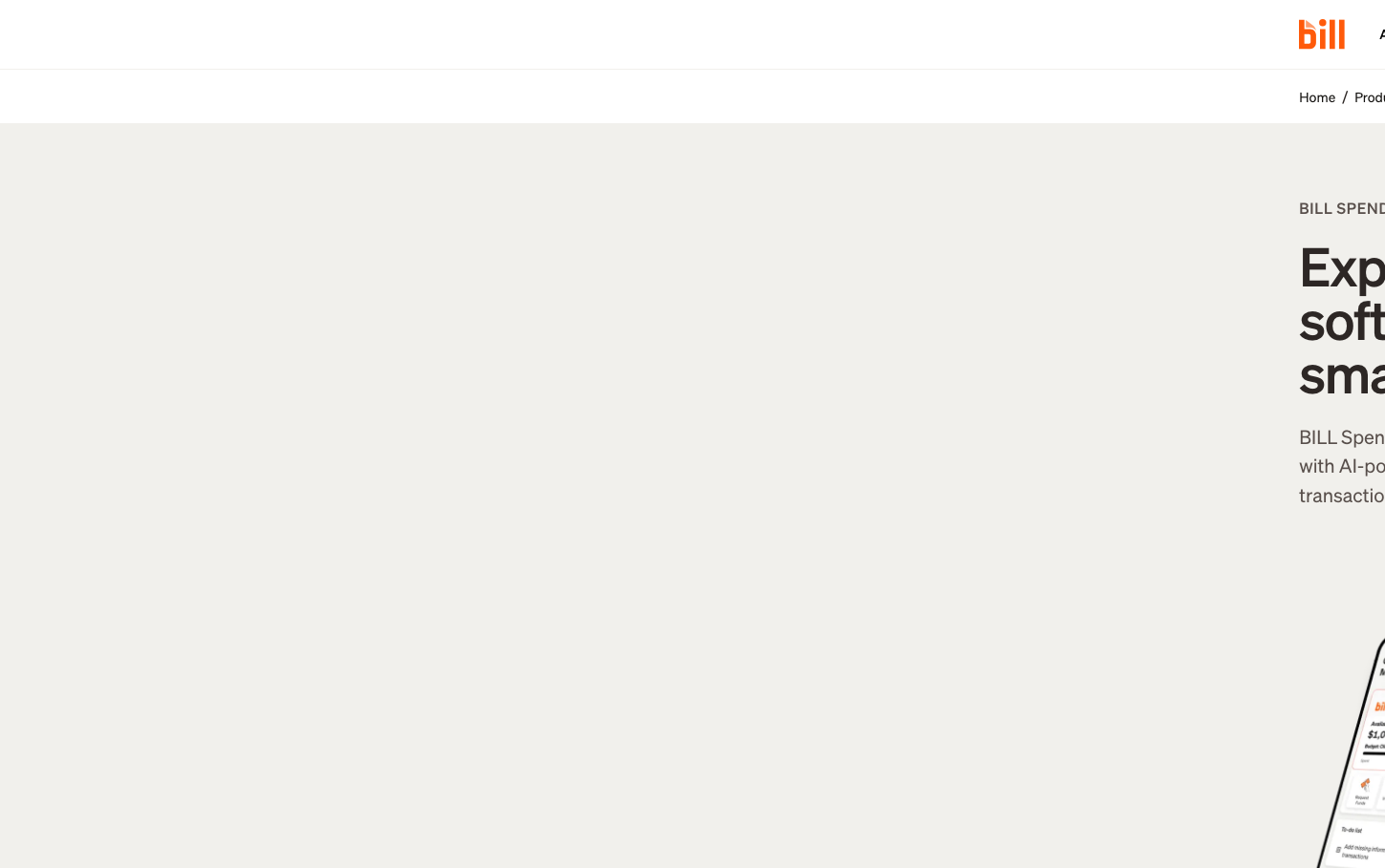
FintechDivvy's brand radiates financial sophistication through warm, coffee-toned neutrals anchored by authoritative deep blues. The custom 'Soehne' typography family creates editorial gravitas while vibrant orange accents inject approachable energy into an otherwise premium, institutional aesthetic.
Design Identity
Signature Color
Divvy Flame Orange
#ff5a0a
energetic financial empowerment breaking through corporate monotony
Visual Identity
The distinctive warm grey-beige neutral palette (#f1f0ec, #c3b4ac) creates an unmistakable 'financial warmth' that distinguishes it from sterile fintech whites and clinical blues.
Component Style
Components feel substantial yet refined - likely featuring moderate border radius (6-8px) with the signature orange used sparingly for primary actions. The button hover state (#2269d3) suggests smooth interactive transitions with depth.
Spacing Philosophy
Generous breathing room with an editorial sensibility - the complex typography sizing (56px h1, 32px h3, 28px h2) suggests asymmetric layouts with ample whitespace to let the sophisticated type hierarchy shine.
Design Principles
- Typography uses custom Soehne family exclusively for brand distinction
- Orange (#ff5a0a) reserved for primary CTAs and key highlights only
- Neutral palette stays within warm coffee tones (#fdfcfc to #2d2725)
- Button states progress from deep blue (#024dbd) to pressed navy (#0242a1)
- Body text maintains 1.5x line-height ratio for readability
Target Audience
Finance directors and startup founders who want expense management that feels as sophisticated as their business strategy
Mood
Design descriptions are AI-generated based on visual analysis and may not fully reflect the brand's official design guidelines.
Design System
Typography Scale
| Element | Font | Size | Weight | Line Height |
|---|---|---|---|---|
| body | 16.0187px | 400 | 24.0281px | |
| h1 | 56.0656px | 500 | 56.0656px | |
| h2 | 28.0328px | 500 | 33.6394px | |
| h3 | 32.0375px | 500 | 35.2412px | |
| p | 20.0234px | 400 | 30.0352px | |
| a | 16.0187px | 400 | 24.0281px | |
| input | 14px | 400 | 20px | |
| nav | 16.0187px | 400 | 24.0281px | |
| footer | 16.0187px | 400 | 24.0281px | |
| main | 16.0187px | 400 | 24.0281px |
Color Palette
#ff5a0a#c3b4ac#161412#584f4b#fdfcfc#f1f0ec#2269d3#024dbd#f6f6f3#fff6ee#238d8c#f2fbfa


