Help us build this. Leave comments, suggest improvements, and help create better design documentation for agents.
Mailspring
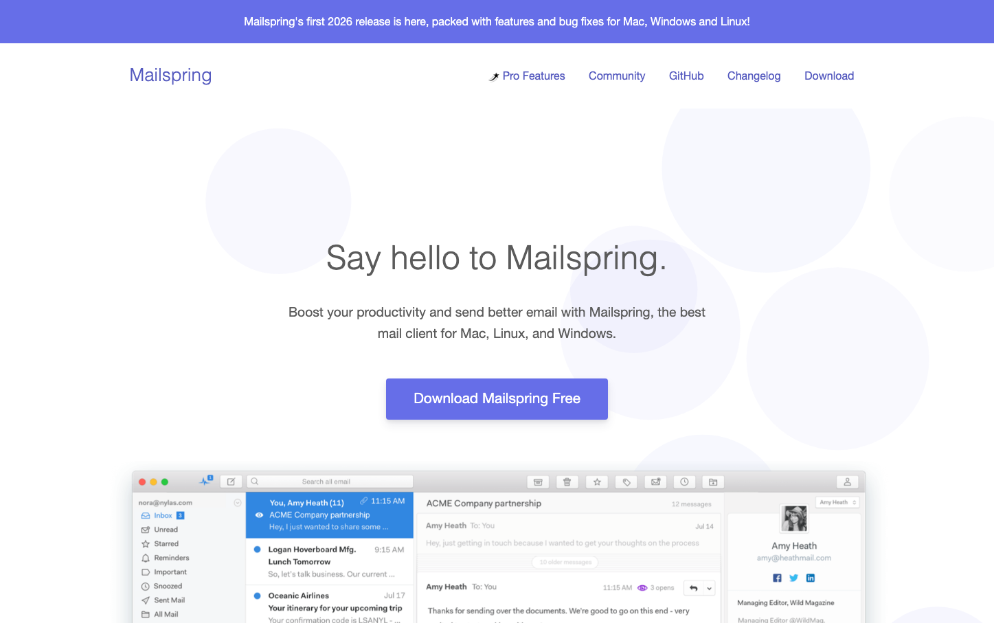
CommunicationMailspring embraces a refined, productivity-focused aesthetic with ultra-light typography that whispers sophistication rather than shouting features. The vibrant purple signature color creates an approachable yet premium feel, while generous whitespace and the prominent email interface screenshot demonstrate confidence in the product itself.
Design Identity
Signature Color
Mailspring Purple
#7C6AE8
Creative productivity trust - bridging the gap between professional email tools and modern design sensibilities
Visual Identity
The dramatic contrast between ultra-light 200-weight headings and the bold purple CTA button, combined with a centered product screenshot that dominates the visual hierarchy
Component Style
Soft, approachable buttons with gentle 6px border radius and subtle shadows. The primary CTA feels substantial with generous padding, while maintaining a friendly, non-aggressive presence through the rounded corners.
Spacing Philosophy
Luxurious vertical breathing room with approximately 80px+ gaps between major sections. The layout feels intentionally sparse, letting the product screenshot and core message dominate without visual competition.
Design Principles
- Headlines use 200 font-weight exclusively for ethereal lightness
- Purple accent color appears only on primary actions
- Product screenshots are centered and given dominant visual weight
- Whitespace ratios favor generous vertical gaps over dense layouts
- Navigation remains minimal and text-based without visual flourishes
Target Audience
Design-conscious professionals and developers who want powerful email functionality without corporate software aesthetics
Mood
Design descriptions are AI-generated based on visual analysis and may not fully reflect the brand's official design guidelines.
Design System
Typography Scale
| Element | Font | Size | Weight | Line Height |
|---|---|---|---|---|
| body | 16px | 400 | 23.2px | |
| h1 | 48px | 200 | 62.4px | |
| h2 | 40px | 200 | 52px | |
| h3 | 20.8px | 700 | 27.04px | |
| h4 | 16px | 700 | 20.8px | |
| p | 19.2px | 400 | 30.72px | |
| a | 26px | 200 | 23.2px |
Color Palette
No colors extracted