Help us build this. Leave comments, suggest improvements, and help create better design documentation for agents.
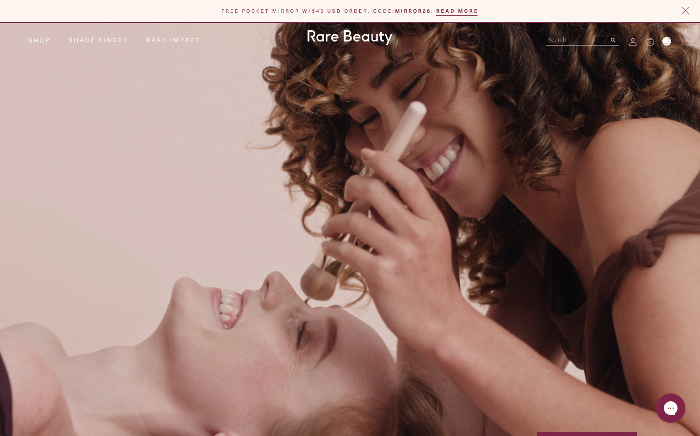
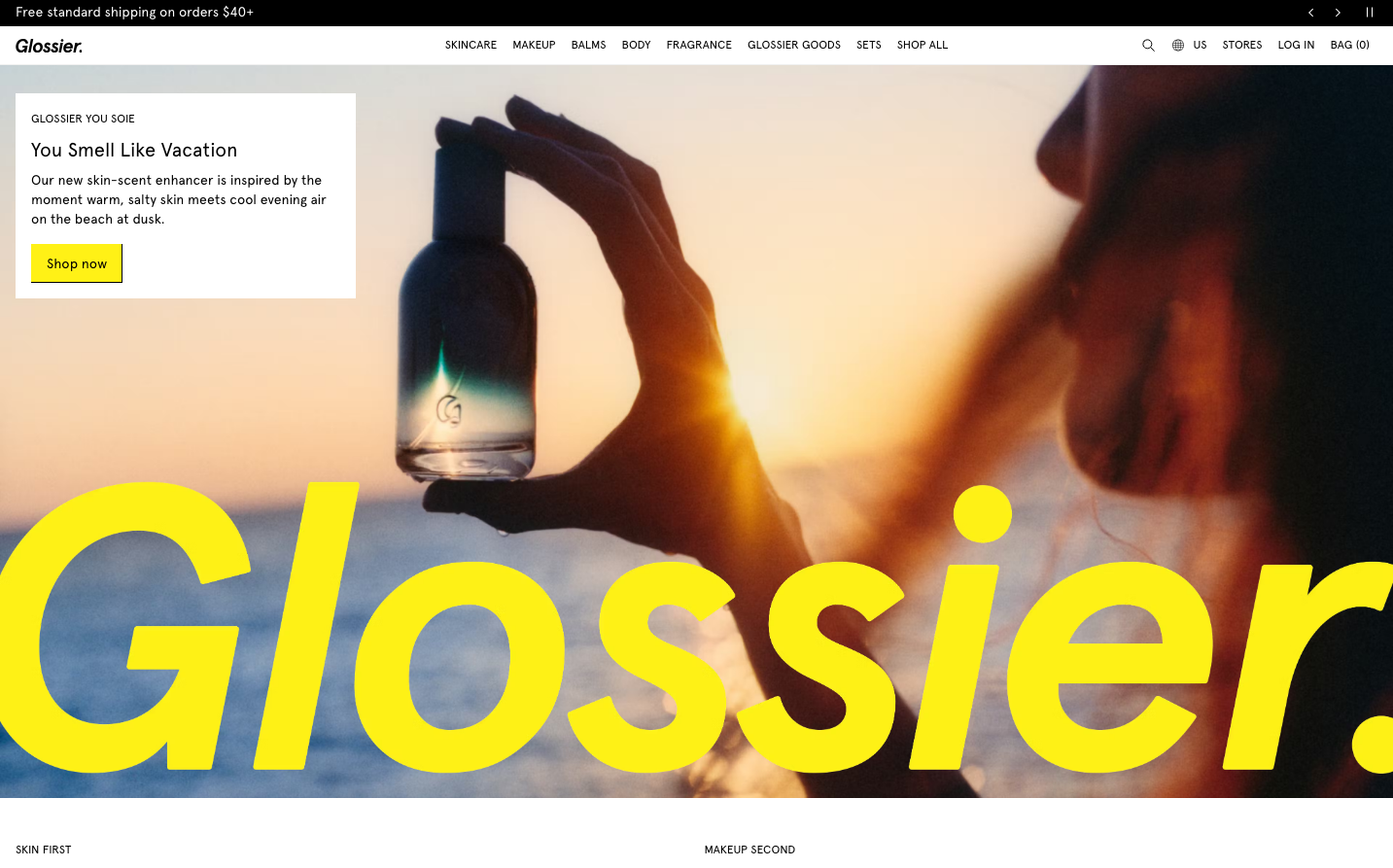
Glossier
BeautyGlossier embodies intimate, sun-drenched minimalism through their signature electric yellow typography that boldly overlays dreamy, golden-hour photography. The brand creates an aesthetic of effortless luxury where oversized yellow sans-serif text becomes both navigation and art, evoking the warmth of vacation skin and the confidence of natural beauty.
Design Identity
Signature Color
Glossier Yellow
#FFFF00
sunny optimism and fearless self-expression in beauty
Visual Identity
Massive yellow typography that dominates the frame, overlaid on intimate lifestyle photography with golden, sunset-lit skin tones - creating a collision between bold graphic design and soft, dreamy imagery.
Component Style
Clean rectangular buttons with sharp corners and bright yellow backgrounds, no shadows or borders - everything feels direct and confident. The 'Shop now' CTA uses bold yellow with black text, maintaining high contrast for immediate attention.
Spacing Philosophy
Generous breathing room around the content card positioned in the upper left, while the main image bleeds full-screen. The layout creates intimate pockets of information within expansive visual storytelling.
Design Principles
- Typography scales to massive display sizes, becoming graphic elements
- Yellow (#FFFF00) is used sparingly but boldly for maximum impact
- Photography always features warm, golden lighting
- Sharp rectangular corners on all interactive elements
- Apercu font family used consistently at 400 weight
Target Audience
Beauty-conscious millennials and Gen Z who value authentic self-expression over perfection and see skincare as a form of self-care ritual
Mood
Design descriptions are AI-generated based on visual analysis and may not fully reflect the brand's official design guidelines.
Design System
Typography Scale
| Element | Font | Size | Weight | Line Height |
|---|---|---|---|---|
| body | 16px | 400 | 18.4px | |
| h2 | 20px | 400 | 28px | |
| h3 | 14px | 400 | 19.6px | |
| h4 | 12px | 400 | 20.4px | |
| p | 14px | 400 | 19.6px | |
| a | 16px | 400 | 18.4px | |
| button | 14px | 400 | 19.6px | |
| input | 14px | 400 | 19.6px | |
| nav | 12px | 400 | 15.6px | |
| header | 32px | 500 | 35px |
Color Palette
No colors extracted