Help us build this. Leave comments, suggest improvements, and help create better design documentation for agents.
Good UI
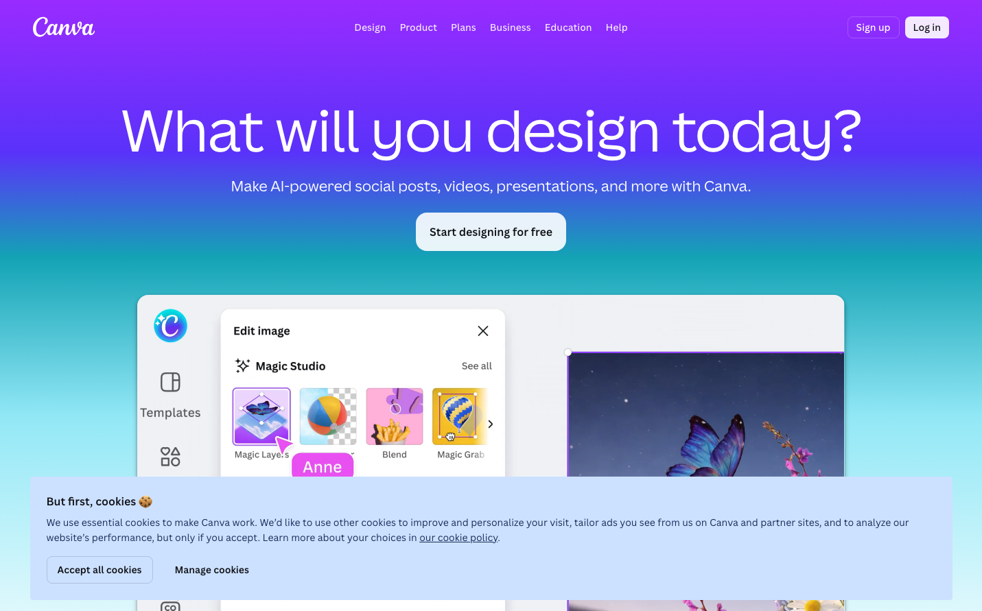
DesignGood UI embodies a stark, data-driven aesthetic with its signature orange accent cutting through a predominantly dark, monochromatic palette. The Oswald typeface creates an industrial, no-nonsense tone that speaks to serious practitioners who prioritize insights over aesthetics.

Design Identity
Signature Color
Signal Orange
#E85A2B
urgent optimization - the color of A/B test alerts and conversion breakthroughs
Visual Identity
The dramatic dark hero section with stark white typography and strategic orange accents creates an unmistakable 'testing lab' atmosphere - like viewing conversion data on multiple monitors in a dimly lit optimization center.
Component Style
Minimal rectangular buttons with subtle rounded corners (4-6px), clean form inputs with light borders, and strategic use of orange highlights. Components feel utilitarian and precise - built for function over beauty, with just enough polish to feel professional.
Spacing Philosophy
Generous vertical breathing room in the hero section creates focus, while the navigation maintains tight horizontal spacing. The layout uses dramatic contrast between dense content areas and expansive whitespace to guide attention.
Design Principles
- Orange reserved exclusively for primary actions and key highlights
- Oswald typography at 300 weight throughout for consistent industrial feel
- Dark backgrounds paired with stark white text for high contrast
- Minimal border radius (under 6px) keeps everything sharp and technical
- Strategic color limitation - primarily grayscale with orange accents
Target Audience
Growth hackers, conversion rate specialists, and product managers who obsess over metrics and view design as a vehicle for optimization rather than art
Mood
Design descriptions are AI-generated based on visual analysis and may not fully reflect the brand's official design guidelines.
Design System
Typography Scale
| Element | Font | Size | Weight | Line Height |
|---|---|---|---|---|
| body | 16px | 300 | 24px | |
| h1 | 44.8px | 300 | 58.24px | |
| h2 | 44.8px | 300 | 58.24px | |
| h3 | 26px | 300 | 36.4px | |
| h4 | 32px | 300 | 45px | |
| p | 18px | 300 | 27px | |
| a | 20px | 300 | 48px | |
| button | 20px | 300 | 48px | |
| input | 18px | 300 | 40px | |
| nav | 16px | 300 | 24px |
Color Palette
No colors extracted