Help us build this. Leave comments, suggest improvements, and help create better design documentation for agents.
Gousto
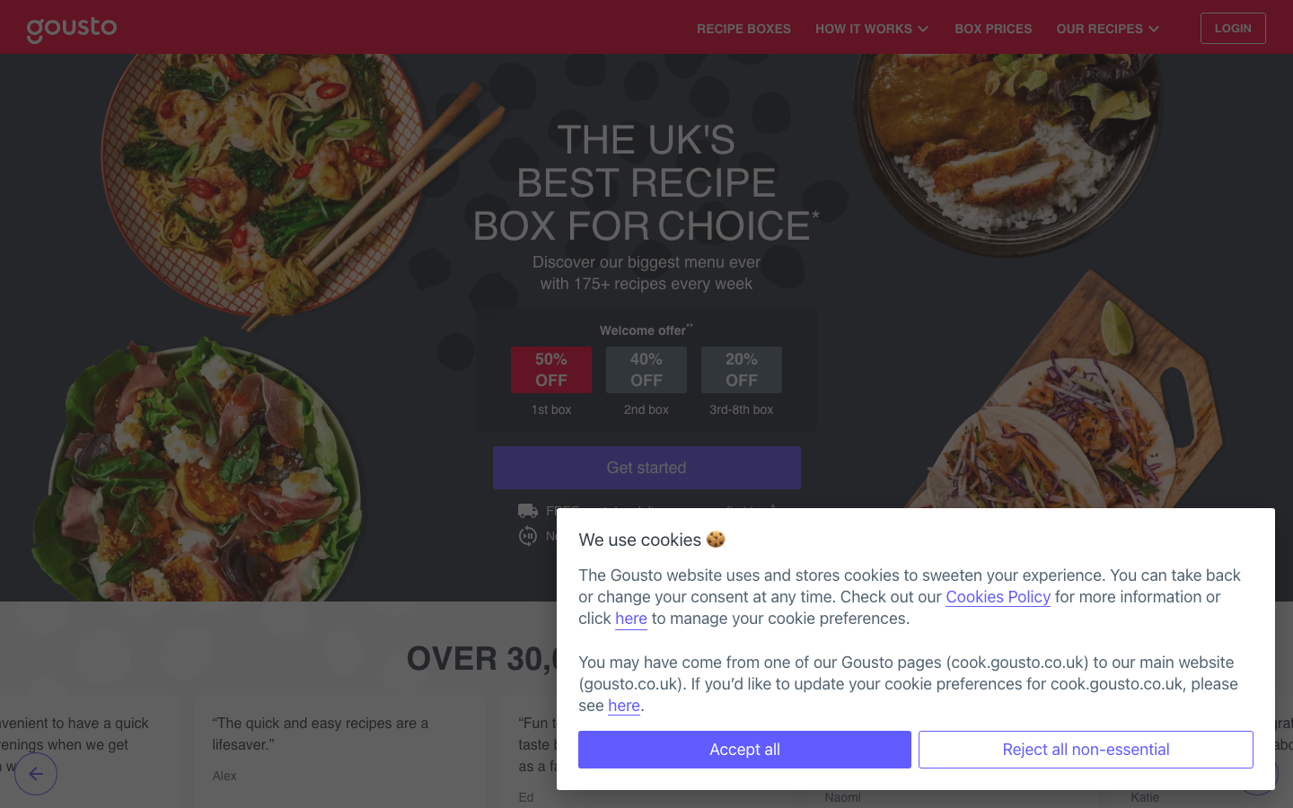
FoodGousto's aesthetic centers on food-first photography with vibrant, colorful dishes taking center stage against a dark, atmospheric background. The brand uses a quirky food-themed color palette (Kale, Bluecheese, DarkChilli) combined with the distinctive Axiformabook typeface to create an approachable yet premium cooking experience that feels more like a culinary adventure than a meal delivery service.
Design Identity
Signature Color
Gousto Kale
#7d86fe
Culinary creativity and premium accessibility - a sophisticated purple that bridges gourmet aspiration with everyday cooking
Visual Identity
Dark, moody food photography arranged in organic circular compositions with generous whitespace, creating an editorial magazine aesthetic that elevates home cooking to restaurant-quality presentation
Component Style
Subtle 3px rounded corners with clean fills, no heavy shadows - components feel soft and approachable rather than corporate or technical. Buttons have gentle curves that echo the organic nature of food.
Spacing Philosophy
Generous breathing room around hero imagery with tight, efficient spacing in UI elements. The layout prioritizes visual impact of food photography over dense information architecture.
Design Principles
- Border radius consistently uses 3px for subtle softness
- Food imagery always takes visual priority over text
- Typography uses Axiformabook family exclusively for brand consistency
- Color names follow food ingredients (Kale, Pepper, Aubergine, Radish)
- Dark overlays at 0.7 opacity maintain food photo visibility
Target Audience
Aspirational home cooks aged 25-40 who want restaurant-quality meals but lack time for meal planning and shopping
Mood
Design descriptions are AI-generated based on visual analysis and may not fully reflect the brand's official design guidelines.
Design System
Typography Scale
| Element | Font | Size | Weight | Line Height |
|---|---|---|---|---|
| body | 16px | 400 | 22.4px | |
| h1 | 44px | 400 | 48px | |
| h2 | 36px | 700 | 40px | |
| h3 | 18px | 700 | 28px | |
| h5 | 18px | 700 | 24px | |
| p | 16px | 400 | 24px | |
| a | 13px | 400 | 13px | |
| button | 16px | 400 | 22.4px | |
| input | 16px | 400 | 19.2px | |
| header | 16px | 400 | 22.4px |
Color Palette
#a6a19d#c74e35#7290ff#cfd5db#018f25#c0c5c9#7d86fe#dbdbdb#d5dee2#1e1d1d#ffffff#596067


