Help us build this. Leave comments, suggest improvements, and help create better design documentation for agents.
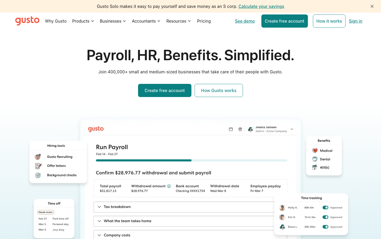
Gusto
HR TechGusto's brand exudes approachable professionalism through its distinctive teal-coral color pairing and sophisticated typography hierarchy. The clearface serif headlines create editorial warmth while the clean interface design communicates trustworthy simplicity for business owners who want powerful tools without complexity.
Design Identity
Signature Color
Gusto Teal
#2EAB9C
trustworthy fintech reliability with a human touch
Visual Identity
The distinctive combination of warm serif headlines (clearface) with clean sans-serif UI elements, paired with generous whitespace and that signature teal accent color creates an immediately recognizable 'approachable authority' aesthetic.
Component Style
Softly rounded corners (approximately 6-8px radius) with clean fills and subtle borders. Buttons feel substantial but friendly with medium padding. Cards and interface elements use gentle shadows and the signature teal for primary actions, creating a polished but never intimidating feeling.
Spacing Philosophy
Generous vertical breathing room with large 80-120px gaps between major sections creates a sense of calm authority. Interface elements use comfortable 16-24px internal spacing that feels substantial without being bloated.
Design Principles
- Headlines always use clearface serif at 600 weight for editorial authority
- UI text uses GCentra sans-serif at 400-500 weights for clarity
- Border radius stays consistent at 6-8px for friendly approachability
- Teal (#2EAB9C) reserved exclusively for primary actions and key highlights
- Line height maintains 1.5x ratio for comfortable reading density
Target Audience
Small to medium business owners and HR managers who need sophisticated payroll tools but value simplicity and human-centered design over enterprise complexity
Mood
Design descriptions are AI-generated based on visual analysis and may not fully reflect the brand's official design guidelines.
Design System
Typography Scale
| Element | Font | Size | Weight | Line Height |
|---|---|---|---|---|
| body | 16px | 400 | 24px | |
| h1 | 56px | 600 | 64px | |
| h2 | 42px | 600 | 50px | |
| h3 | 42px | 600 | 50px | |
| h4 | 32px | 600 | 40px | |
| p | 16px | 400 | 24px | |
| a | 16px | 500 | 24px | |
| button | 20px | 400 | 23px | |
| nav | 16px | 400 | 24px | |
| header | 16px | 400 | 24px |
Color Palette
No colors extracted