Help us build this. Leave comments, suggest improvements, and help create better design documentation for agents.
Hermès
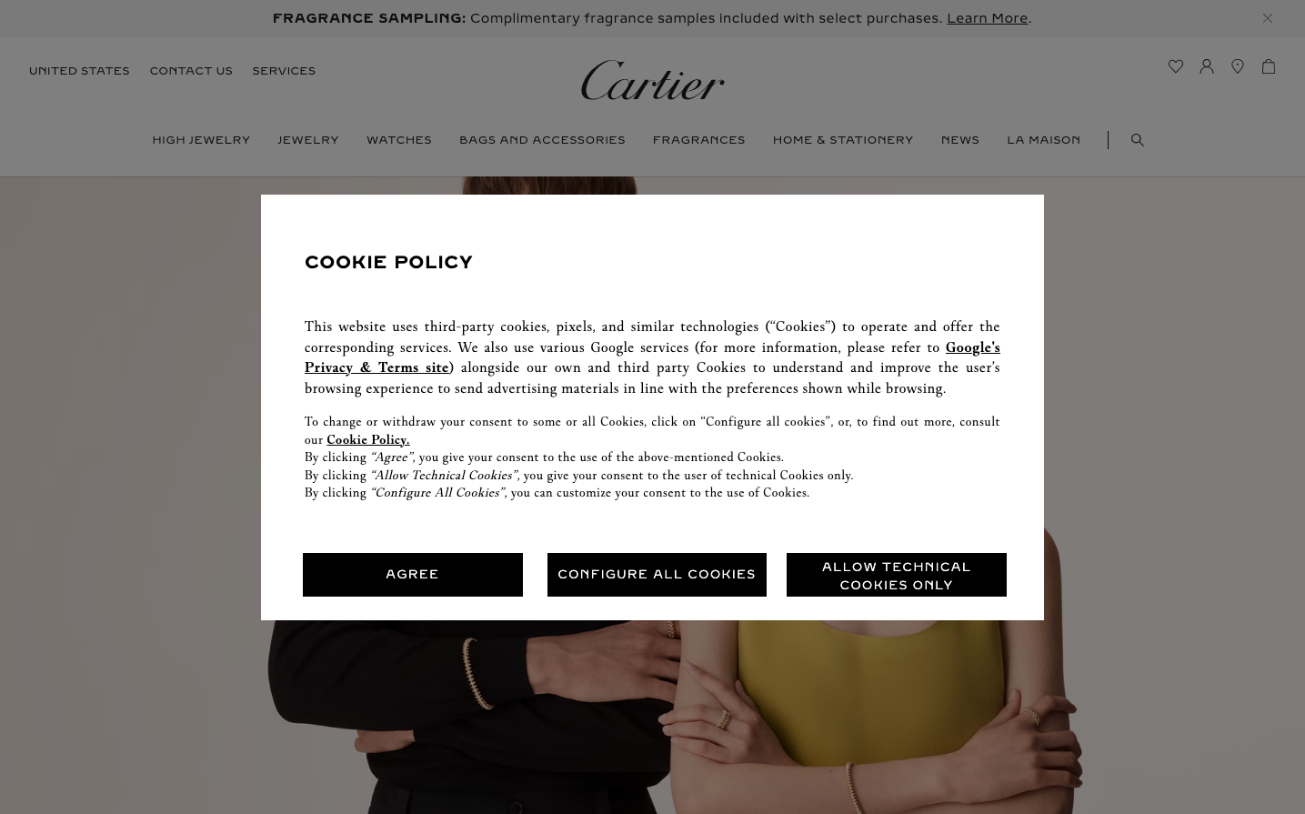
LuxuryHermès embodies aristocratic minimalism with a monochromatic palette that whispers luxury rather than shouting it. The classical typography and abundant whitespace create an atmosphere of exclusivity and restraint, where every element is deliberately chosen and nothing is superfluous.
Design Identity
Signature Color
Hermès Black
#000000
timeless luxury and uncompromising sophistication
Visual Identity
Extreme whitespace dominance with surgical precision in typography hierarchy - the brand is recognizable by what it doesn't show rather than what it does.
Component Style
No visible interactive components in this state - pure typographic minimalism with razor-sharp text rendering and no decorative elements, shadows, or borders.
Spacing Philosophy
Cathedral-like spacing with massive whitespace breathing room that creates a sense of reverence and exclusivity - content floats in an ocean of white space.
Design Principles
- Typography uses classical serif (Times) exclusively
- Color palette limited to pure black on white
- Whitespace ratios favor emptiness over content density
- Zero decorative elements or visual flourishes
- Content hierarchy through size and weight only
Target Audience
Ultra-high-net-worth individuals who view luxury as understatement and exclusivity as the ultimate status symbol
Mood
Design descriptions are AI-generated based on visual analysis and may not fully reflect the brand's official design guidelines.
Design System
Typography Scale
| Element | Font | Size | Weight | Line Height |
|---|---|---|---|---|
| body | 16px | 400 | normal |
Color Palette
No colors extracted
UI Elements
No components detected