Help us build this. Leave comments, suggest improvements, and help create better design documentation for agents.
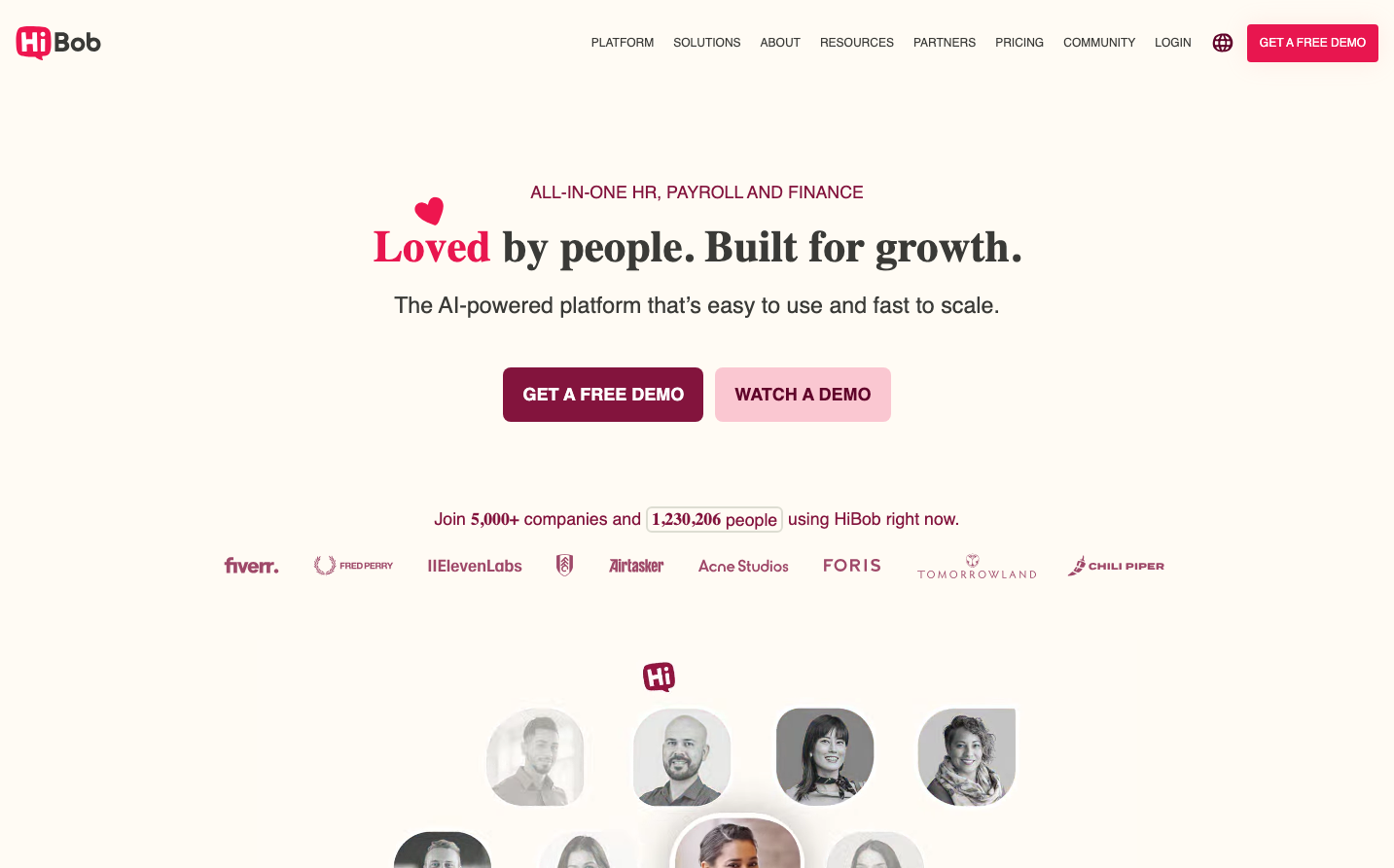
HiBob
HR TechHiBob uses a bold burgundy-meets-pink color story that feels both professional and approachable, with elegant serif headings creating emotional warmth against clean sans-serif body text. The design balances corporate sophistication with human-centered accessibility through generous whitespace and friendly rounded corners.
Design Identity
Signature Color
Cherry Syrup
#E8164F
Human-centered professionalism - trustworthy yet approachable, breaking away from cold corporate blues
Visual Identity
Distinctive burgundy-to-pink gradient buttons paired with elegant serif headlines create an instantly recognizable warmth that stands apart from typical SaaS coldness.
Component Style
Moderately rounded corners (8px) with subtle shadows, buttons have generous padding and smooth gradients from burgundy to bright pink. Everything feels substantial but friendly - no sharp edges or harsh contrasts.
Spacing Philosophy
Generous vertical breathing room with large section gaps creating a premium, unhurried feel. Tight internal component spacing (10-20px padding) keeps interactions focused while expansive outer margins convey confidence.
Design Principles
- Border radius consistently 8px for large elements
- Button padding follows 10px/12px/14px block, 13px/18px/20px inline progression
- Typography mixes Sentinel serif for headlines with Gotham sans-serif for UI
- Shadows use soft natural effects (6px 6px 9px) rather than sharp edges
- Color hierarchy built on cherry syrup (#E8164F) as primary action color
Target Audience
HR leaders and people operations professionals who value both data-driven efficiency and employee experience, seeking tools that feel human rather than mechanical
Mood
Design descriptions are AI-generated based on visual analysis and may not fully reflect the brand's official design guidelines.
Design System
Typography Scale
| Element | Font | Size | Weight | Line Height |
|---|---|---|---|---|
| body | 16px | 400 | 24px | |
| h1 | 45.3962px | 800 | 54.4754px | |
| h2 | 23.22px | 400 | 32.508px | |
| h3 | 17.7363px | 400 | 23.0572px | |
| h4 | 26.6925px | 800 | 37.3695px | |
| p | 14px | 500 | 21px | |
| a | 16px | 700 | 0px | |
| button | 16px | 400 | normal | |
| input | 16px | 400 | 24px | |
| nav | 16px | 400 | 24px |
Color Palette
#007aff#7a00df#007cba#006ba1#005a87#000000#abb8c3#ffffff#f78da7#cf2e2e#ff6900#fcb900