Help us build this. Leave comments, suggest improvements, and help create better design documentation for agents.
Hotels
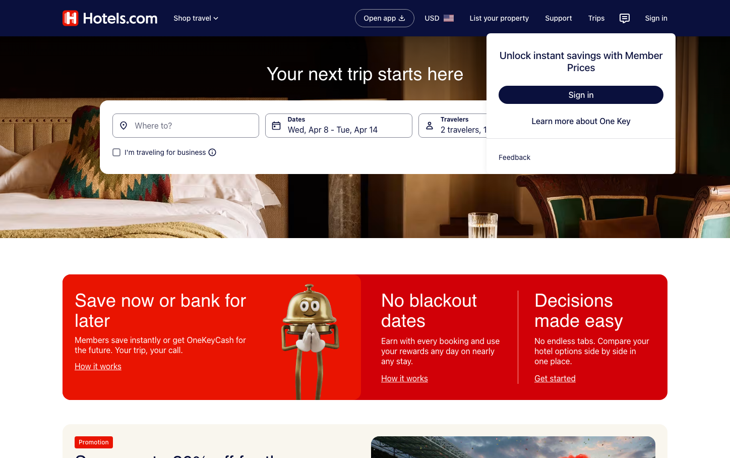
TravelHotels.com embraces a warm, travel-inspired aesthetic anchored by a vibrant red that feels both urgent and adventurous. The Recoleta serif headlines create an editorial, magazine-like sophistication while Centra No2 maintains approachability throughout the interface.
Design Identity
Signature Color
Hotels Red
#e91401
urgent wanderlust - the color of adventure calling and immediate booking impulses
Visual Identity
The three-column promotional section with its cartoon bellhop mascot and red-white-gradient treatment creates an unmistakable playful-yet-premium travel booking experience that balances urgency with approachability.
Component Style
Rounded corners with generous padding create friendly, approachable components. The primary button uses full saturation with white text for maximum contrast, while form inputs have clean minimal styling. Cards use subtle shadows and warm background tints that echo hospitality.
Spacing Philosophy
Generous breathing room between major sections creates a luxurious browsing experience, while compact internal spacing keeps booking flows efficient. The hero section uses dramatic negative space to focus attention on the search functionality.
Design Principles
- Red (#e91401) dominates all primary actions and branding moments
- Serif headlines (Recoleta) only for major messaging, sans-serif (Centra No2) everywhere else
- Button text always 14px with 500 weight for consistency
- Warm background tints (#f9f6ee) for content sections over pure white
- Rounded corners throughout - never sharp geometric edges
Target Audience
Leisure travelers aged 25-55 who want booking confidence without complexity - people who research thoroughly but book impulsively when they find the right deal
Mood
Design descriptions are AI-generated based on visual analysis and may not fully reflect the brand's official design guidelines.
Design System
Typography Scale
| Element | Font | Size | Weight | Line Height |
|---|---|---|---|---|
| body | 16px | 400 | normal | |
| h1 | 36px | 400 | 40px | |
| h2 | 14px | 500 | 18px | |
| p | 14px | 400 | 18px | |
| a | 14px | 400 | 18px | |
| button | 14px | 500 | 18px | |
| input | 16px | 400 | 20px | |
| header | 16px | 400 | normal |
Color Palette
#caccd2#356cc0#ffffff#f9f6ee#0c0e1c#dfe0e4#676a7d#191e3b#e91401#7b1fa2#a7183c#e61e43