Help us build this. Leave comments, suggest improvements, and help create better design documentation for agents.
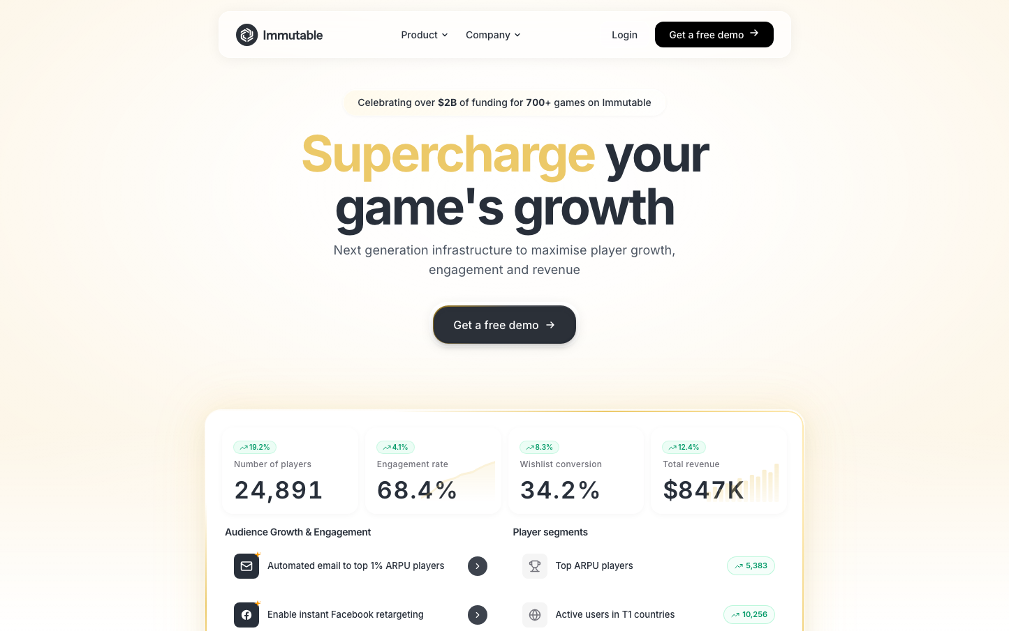
Immutable
GamingImmutable presents a sophisticated gaming infrastructure brand that balances premium financial gravitas with gaming accessibility. The warm gold accent against clean neutrals creates an approachable yet authoritative presence, while the expansive whitespace and confident typography communicate enterprise-level reliability for gaming companies seeking growth.
Design Identity
Signature Color
Immutable Gold
#ecc968
Gaming economy prosperity - bridging traditional finance credibility with gaming innovation and digital asset value
Visual Identity
Massive typographic hierarchy with ultra-generous vertical spacing creates a museum-like sense of importance, while the single golden accent color provides warmth against an otherwise neutral palette
Component Style
Softly rounded buttons (approximately 6-8px radius) with bold fills and no visible shadows or borders - everything feels substantial yet approachable, like premium gaming hardware
Spacing Philosophy
Cathedral-like vertical spacing with 80-120px section gaps creates a sense of importance and allows each metric to breathe, while the dashboard cards use generous internal padding for scannable data presentation
Design Principles
- Typography scale jumps dramatically from 14px body to 72px headlines
- Only one accent color (gold) used sparingly for maximum impact
- Metrics displayed in clean cards with minimal visual decoration
- All buttons use the same rounded corner treatment
- Inter font family exclusively for technical precision
Target Audience
Gaming studio founders and technical leads who need infrastructure that scales - developers who understand the complexity behind simple interfaces and value data-driven growth metrics
Mood
Design descriptions are AI-generated based on visual analysis and may not fully reflect the brand's official design guidelines.
Design System
Typography Scale
| Element | Font | Size | Weight | Line Height |
|---|---|---|---|---|
| body | 16px | 400 | 24px | |
| h1 | 72px | 700 | 75.6px | |
| h2 | 47px | 700 | 51.7px | |
| h3 | 14px | 600 | 20px | |
| h4 | 14px | 500 | 20px | |
| p | 14px | 500 | 20px | |
| a | 16px | 400 | 24px | |
| button | 14px | 500 | 21px | |
| nav | 16px | 400 | 24px | |
| footer | 16px | 400 | 24px |
Color Palette
#4c5562#ffffff#ecc968#000000#282f3a