Help us build this. Leave comments, suggest improvements, and help create better design documentation for agents.
Inter
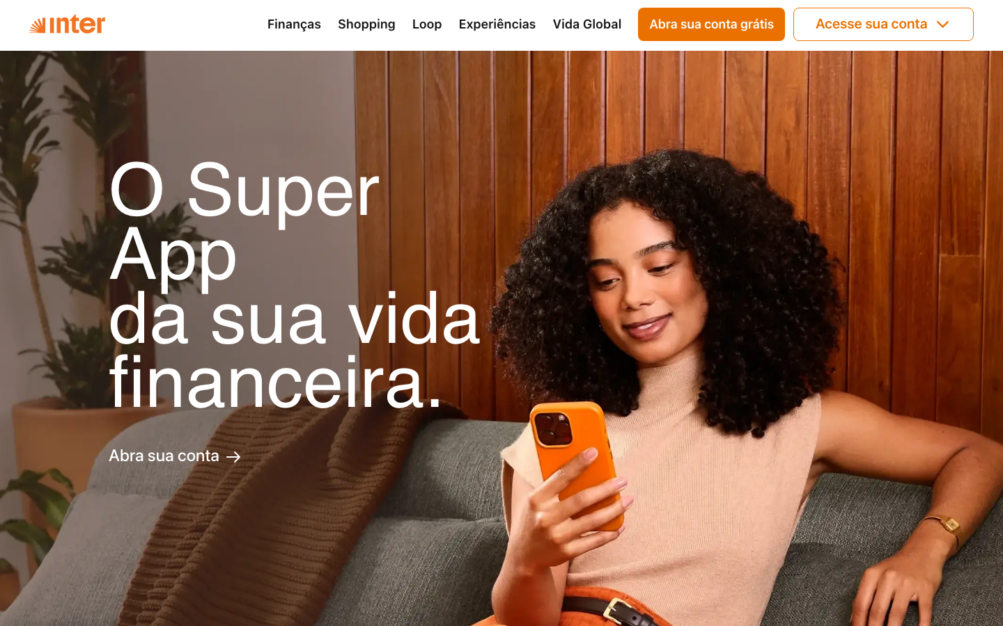
NeobankInter's brand radiates warm financial empowerment through its distinctive orange-centric palette and cozy, approachable aesthetic. The typography mixing large Citrina headers with Inter body text creates a confident yet friendly tone that makes financial services feel accessible and human.
Design Identity
Signature Color
Inter Orange
#ea7100
Financial warmth and approachable expertise - making banking feel human and energetic
Visual Identity
The bold orange accent color combined with warm wood textures and relaxed lifestyle photography creates an unmistakably cozy-tech aesthetic that humanizes fintech.
Component Style
Buttons feature generous rounded corners (24px+ for pills) with the signature orange background. Cards use subtle shadows (2px 16px rgba(0,0,0,.08)) and 8px border radius. Everything feels soft and approachable rather than sharp or corporate.
Spacing Philosophy
Generous whitespace creates breathing room around content blocks. The layout feels conversational with comfortable padding (16px standard) and relaxed line-heights that prioritize readability over density.
Design Principles
- Orange (#ea7100) is the primary accent across all interactive elements
- Border radius ranges from 8px for containers to 24px+ for pills - nothing sharp
- Typography scales dramatically: 14px body to 104px hero headlines using Citrina
- Shadows are always subtle: maximum 24px blur with 16% opacity
- Button text uses 18px Inter at 600 weight for confident clarity
Target Audience
Young professionals and millennials seeking approachable financial management tools who value lifestyle integration over traditional banking formality
Mood
Design descriptions are AI-generated based on visual analysis and may not fully reflect the brand's official design guidelines.
Design System
Typography Scale
| Element | Font | Size | Weight | Line Height |
|---|---|---|---|---|
| body | 14px | 400 | 20.72px | |
| h1 | 80px | 400 | 88px | |
| h2 | 104px | 400 | 92px | |
| p | 32px | 400 | 40px | |
| a | 14px | 400 | 20.72px | |
| button | 18px | 600 | 22px | |
| nav | 14px | 400 | 20.72px | |
| header | 14px | 400 | 20.72px | |
| footer | 12px | 400 | 17.76px | |
| main | 14px | 400 | 20.72px |
Color Palette
#fdf3e5#dedfe4#6a6c72#ffffff#ea7100#161616#fff7d9#f56a50#8c91a9#fef0ed#d1e7dd#e2e3e5