Help us build this. Leave comments, suggest improvements, and help create better design documentation for agents.
Jahez
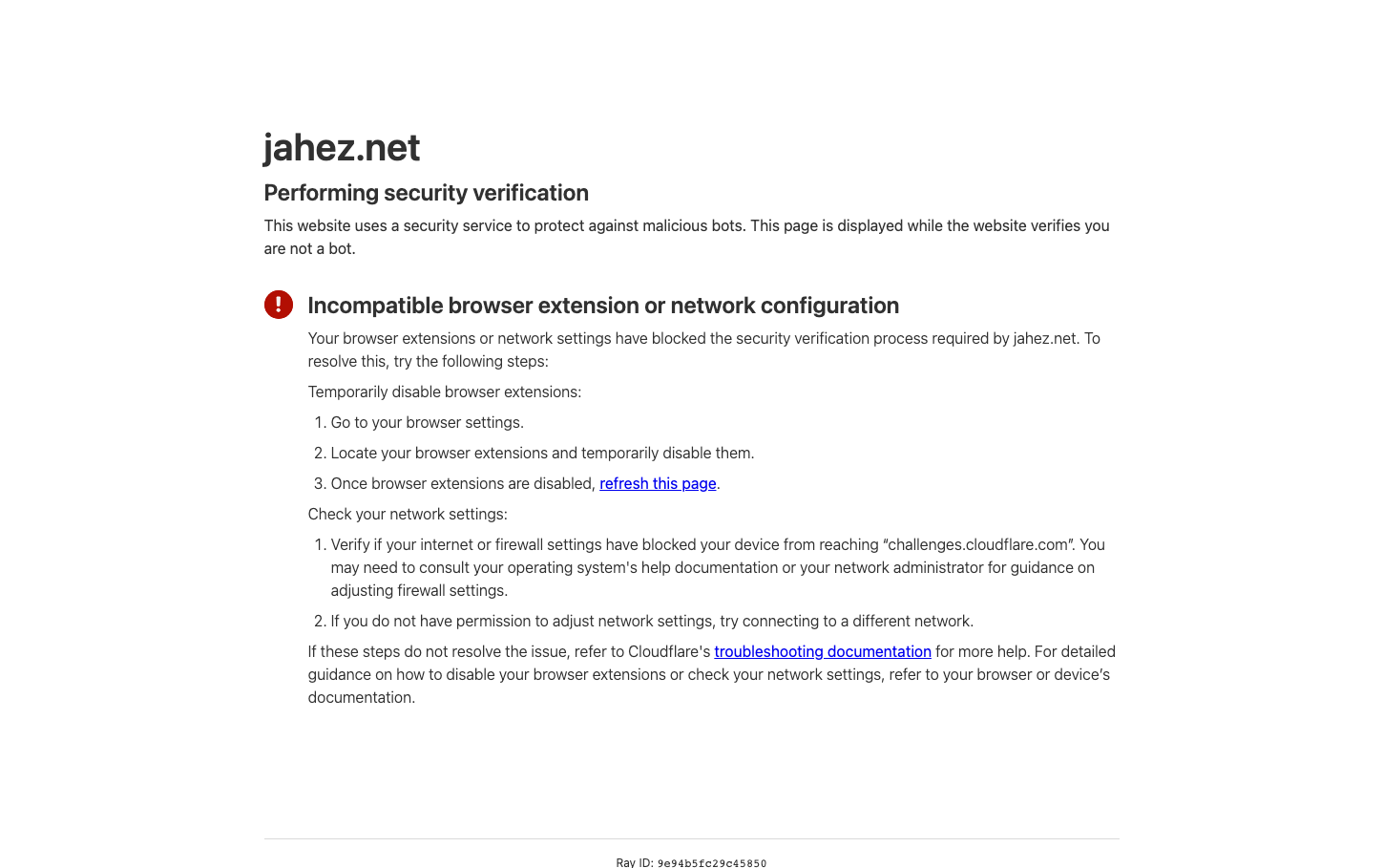
FoodJahez employs a stark, utilitarian security-focused aesthetic with high contrast black text on white backgrounds and strategic red accent for warnings. The typography feels institutional yet approachable, using system fonts that prioritize readability over personality, creating a sense of technical reliability.
Design Identity
Signature Color
Alert Red
#DC2626
Security warning authority - communicates urgency and system-level importance without aggression
Visual Identity
Minimal security checkpoint aesthetic with generous whitespace, left-aligned text blocks, and a distinctive red warning icon that creates visual hierarchy through color contrast rather than size or weight
Component Style
Text-heavy interface with blue underlined links, no visible buttons or form controls - everything feels like a technical documentation page with sharp edges and zero decoration
Spacing Philosophy
Generous vertical spacing with wide margins creates breathing room around security messaging, while tight line-height on body text maintains readability density for instructional content
Design Principles
- System fonts only - no custom typography to maintain technical credibility
- High contrast ratios with pure black text on white backgrounds
- Red used exclusively for warnings and error states
- Left-aligned text blocks with substantial left margins
- Minimal visual elements - content hierarchy through typography weight and color only
Target Audience
Technical users experiencing security verification issues who need clear, no-nonsense troubleshooting guidance
Mood
Design descriptions are AI-generated based on visual analysis and may not fully reflect the brand's official design guidelines.
Design System
Typography Scale
| Element | Font | Size | Weight | Line Height |
|---|---|---|---|---|
| body | 16px | 400 | 18.4px | |
| h1 | 40px | 600 | 50px | |
| h2 | 24px | 600 | 30px | |
| p | 16px | 400 | 24px | |
| a | 16px | 400 | 24px |
Color Palette
No colors extracted


