Help us build this. Leave comments, suggest improvements, and help create better design documentation for agents.
Jobandtalent
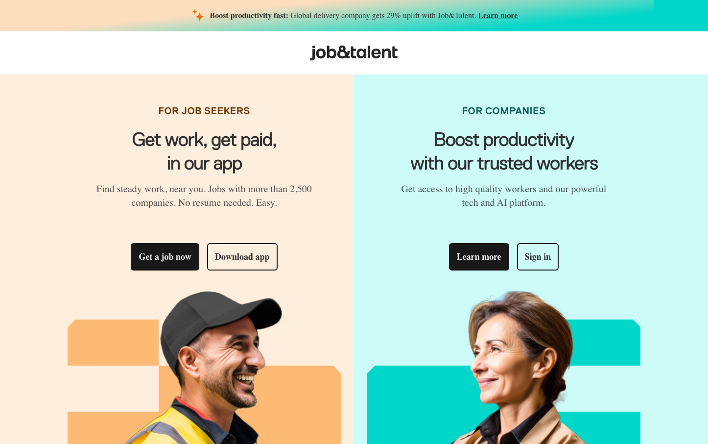
HR TechJob&Talent employs a warm-meets-digital aesthetic with gradient peach-to-teal backgrounds that create an approachable, optimistic atmosphere. The dual-sided layout with contrasting warm (job seekers) and cool (companies) sections tells a story of human connection bridging both sides of the employment equation.
Design Identity
Signature Color
Teal Prosperity
#00B5A5
Professional growth and digital-forward employment solutions
Visual Identity
Split-screen gradient backgrounds with contrasting warm peach and cool teal sections, creating a clear visual separation between user types while maintaining brand unity through the shared gradient treatment.
Component Style
Rounded buttons with 8px corners and solid fills, no shadows or borders. Dark charcoal primary buttons with white text, light secondary buttons with dark text. Components feel approachable and tactile rather than sharp or technical.
Spacing Philosophy
Generous vertical breathing room with large sections creating an uncluttered, approachable feel. Tight internal component padding keeps UI elements compact while the overall layout feels spacious and welcoming.
Design Principles
- Gradient backgrounds always transition from warm to cool tones
- Button border radius consistently 8px across all components
- Font weights limited to 400, 600, and 700 for clear hierarchy
- Split-screen layouts maintain 50/50 visual balance
- Dark charcoal (#252525) for primary actions, never pure black
Target Audience
Blue-collar workers seeking steady employment and SMB hiring managers who value human-centric, accessible technology over complex enterprise tools.
Mood
Design descriptions are AI-generated based on visual analysis and may not fully reflect the brand's official design guidelines.
Design System
Typography Scale
| Element | Font | Size | Weight | Line Height |
|---|---|---|---|---|
| body | 16px | 400 | 16px | |
| h1 | 1px | 400 | 1px | |
| h2 | 40px | 400 | 48px | |
| p | 20px | 400 | 20px | |
| a | 16px | 700 | 24px | |
| button | 16px | 700 | 24px | |
| nav | 16px | 600 | 24px | |
| header | 16px | 400 | 16px | |
| footer | 16px | 400 | 16px | |
| main | 16px | 400 | 16px |
Color Palette
#30363c#ffffff#2c2f31#5e6266#000000#eaeff2#d4dae0#f0f4f7#667481#d5dee2#e9eff4#dee4e9