Help us build this. Leave comments, suggest improvements, and help create better design documentation for agents.
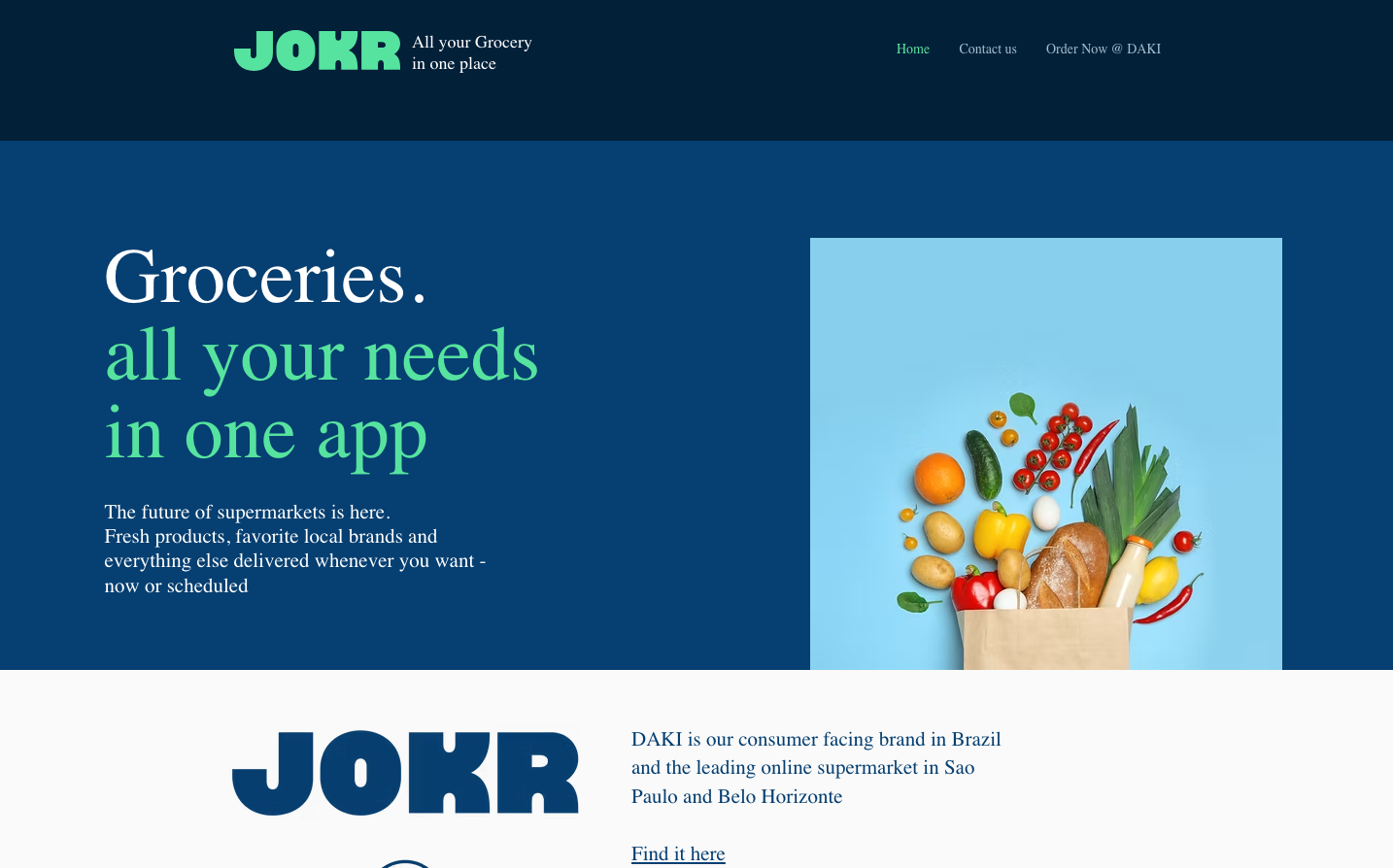
Jokr
Quick CommerceJOKR creates a confident, appetite-driven aesthetic that balances midnight sophistication with fresh vitality. The deep navy foundation evokes premium delivery reliability, while the electric mint green pulses with the energy of instant gratification and fresh produce.
Design Identity
Signature Color
Electric Mint
#56e39f
Fresh delivery velocity - the instant satisfaction of getting premium groceries when you want them
Visual Identity
The striking contrast between deep oceanic blues and vibrant mint green, combined with bold serif headlines that feel both editorial and approachable - like a premium food magazine meets tech unicorn.
Component Style
Clean, confident elements with subtle rounded corners. The primary button uses the signature mint with dark navy text for maximum contrast and accessibility. Components feel substantial but not heavy, with gentle curves that suggest organic freshness.
Spacing Philosophy
Generous breathing room that mirrors the ease of the service - wide margins create a sense of premium space, while the hero layout uses dramatic asymmetry with the grocery bag image taking up significant real estate to showcase the product quality.
Design Principles
- Typography mixing: Bold serif headlines (80px) paired with clean sans-serif body text (14px)
- Color temperature contrast: Cool navy blues balanced with warm mint green accents
- Asymmetrical hero layouts with 60/40 text-to-image ratios
- Generous line-height (45px) for body text creates easy scanning
- Dark backgrounds with light text for premium nighttime delivery positioning
Target Audience
Urban professionals and families who value convenience and quality - people who want restaurant-grade ingredients delivered with tech-startup speed but don't want to compromise on freshness or selection.
Mood
Design descriptions are AI-generated based on visual analysis and may not fully reflect the brand's official design guidelines.
Design System
Typography Scale
| Element | Font | Size | Weight | Line Height |
|---|---|---|---|---|
| body | 10px | 400 | normal | |
| h1 | 80px | 400 | 80px | |
| h2 | 40px | 400 | normal | |
| h3 | 18px | 400 | normal | |
| h4 | 24px | 400 | normal | |
| p | 14px | 400 | 45px | |
| a | 10px | 400 | normal | |
| nav | 10px | 400 | normal | |
| header | 10px | 400 | normal | |
| footer | 10px | 400 | normal |
Color Palette
#56e39f#032039#4e7495#a8c3dc#063f71#7e9db8#551b16#1d4c35#39976a#a3ecc9#c3f6dd#263b31