Help us build this. Leave comments, suggest improvements, and help create better design documentation for agents.
JPMorgan
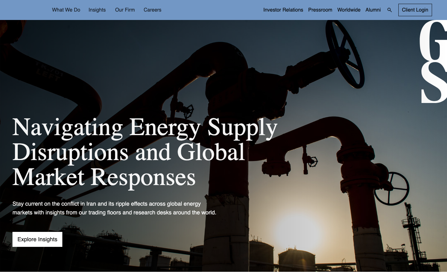
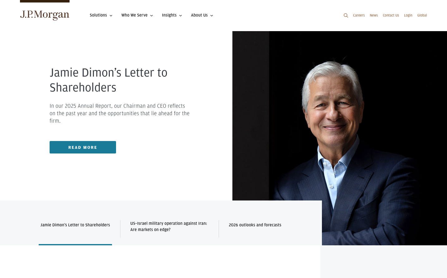
FinanceJPMorgan's brand exudes institutional gravitas through dramatic portraiture and restrained sophistication. The commanding use of stark white space against dark imagery creates an atmosphere of premium financial authority, while the 'Amplitude' typeface delivers measured corporate confidence.
Design Identity
Signature Color
JPMorgan Teal
#0077A6
institutional trust and financial stability with modern sophistication
Visual Identity
Dramatic high-contrast portraiture as hero elements, with executive photography treated as premium editorial content against expansive white backgrounds
Component Style
Clean rectangular buttons with subtle rounded corners, minimal borders, and understated hover states. Everything feels substantial yet refined - no flashy effects, just confident simplicity with generous touch targets.
Spacing Philosophy
Luxurious white space dominates with wide margins and generous vertical rhythm. Content breathing room suggests premium positioning - never cramped, always considered.
Design Principles
- Typography never exceeds 3 weights: 300 (light), 400 (regular), 700 (bold)
- Amplitude font family used exclusively across all elements
- High-contrast photography always anchors major sections
- Button text remains understated at 14px with 400 weight
- Line heights maintain 1.5x ratio for optimal readability
Target Audience
C-suite executives and institutional investors who expect gravitas over flashiness in their financial partnerships
Mood
Design descriptions are AI-generated based on visual analysis and may not fully reflect the brand's official design guidelines.
Design System
Typography Scale
| Element | Font | Size | Weight | Line Height |
|---|---|---|---|---|
| body | 16px | 400 | 24px | |
| h1 | 32px | 700 | 48px | |
| h2 | 40px | 300 | 48px | |
| h3 | 18.72px | 700 | 28.08px | |
| p | 32px | 300 | 40px | |
| a | 16px | 500 | 24px | |
| button | 14px | 400 | 20px | |
| input | 14px | 400 | 20px | |
| nav | 16px | 400 | 24px | |
| footer | 16px | 400 | 24px |
Color Palette
No colors extracted