Help us build this. Leave comments, suggest improvements, and help create better design documentation for agents.
Kia
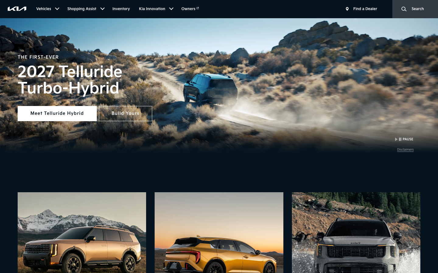
AutomotiveKia's brand identity embodies rugged sophistication through cinematic hero imagery and bold automotive storytelling. The typography uses their custom 'designk' family to convey engineered precision while maintaining approachability, creating a premium yet accessible adventure-ready aesthetic.
Design Identity
Signature Color
Kia Electric Blue
#0f70f0
Innovation-forward automotive technology with electric vehicle future-focus
Visual Identity
Dramatic full-bleed hero photography showcasing vehicles in extreme environments, combined with bold white typography overlaid on natural landscapes - instantly recognizable automotive adventure branding
Component Style
Clean rectangular buttons with minimal styling, subtle shadows on interactive elements (0.625rem focus shadows), and crisp borders using #dcdcdc. Components feel sturdy and automotive-grade rather than tech-sleek.
Spacing Philosophy
Generous horizontal padding scales from 25px mobile to 80px desktop, creating breathing room that matches the expansive landscape photography. Large-scale typography dominates with dramatic size jumps from 12px body to 50px headlines.
Design Principles
- Typography uses only designk custom family with Helvetica fallbacks
- Hero headlines at 50px with tight 54px line-height for impact
- Horizontal padding scales 3x from mobile (25px) to desktop (80px)
- Shadows use consistent 0.625rem blur radius across components
- Primary blue #0f70f0 with darker #0c5ecb hover states
Target Audience
Adventure-seeking car buyers aged 30-50 who value capability over luxury, prioritizing reliability and innovation for active lifestyles
Mood
Design descriptions are AI-generated based on visual analysis and may not fully reflect the brand's official design guidelines.
Design System
Typography Scale
| Element | Font | Size | Weight | Line Height |
|---|---|---|---|---|
| body | 16px | 400 | 16px | |
| h1 | 50px | 400 | 54px | |
| h2 | 16px | 400 | 24px | |
| h3 | 16px | 400 | 24px | |
| p | 12px | 400 | 20px | |
| a | 16px | 400 | 16px | |
| button | 13.3333px | 400 | 0px | |
| input | 12px | 400 | 20px | |
| nav | 16px | 400 | 16px | |
| header | 16px | 400 | 16px |
Color Palette
#fafafa#a8a8a8#0f70f0#0c5ecb#ffffff#212121#757575#616161#dcdcdc#940000#e9e9e9#f9f9f9