Help us build this. Leave comments, suggest improvements, and help create better design documentation for agents.
Kitopi
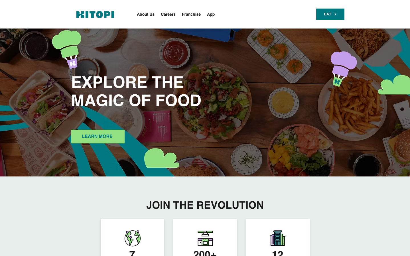
FoodKitopi creates a vibrant, food-centric identity through playful teal gradients and whimsical illustrated chef icons scattered across appetizing food photography. The bold Montserrat typography commands attention while maintaining approachability, balancing professional cloud kitchen operations with the joy of culinary discovery.
Design Identity
Signature Color
Kitopi Teal
#007882
Fresh culinary innovation and trustworthy food technology
Visual Identity
Colorful cartoon chef hat icons floating over rich food photography with dynamic teal geometric overlays - immediately recognizable as a playful yet professional food tech platform
Component Style
Clean rectangular buttons with subtle rounding, no heavy shadows or borders. Components feel light and accessible with the signature teal providing strong contrast against neutral backgrounds. Everything maintains crisp edges while the illustrated elements add organic warmth.
Spacing Philosophy
Generous breathing room around hero content with large-scale food imagery taking center stage. Compact navigation maintains efficiency while the main messaging gets expansive treatment with plenty of white space for impact.
Design Principles
- Hero typography uses Montserrat at 56px with 700 weight for maximum impact
- Signature teal (#007882) always appears in high-contrast applications
- Illustrated chef icons in green and purple provide brand personality without overwhelming
- Food photography fills full viewport width to showcase product quality
- All body text maintains 14px minimum for accessibility
Target Audience
Food entrepreneurs and restaurant owners seeking modern cloud kitchen solutions who value both technology efficiency and culinary passion
Mood
Design descriptions are AI-generated based on visual analysis and may not fully reflect the brand's official design guidelines.
Design System
Typography Scale
| Element | Font | Size | Weight | Line Height |
|---|---|---|---|---|
| body | 10px | 400 | normal | |
| h1 | 56px | 700 | normal | |
| h3 | 36px | 700 | normal | |
| h4 | 30px | 700 | normal | |
| h5 | 24px | 700 | normal | |
| p | 14px | 700 | 38px | |
| a | 10px | 400 | normal | |
| button | 13.3333px | 400 | normal | |
| nav | 10px | 400 | normal | |
| header | 10px | 400 | normal |
Color Palette
#582f91#ffffff#7c7c83#1b1b1e#dadada#3c3c4e#007882#93e080#c49eed#bea9da#3b1f61#1d1030